Case StudyOptum Serve
A secure web app enabling service members to request procedures, manage appointments and update records for deployment.
Optum Serve needed a web app for service members to manage the deployment readiness by being to see what they're due for and staying updated and ready to be deployed


Overview
A secure web app enabling service members to request procedures, manage appointments and update records for deployment.
RHRP4 is a DHA (Defense Health Agency) program delivering medical/dental readiness services such as physical exams, immunizations, labs, dental, behavioral health to Reserve Component and TRICARE Prime Remote service members, DoD civilians, and DHS personnel across all 50 states, PR, Guam, and other territories. This project was the Service Member facing side of the Electronic Scheduling Capability: a secure web/mobile app letting service members find providers, book and manage appointments across three modalities (in-clinic, virtual health, group events), upload records, and track which readiness requirements are coming due.
My role was to facilitate design workshops to fully understand the problem, the product, the data and processes, the goal, and align business objectives. Collaborate with directors, stakeholders, and developers to redesign the dashboard displaying data analytics. My role also consisted of conducting user research, gathering feedback and requirements, creating user flows and wireframes, and finalize a design mockup with a prototype.
Focus: Dashboard clarity, hierarchy, deployment readiness status
Scope: User research, UX exploration, visual refinement
Main Problems
The task was to design an experience for the service members in order to manage procedure requests in order for them to be ready to be deployed.
- Readiness data lived across multiple DoD/DHS systems of record (DENCLASS, CDS, DXP, DEERS, DOEHRS-HCD)
- Scheduling was historically phone-first, and service members had no clear, unified view of what was overdue or coming due.
- The PWS explicitly requires the system to “display SM electronic health record overdue readiness services status and services due in the next 30/60/90 days”
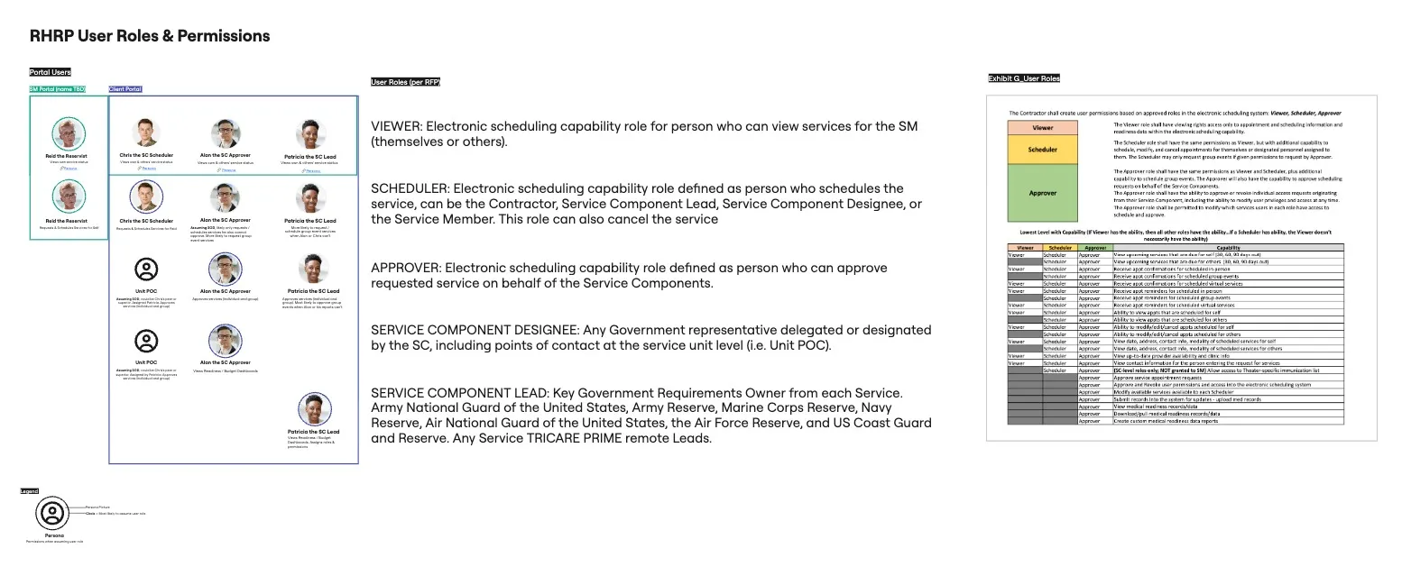
- SMs needed to self-schedule or have someone schedule on their behalf (a Scheduler could be the SC Lead, a designee, or the SM), which means the product had to support delegation, not just self-service.
- No-shows and late cancellations were expensive so a design solution is needed to effectively reduce waste.
DISCOVERY
Key Findings
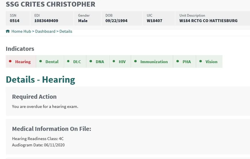
- The current contract holder, QTC, is a different organization and so I had no insight into the current customer facing experience. However, I did have access to a semi-relevant view for clients.
- There is no information about due dates, only a date of when it was received, and two colors: green to signify that they are compliant, and red for out of compliance, no in between.
- Given the contract requirement to show services due within 30/60/90 days, my approach was to focus on allowing a more insight view of their readiness, along with the ability to request procedures.
Cross Department Collaboration
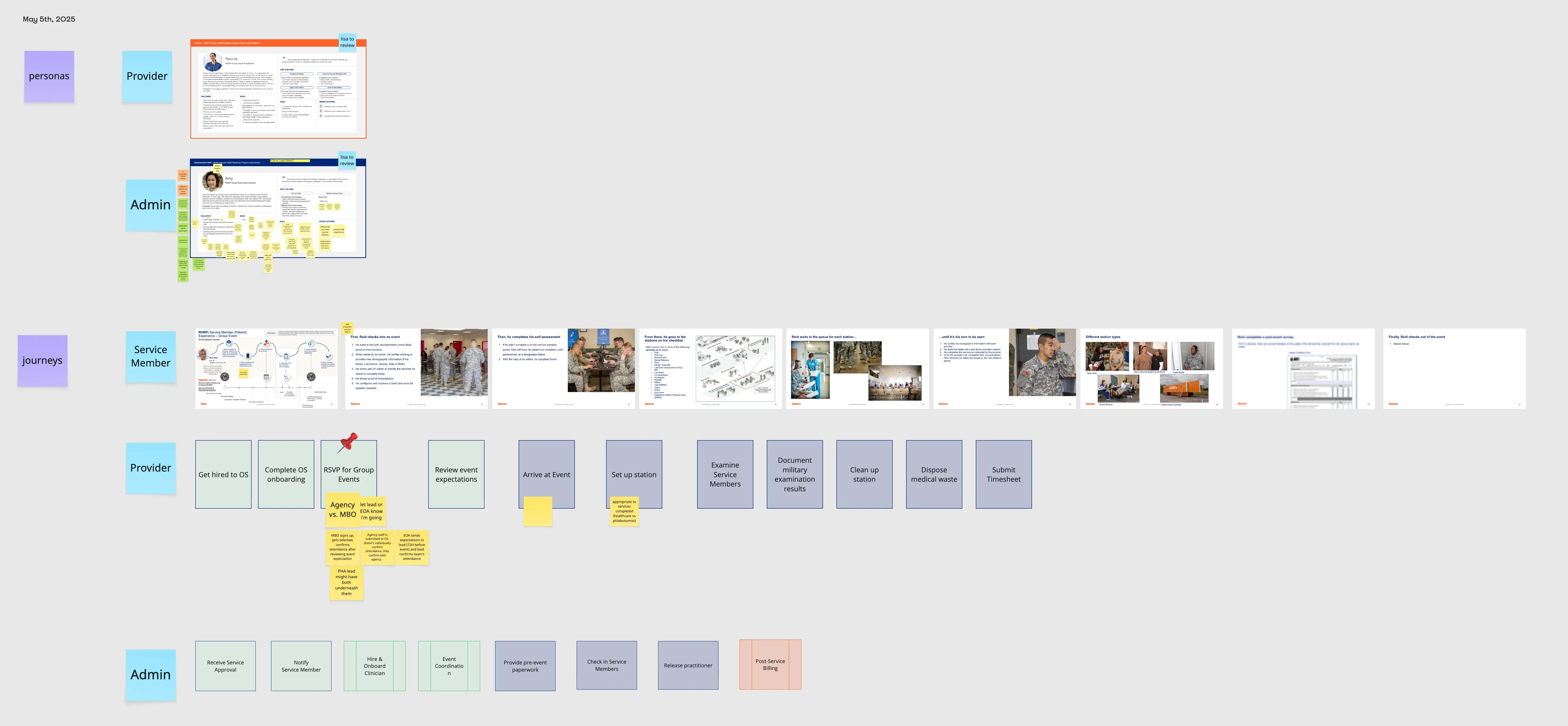
I also had the opportunity to connect with our Associate Director Deputy Program Manager, who served in the Army National Guard. He was a great asset because he provided information about what they used to use vs. what is actually needed in order to be ready to be deployed. I was also able to connect with the Program team that initially was awarded RHRP2, and therefore had a wealth of knowledge of the contract as a whole and how each domain operated.
Existing UI
Persona Research
User Roles
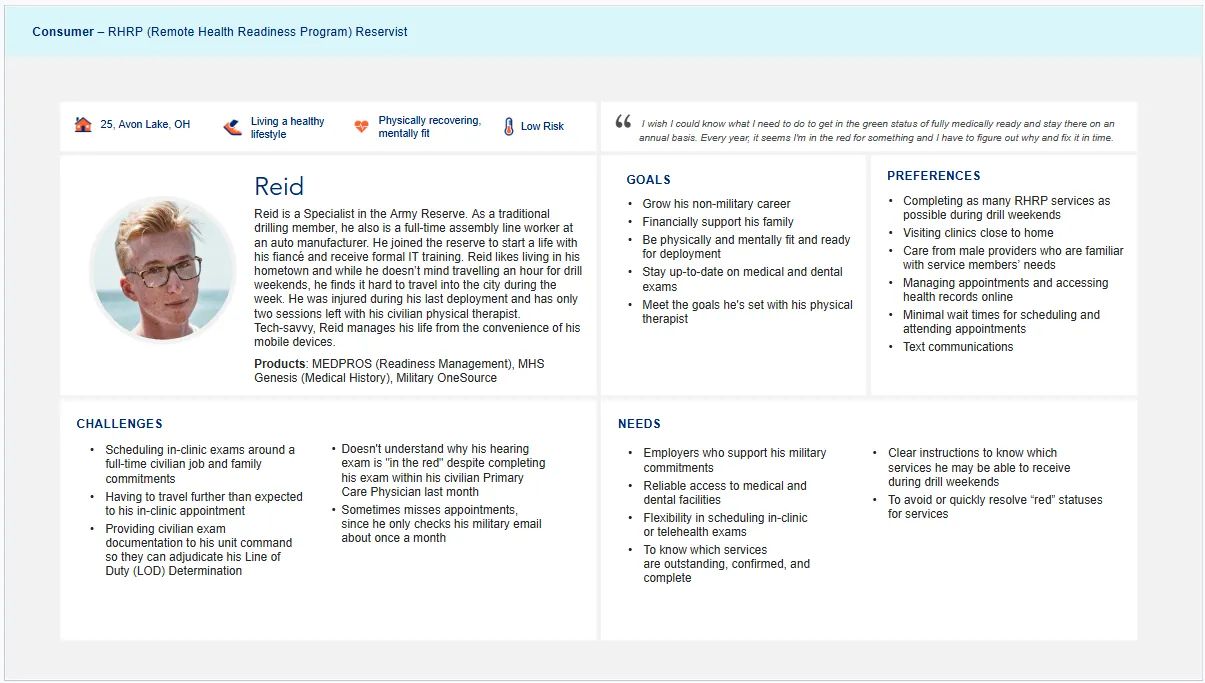
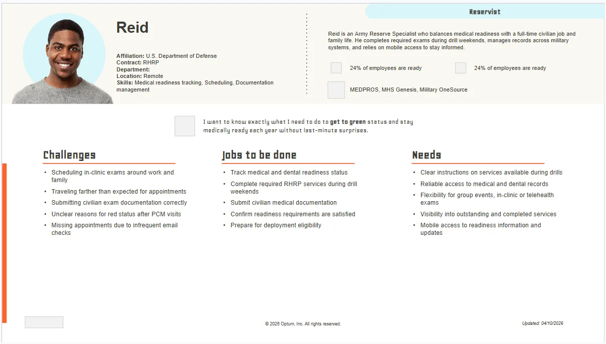
Persona Development: Reid, Before & After
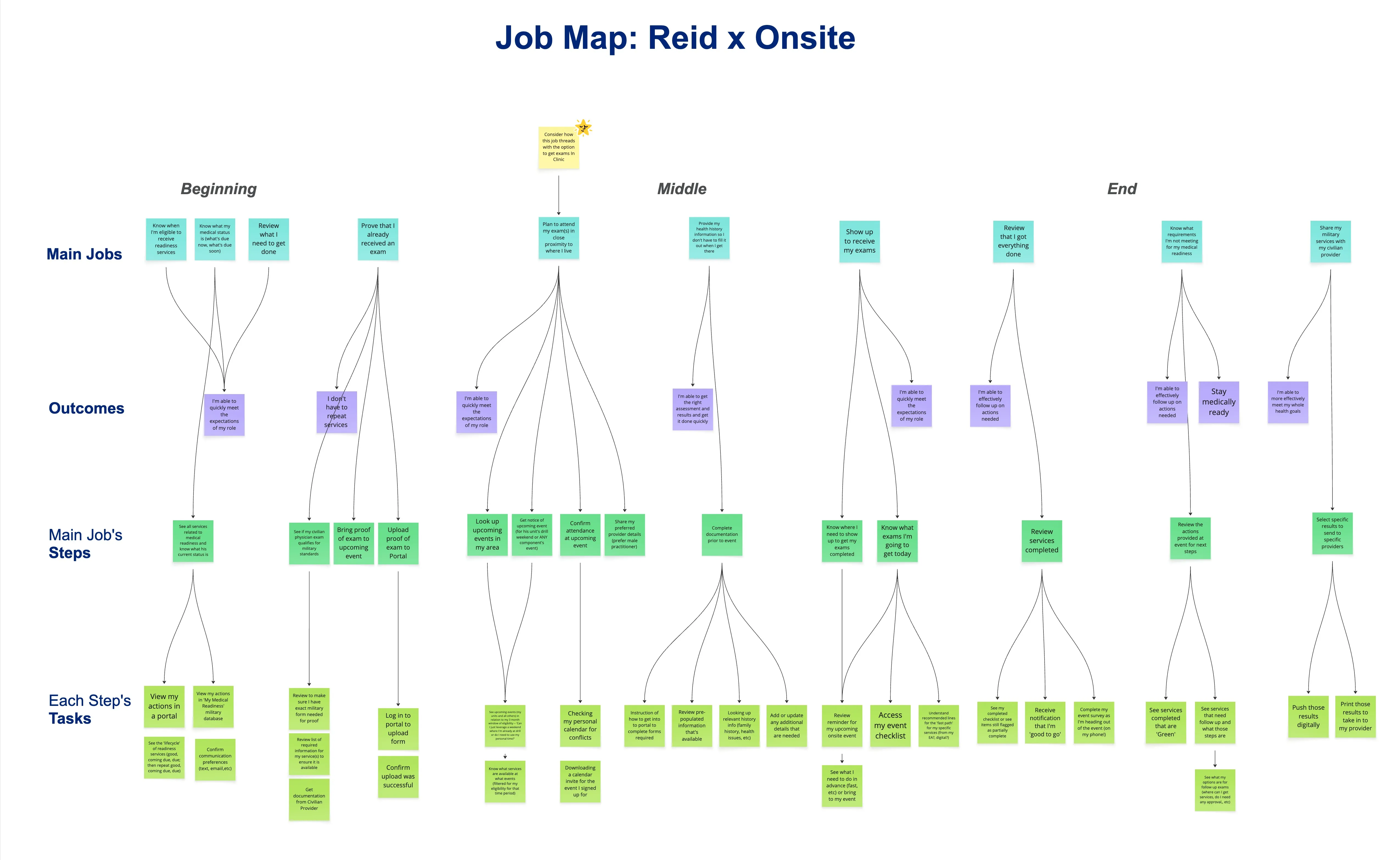
Reid's Job Map
Exploration
Initial Wireframes
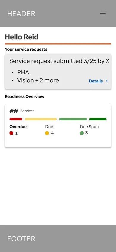
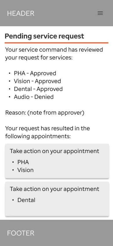
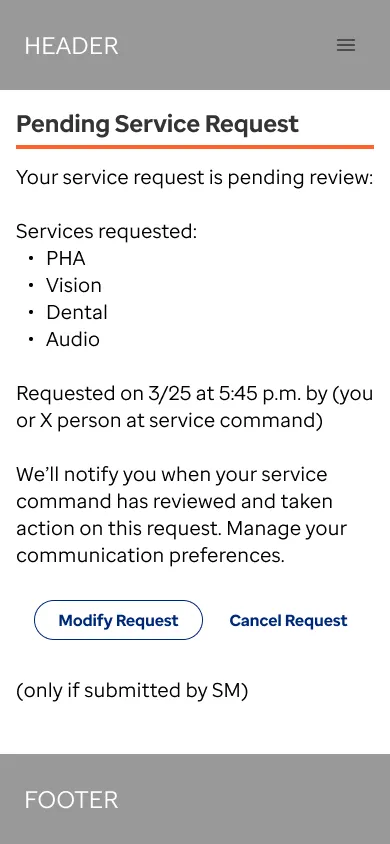
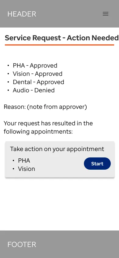
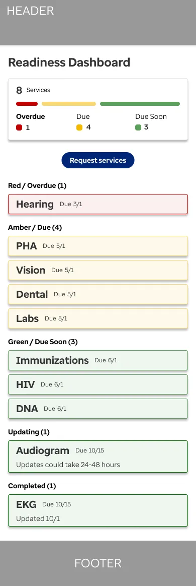
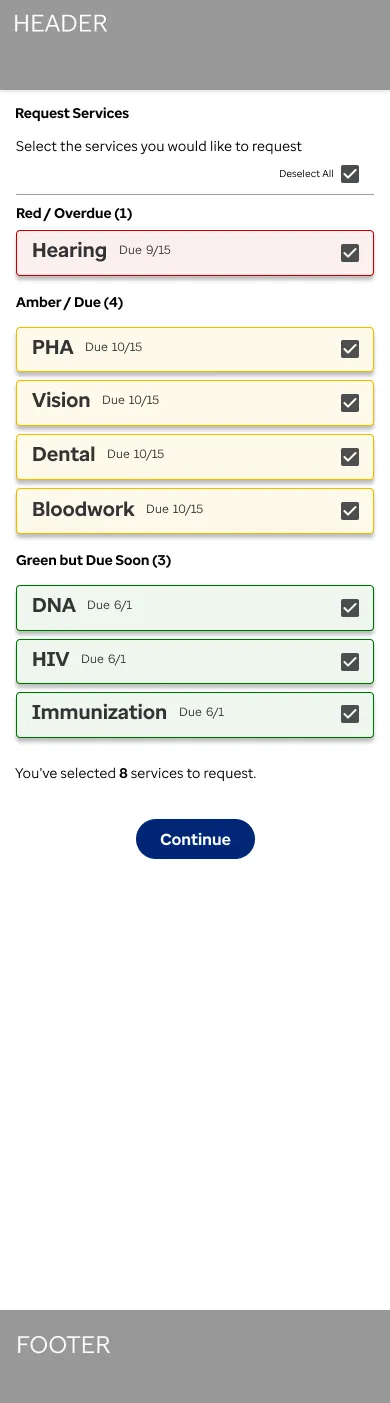
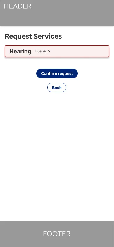
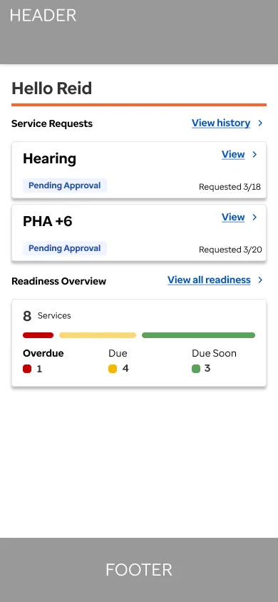
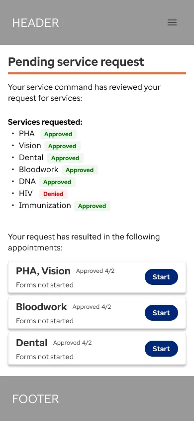
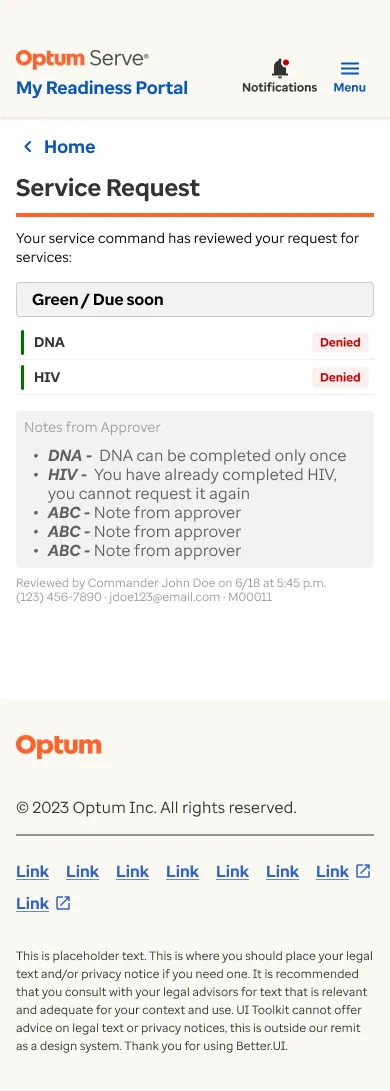
Based off of initial conversations, we knew we had to provide an experience where service members could see their status. We broke this up into Red, Amber, and Green to fit the requirements of 30/60/90 days out. We also provided a way to request medical procedures that were necessary for them to avoid being in the Red. We also provided a way to view the status of the request per procedure because the approving authority may approve or deny them.
Digital Sketch
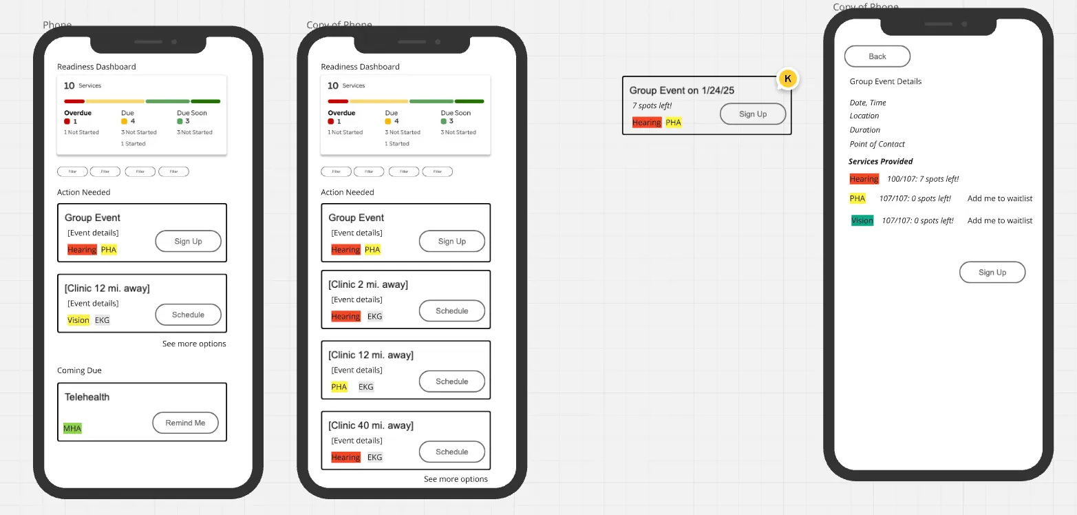
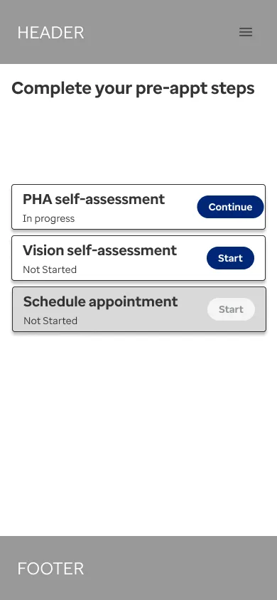
Initial Wireframe Screens
Further Iterations
After conducting user research and gathering feedback, we leaned away from a generic approach, and more toward a detailed results page for the procedures.
Refined Screens
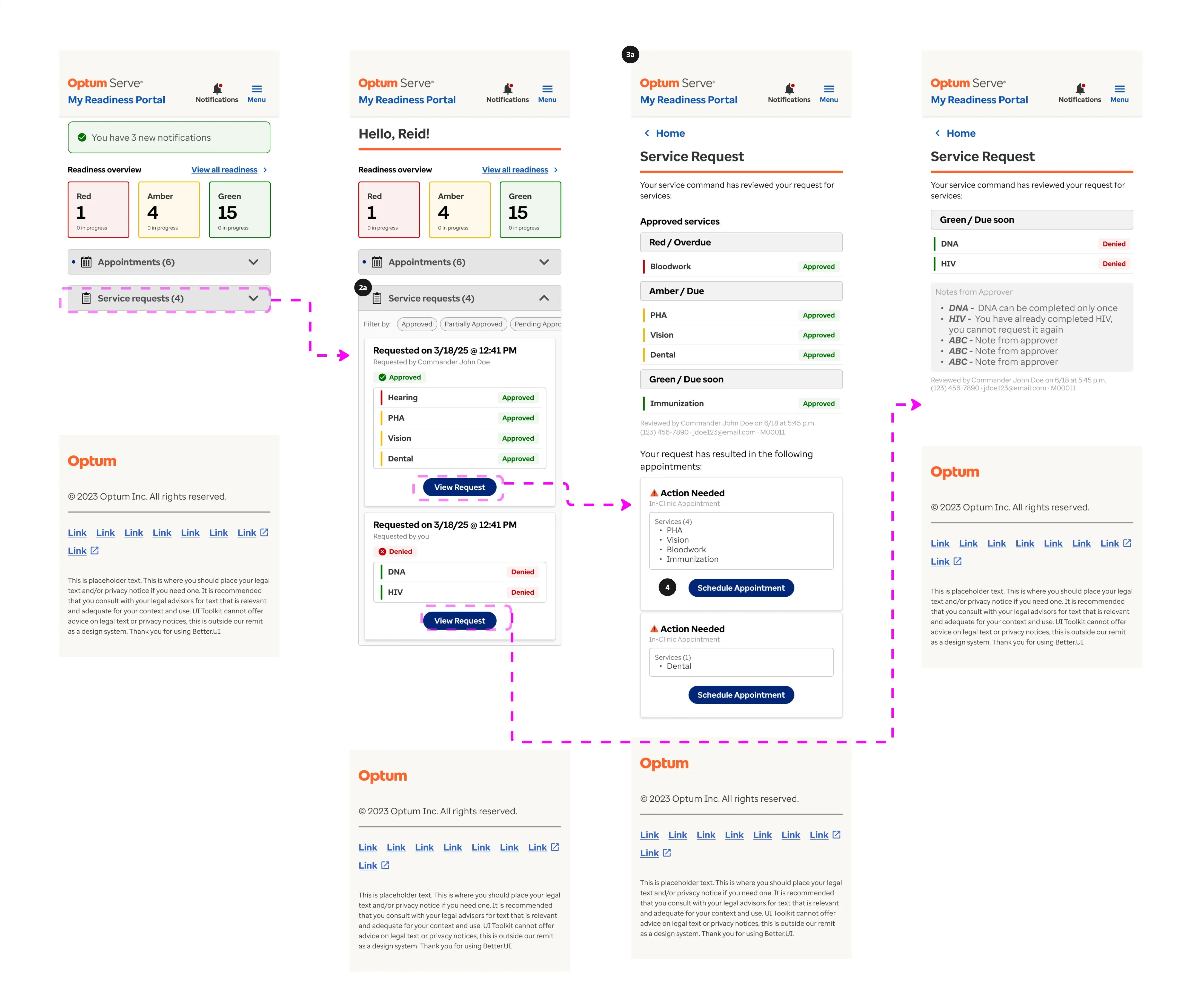
Initial Flow
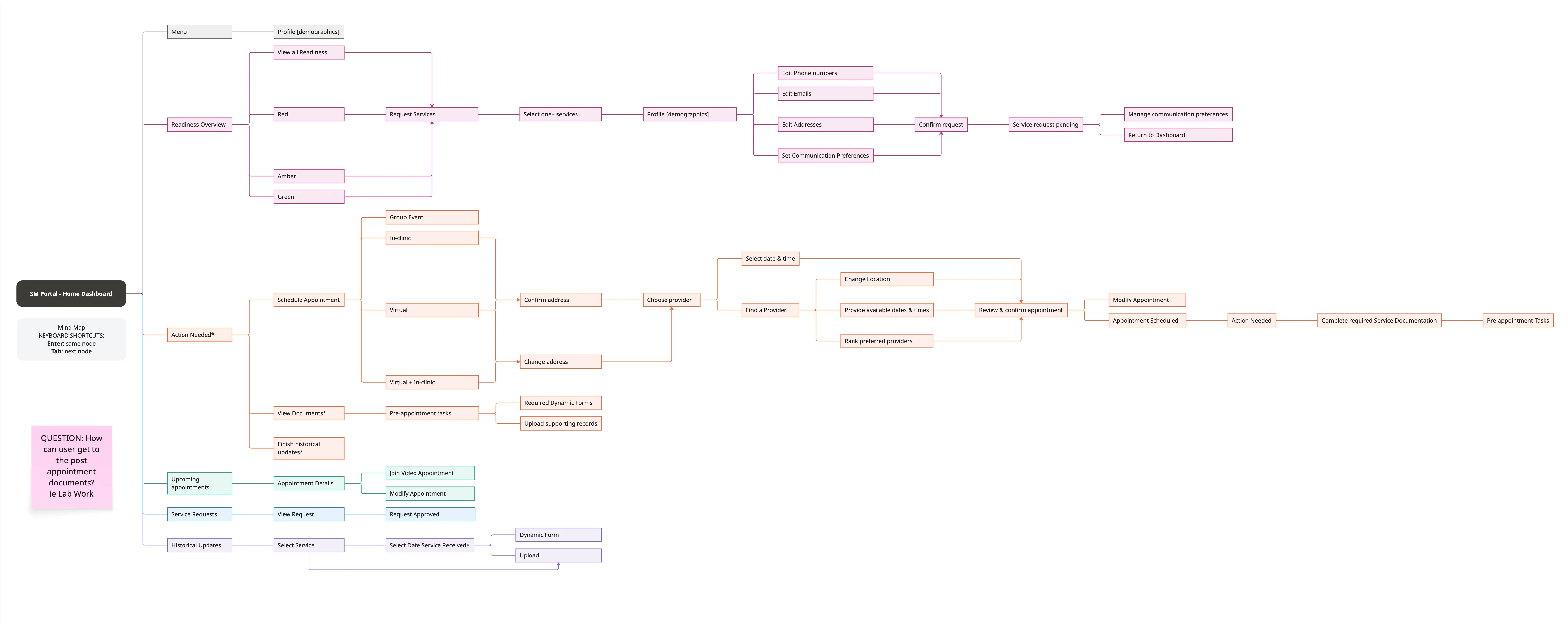
User Flow
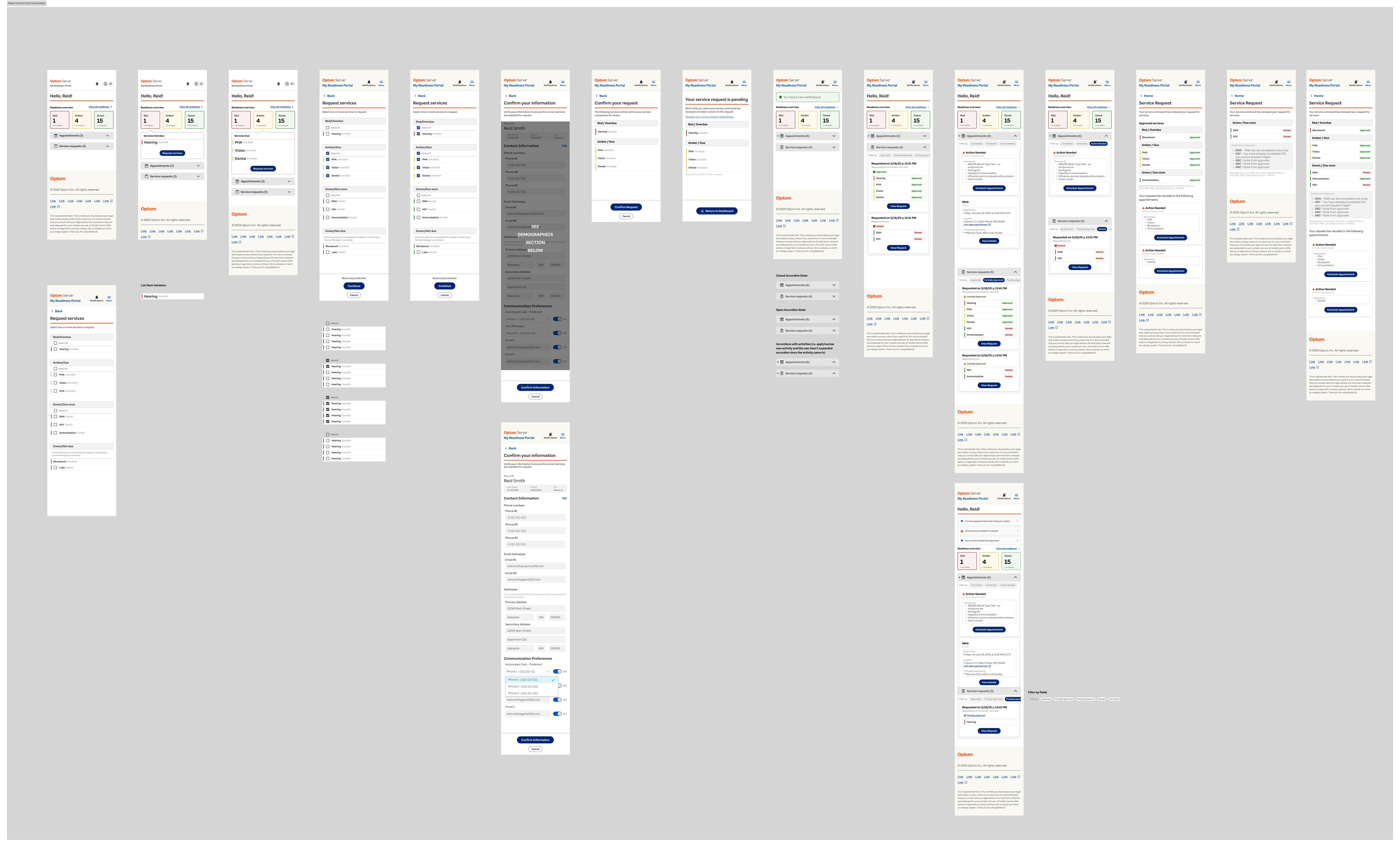
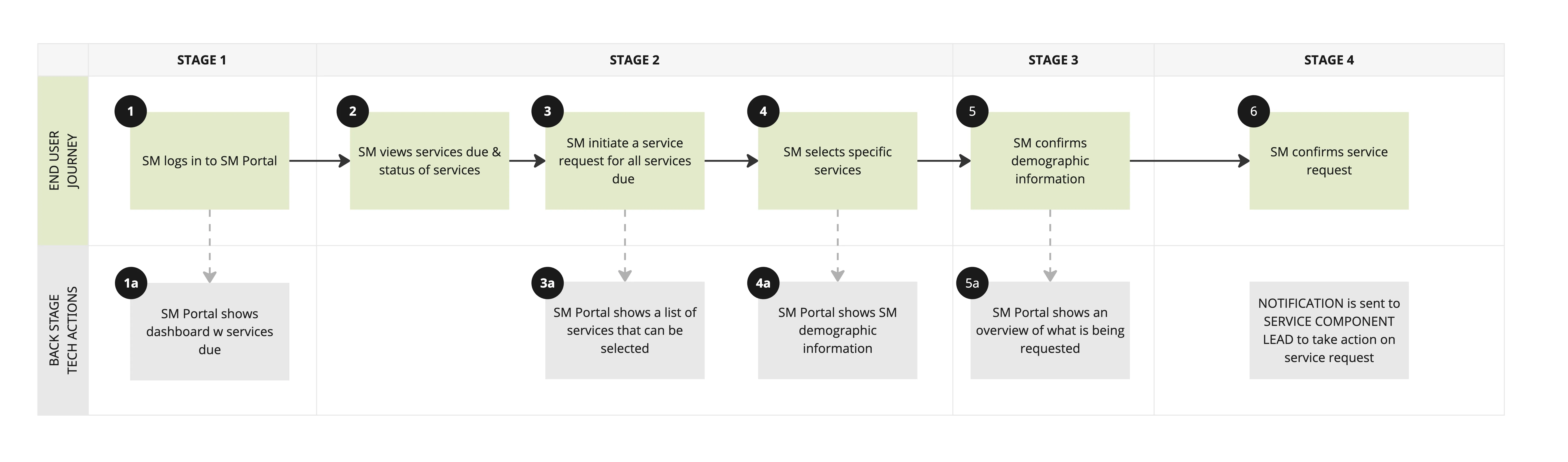
Journey Map/Service Blueprint
How We Worked
Refinements
If I wasn’t desigining, I was in refinements. The team, technical product managers, designers, developers, architects, gathered together for extended sessions to workshop, brainstorm, and work through any and all technical problems from broad ideas, all the way down to the details in order to make it feasible.
Pain Points
Instead of just MVP, we separated features into MVP, Post Award, and Post Go Live. During refinement, as we were thinking of ideas and solutions, we often needed to scale back so that what was being developed met the contractual requirements. The ideas that would be great for the users would be kept in Post Award or Post Go Live so that those ideas could be developed at a later time in order to meet the time constraint.
Dev Team/Architects
Software architects were always in our refinements so they were always aware of the needs and the plans. After design handoff, developers were fully aware of what needed to be done beforehand; the foundation was already in place. We went to UAT frequently in order to make sure that the developed experience was in line with the intended vision.
Final Design
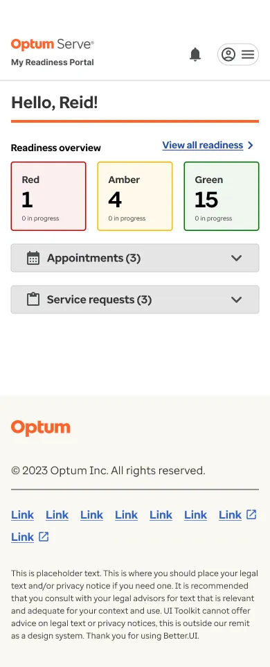
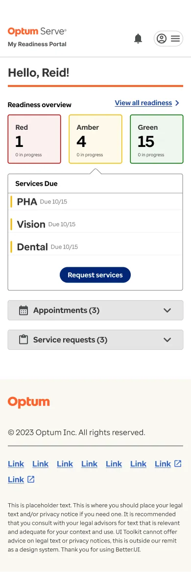
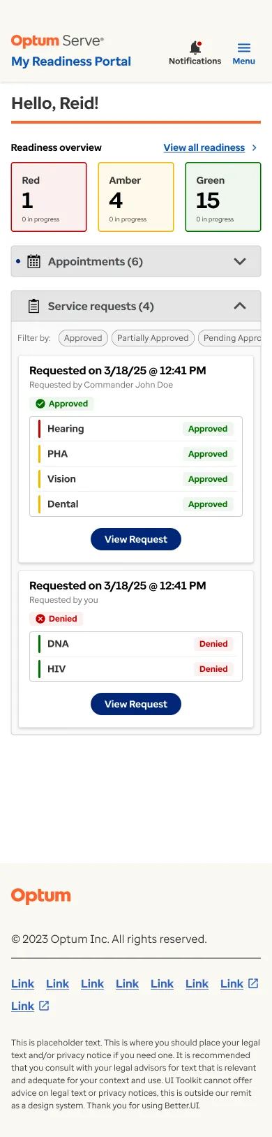
- Tiled approach for readiness status so Service Members can take action on services due by color with a more prominent counter.
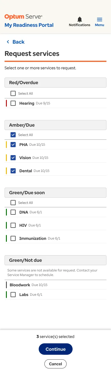
- Simpler procedure list while still color-coding them, while including more options and information to account for use in the client portal.
- Dedicated sections for Appointments and Service requests to view.
Final Design Screens
Outcome
- Tiled approach for readiness status so Service Members can take action on services due by color with a more prominent counter.
- Simpler procedure list while still color-coding them, while including more options and information to account for use in the client portal.
- Dedicated sections for Appointments and Service requests to view.
Final Screens