Case StudyOptum Serve
Designing an end-to-end readiness platform
For Optum Serve’s Reserve Health Readiness Program, I designed across two connected portals so service members could act on upcoming requirements and leaders could coordinate readiness across their organizations.
Delivery Client Portal shipped. Service Member Portal went through user acceptance testing.


My role
Leading design across both portals
I led Client Portal design. I ran stakeholder workshops to map who could request, schedule, and approve services, then designed the unit dashboard, roster, and workflows that connected those actions. On the Service Member Portal, I facilitated workshops, gathered feedback, and translated contractual readiness requirements into a dashboard and request experience. I worked with product managers, designers, engineers, and architects through refinement and user acceptance testing.
The problem
Readiness was difficult to see and harder to act on
Readiness records were spread across systems, and scheduling typically started by phone. A service member could struggle to see what was due. A coordinator responsible for an entire unit also needed to know who was overdue, which requests were underway, and where someone needed to intervene.
The contract required an overdue view and visibility into services due in the next 30, 60, and 90 days. The platform also had to support self-service and delegated scheduling.
Discovery
Mapping the handoffs across roles
I ran workshops with directors and stakeholders to map the command hierarchy and where requests passed between people. I reviewed an available client-facing view and consulted the program team and a deputy program manager with Army National Guard experience. Access to the incumbent member-facing experience was limited, so the contract, the client view, and those conversations informed the early design.
Unit coordinators needed roster-level action, Service Component leads needed utilization and budget context, and approval authorities needed the evidence behind each request. All three depended on the same underlying readiness and request records.
Leadership portal
One data model, with a view for each decision
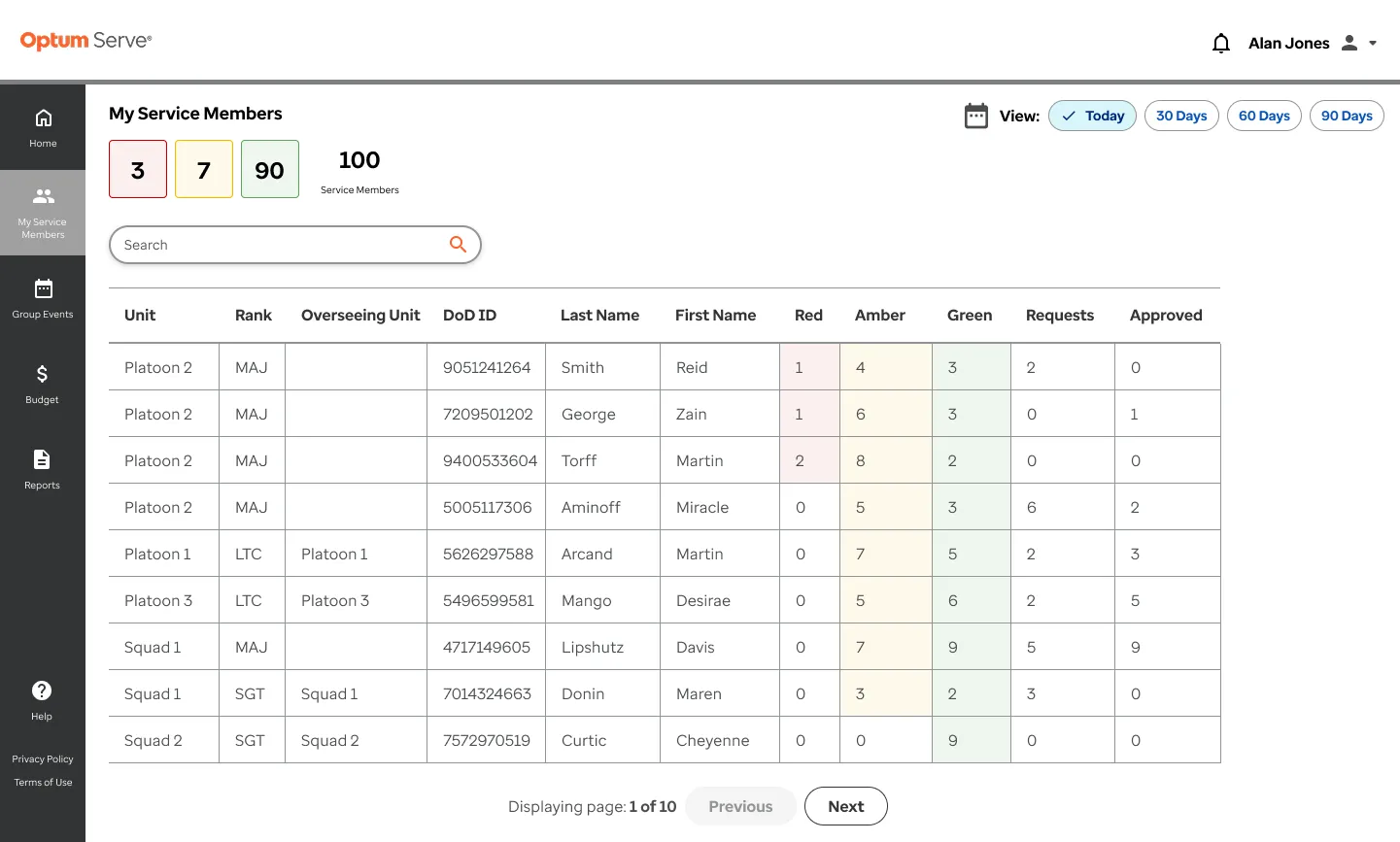
Early unit views borrowed the member portal’s red, amber, and green tiles. A coordinator scanning dozens of people needed to distinguish overdue members who had a request pending from those who still needed a reminder. I moved roster-level status into the unit view so coordinators could make that distinction without opening records one at a time.
The shared model also let us give component leads an aggregate view with a drill-down path, while giving approval authorities a queue centered on the requests they could act on. The roster answers who needs attention today, the component view shows where to investigate across units, and the approval queue brings the member, cost, and justification together for review.
Early unit view
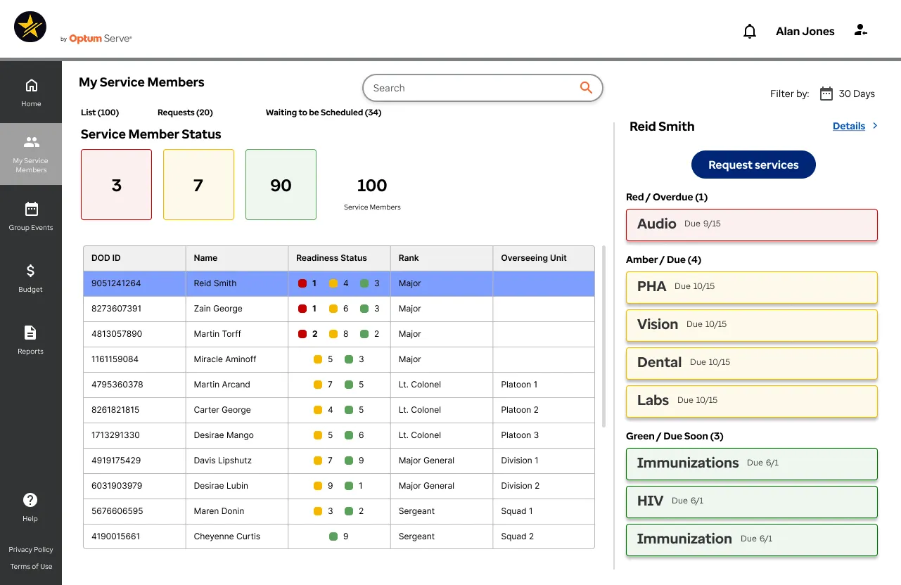
Refined unit view
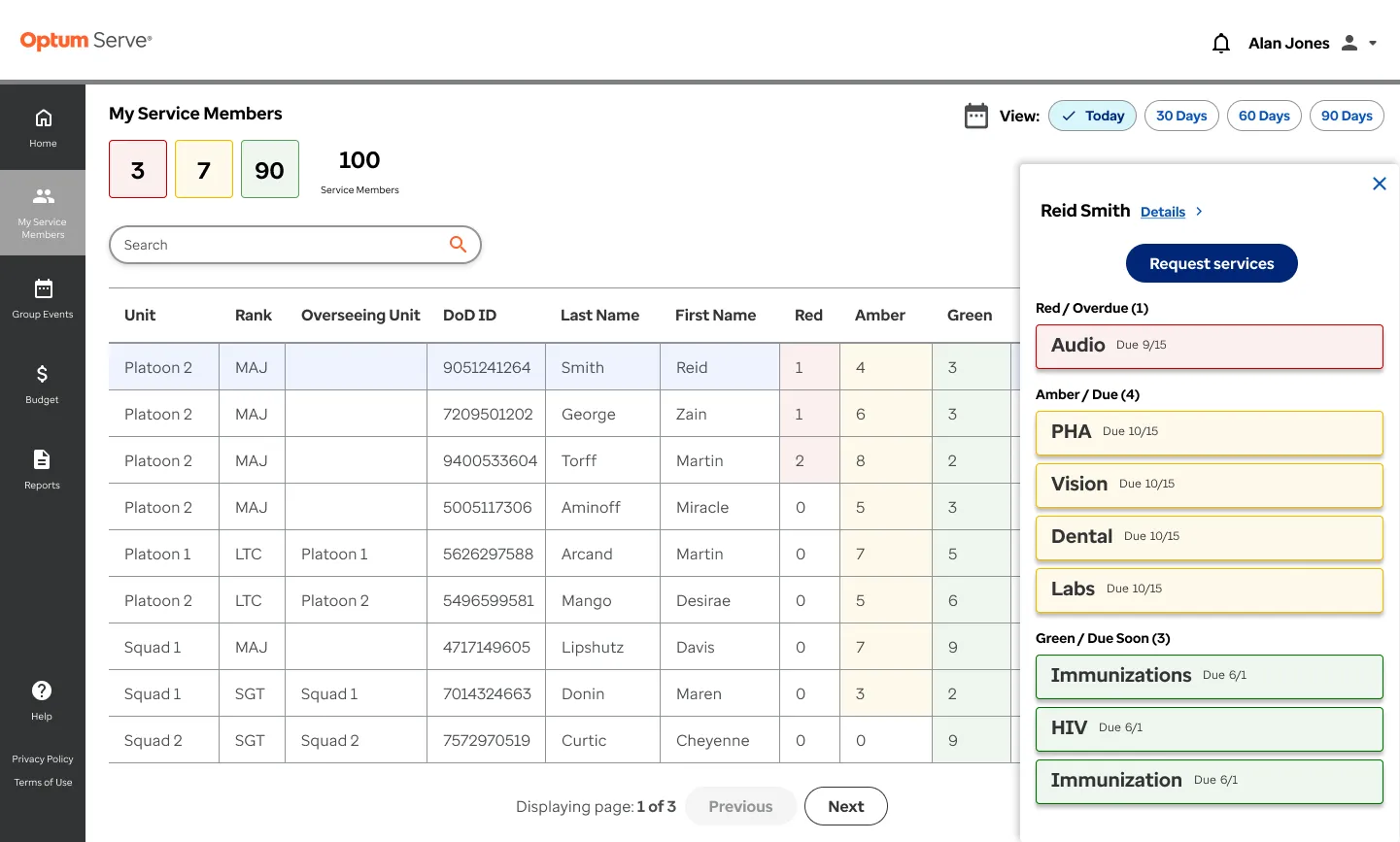
Leadership portal
Keep the member and the reason attached to the request
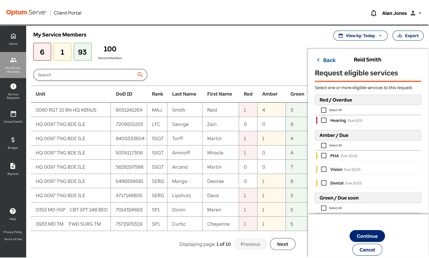
For delegated scheduling, the coordinator needed to verify who they were acting for and what that person was due for without leaving the flow. I kept the member’s context in the request from roster selection through confirmation.
I designed the approval queue around the next decision. The authority sees who the service is for, what it costs, and why it was requested before deciding whether to approve it.
The request and approval handoff

Service member portal
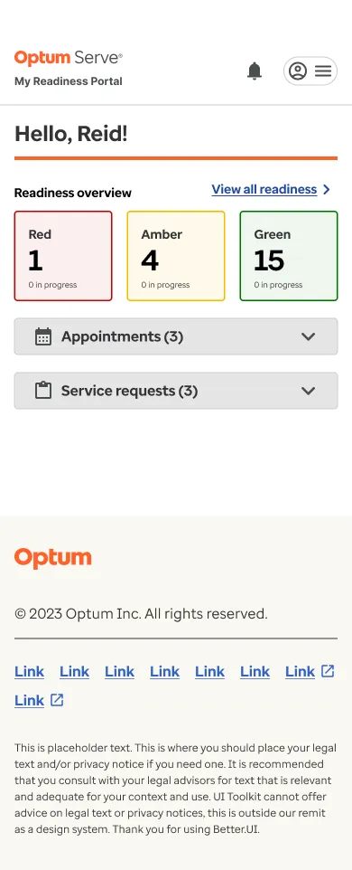
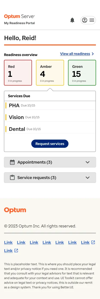
Turn a readiness status into the next action
The existing comparison view signaled compliant or out of compliance. Color offered a quick summary, but it left out upcoming deadlines. We used status tiles and counts for scanning, then gave members access to service-level detail organized around the required due windows.
Feedback on the early overview pushed us toward a more detailed procedure list. Members could use that list to see what needed attention and request the relevant service. Dedicated request and appointment views gave members a place to check progress after they submitted a request.
The accessibility question for the tiles was whether someone could tell an overdue service from an upcoming one without seeing the color. Status labels and due dates should carry that distinction, with enough contrast to read both. I’d verify those cues in the built experience.
Service member home and readiness dashboard
Impact and reflection
What reached delivery and what we deferred
The Client Portal shipped with the dashboard, roster, request, and approval flows. On both portals, the team used refinement and user acceptance testing to compare the developed experience with the design. We phased work around the contractual requirements, moving lower-priority ideas to later releases.
I don’t have post-launch adoption or no-show data to report. I’d measure how long members take to find their next required service and whether they complete scheduling. For the Client Portal, I’d track delegated request completion and time from submission to an approval decision.