Case StudyPhilips
RATE: predicting illness before it happens, from a wearable, for the people who have to act on it.
RATE (Rapid Analysis Threat Exposure) is an algorithm that tracks a wearer's body temperature through wearable technology to predict how likely they are to become ill. It's represented as a score, and a site coordinator looks at that data holistically to request the resources their unit needs.

Overview
Wearable data, turned into an actionable score.
RATE tracks a participant’s body temperature through wearable technology in order to predict how likely they are to become ill. The prediction is represented as a score, and a site coordinator looks at that data holistically to request the medical resources their unit needs before they need them.
My role was to lead design workshops to fully understand the problem, the product, and the goal, and align on business objectives with project managers, stakeholders, and data scientists. I redesigned the dashboard displaying the data analytics: conducting user research, gathering feedback and requirements, creating user flows and wireframes, and finalizing a design mockup with a working prototype.
Focus: Predictive health scoring for individuals and unit-level resourcing
Scope: User research, UX exploration, mobile and desktop dashboard redesign
Background
A DoD investment in predictive wearable health
The Department of Defense has been investing in wearable technology that could rapidly predict disease, partnering with the Defense Innovation Unit and Philips to take an iterative approach to health and infectious disease detection.
The Problem
Why the current interface wasn't working
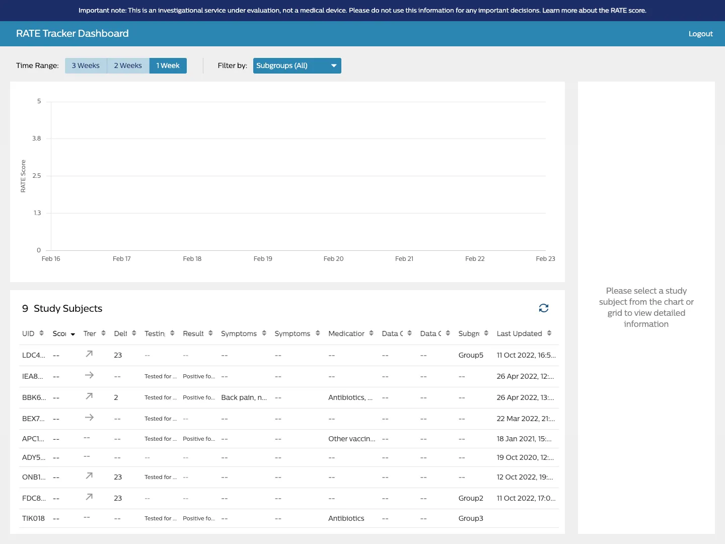
- Lack of data aggregation.
- Minimal filtering.
- Ambiguous support for additional algorithms.
- Missing export summary data feature.
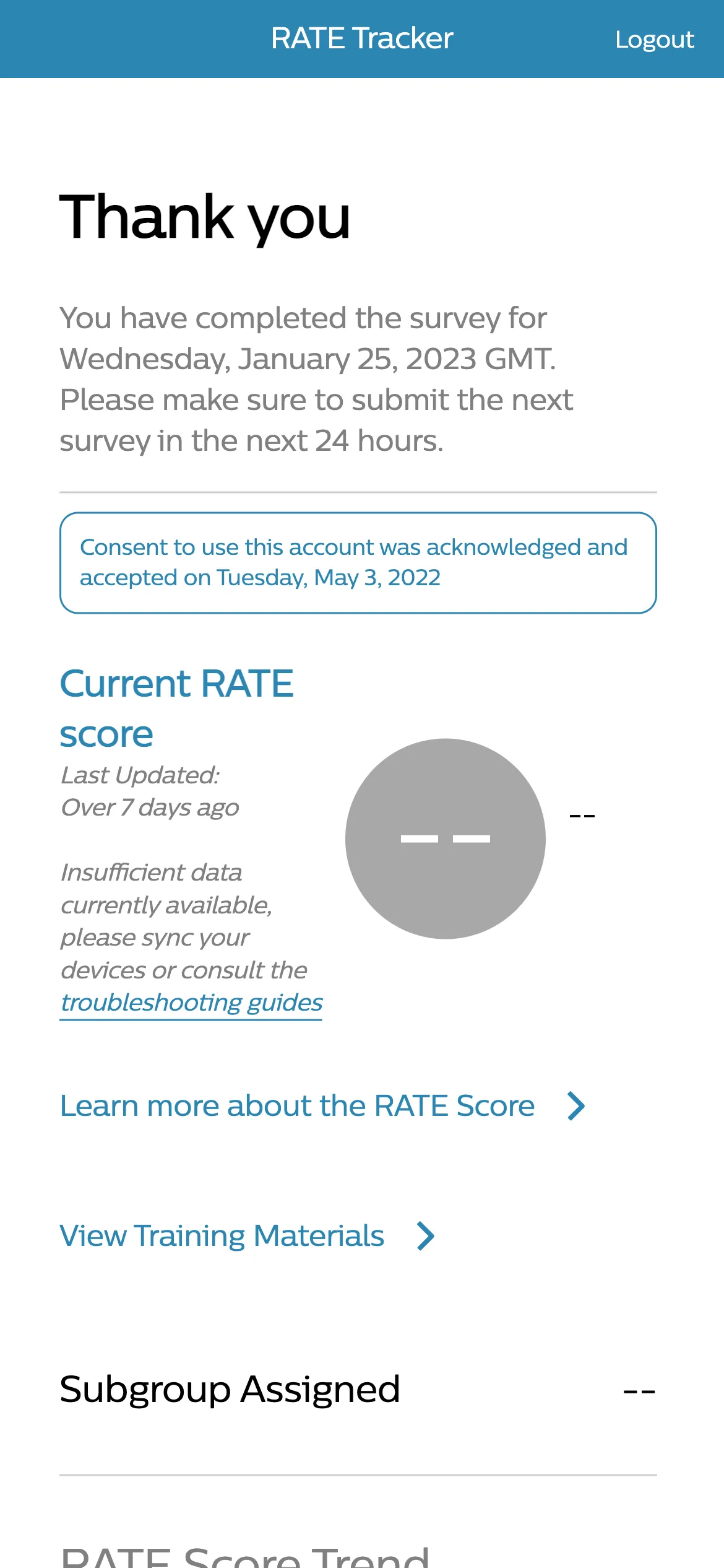
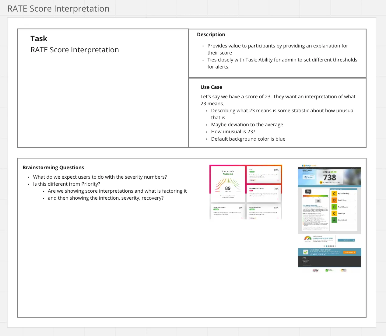
- No clear meaning or insight from the current score.
The task was to redesign the mobile and desktop experience for participants (soldiers) and site coordinators (managers) respectively, for early detection of threat exposures and illnesses — providing insight based on personal scores from the algorithm, as well as actionable insight through better data aggregation.
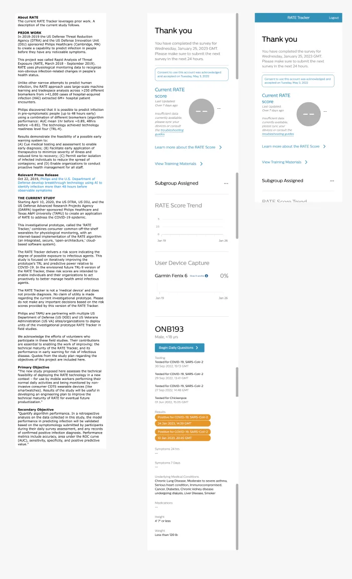
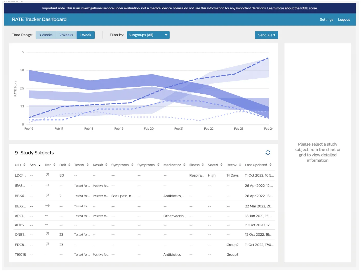
Current Interface
Discovery
Key findings
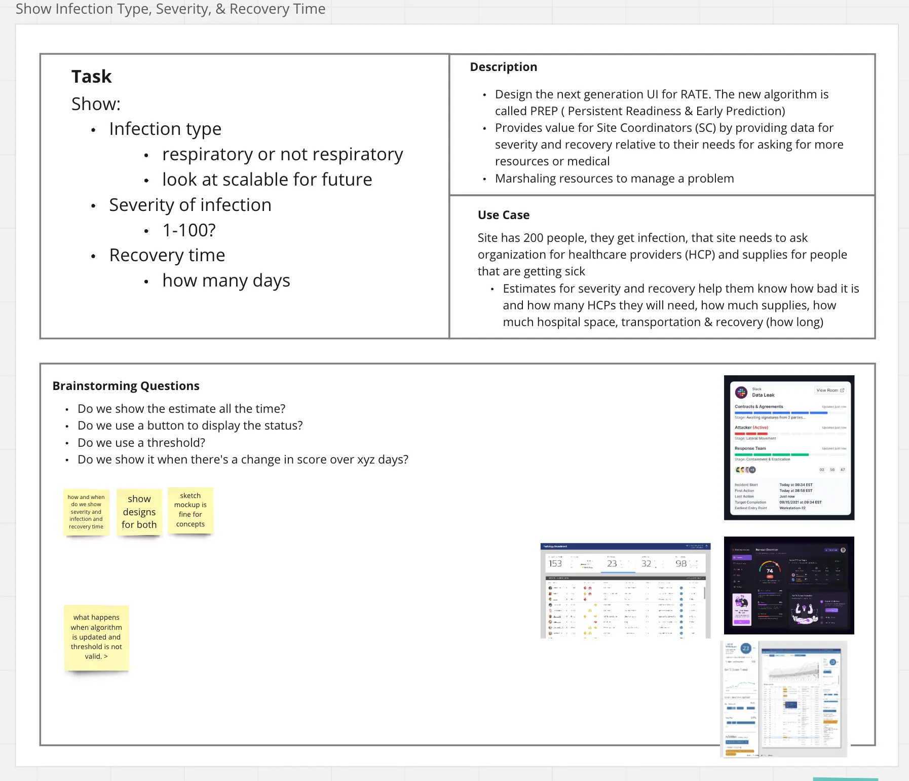
- The most important thing to know is when a participant is sick, how sick they are, what illness they have, and how long it will take them to recover.
- Those key pieces of information let site coordinators request additional resources — how much, and for how long.
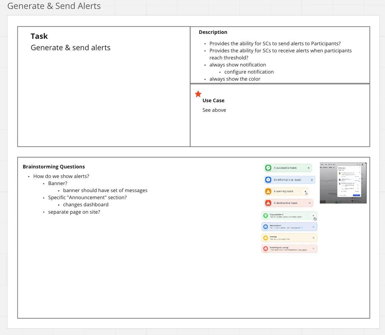
- Alerts are vital for communication; currently, site coordinators check scores manually.
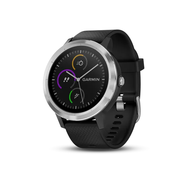
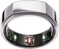
Cross-department collaboration — design workshops: I organized a design workshop with the team to learn in detail what the algorithms do and how the information is captured and tracked. They currently use Oura Rings and Garmin Watches to track the temperature of participants (soldiers).
- RATE — Rapid Analysis of Threat Exposure
- PREP — Persistent Readiness & Early Prediction
- NOTE — Notification of Toxic Exposure
Wearables in Use
Use cases
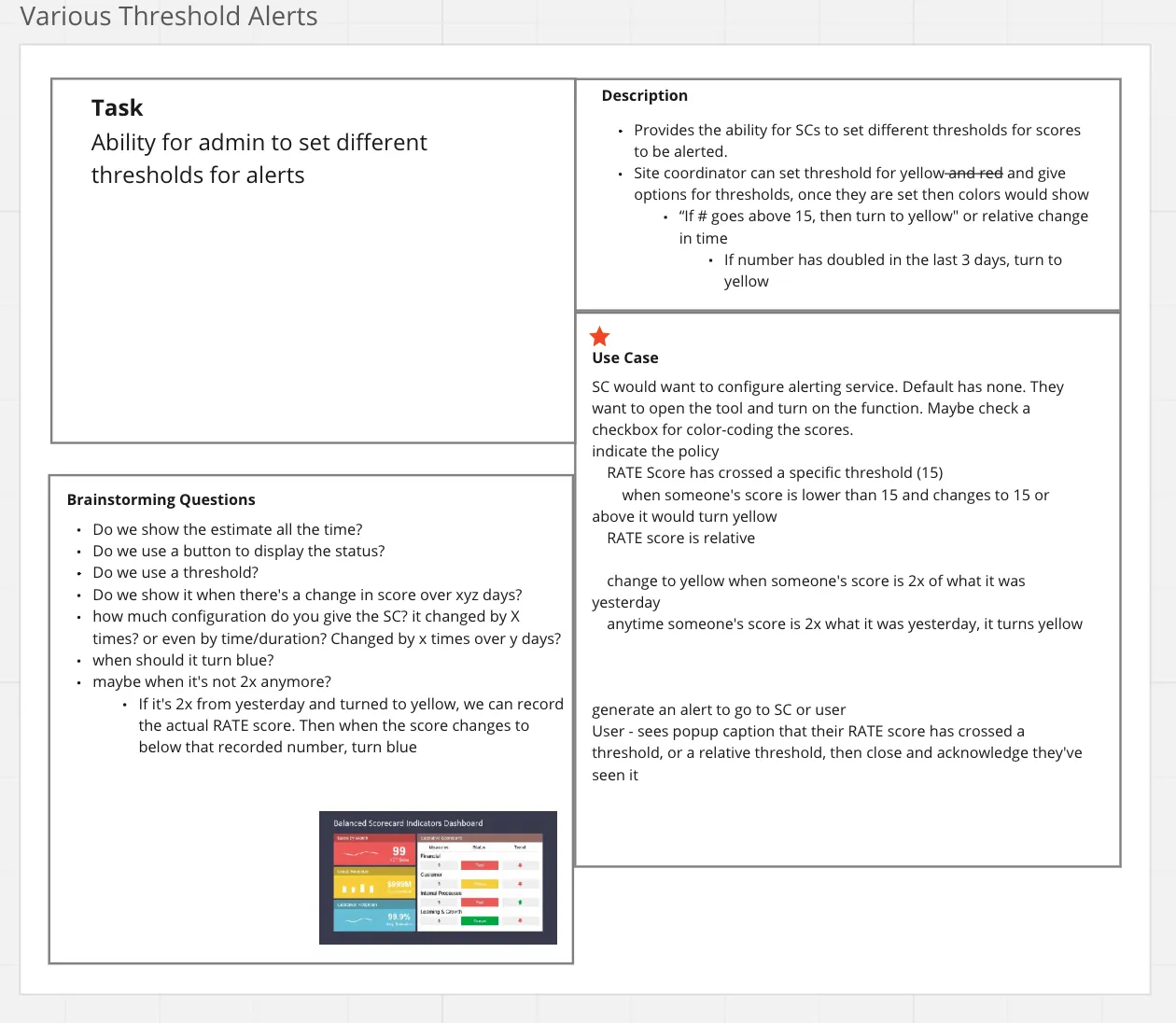
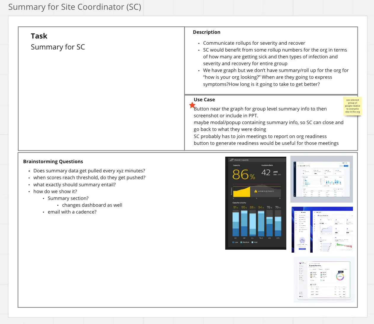
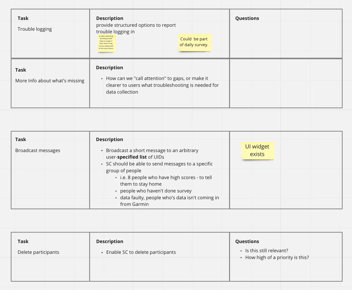
During collaboration, it was necessary for the team to prioritize the backlog — aligning on what to focus on first, and how important certain tasks were relative to others.
Use Cases
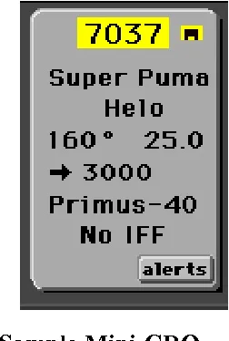
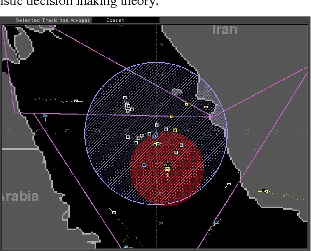
Existing UIs
Site coordinators (managers) are familiar with seeing varying levels of information at once. Participants only see the score and their trend — when they want to learn more about their score, they’re given a page describing the algorithm, rather than what the score means to them.
Existing UI Context
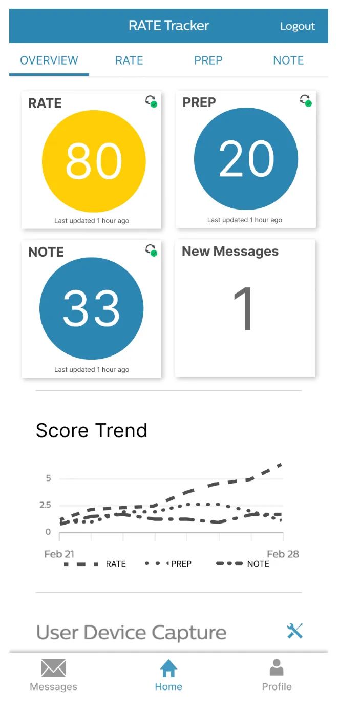
Participant Score Explainer
Explore
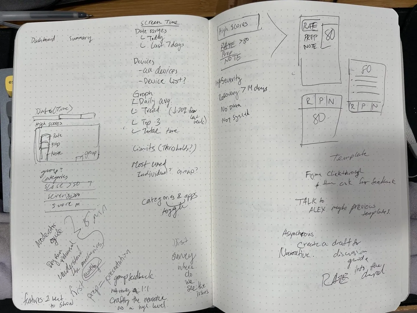
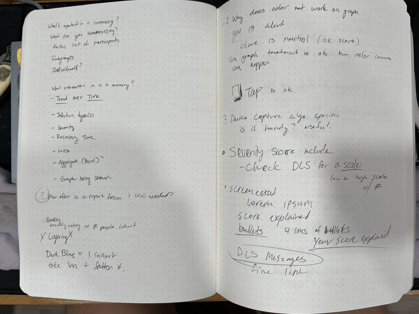
Sketches and requirements gathering
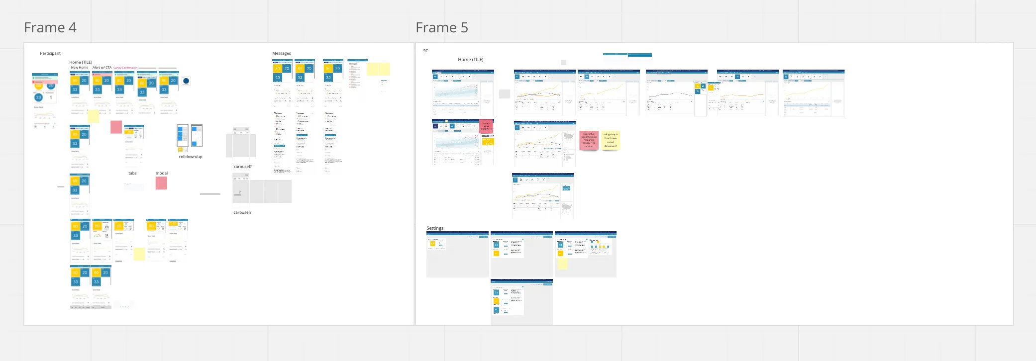
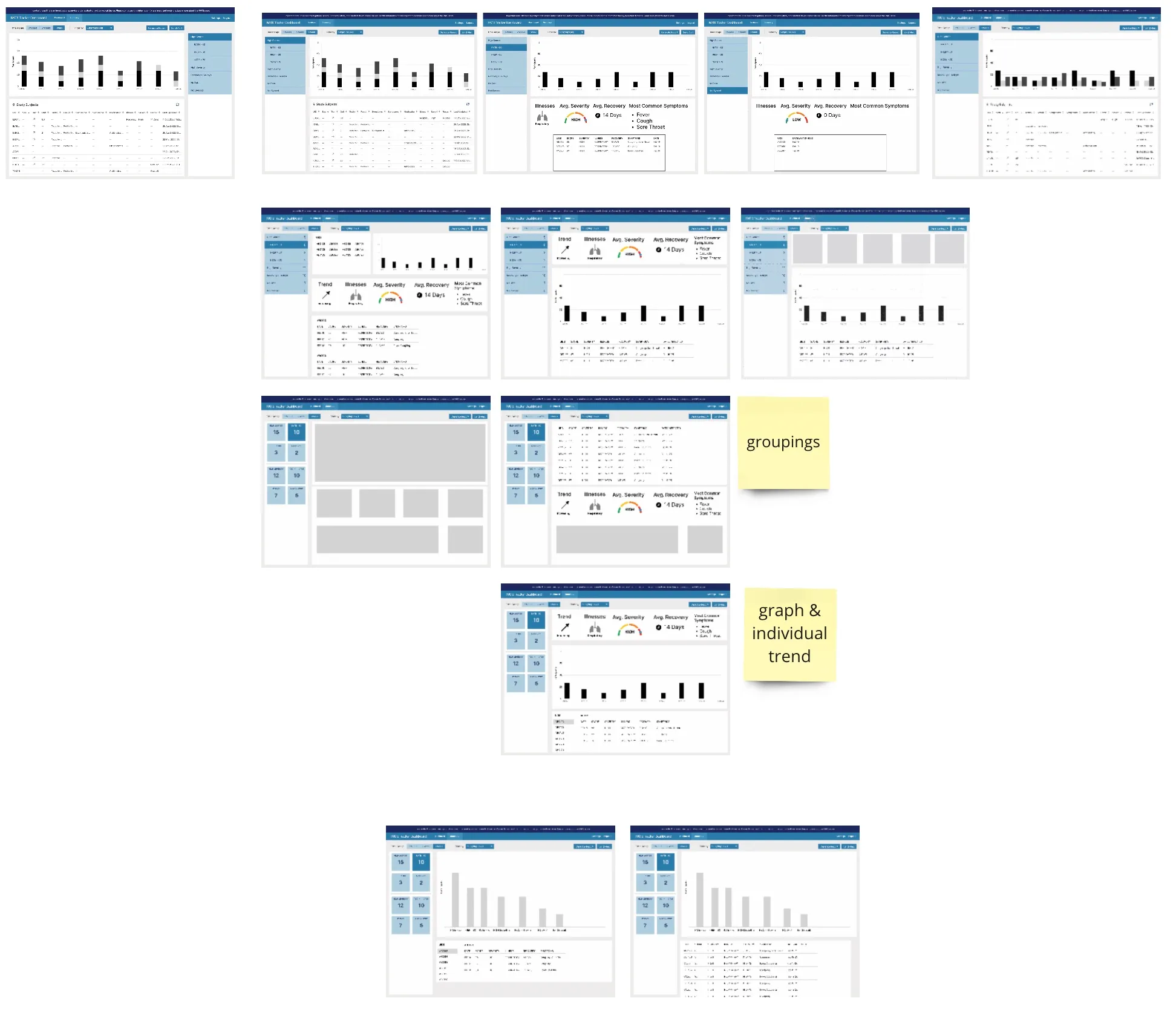
Early sketches for RATE, exploring how scores, filters, and thresholds could come together.
Early Sketches
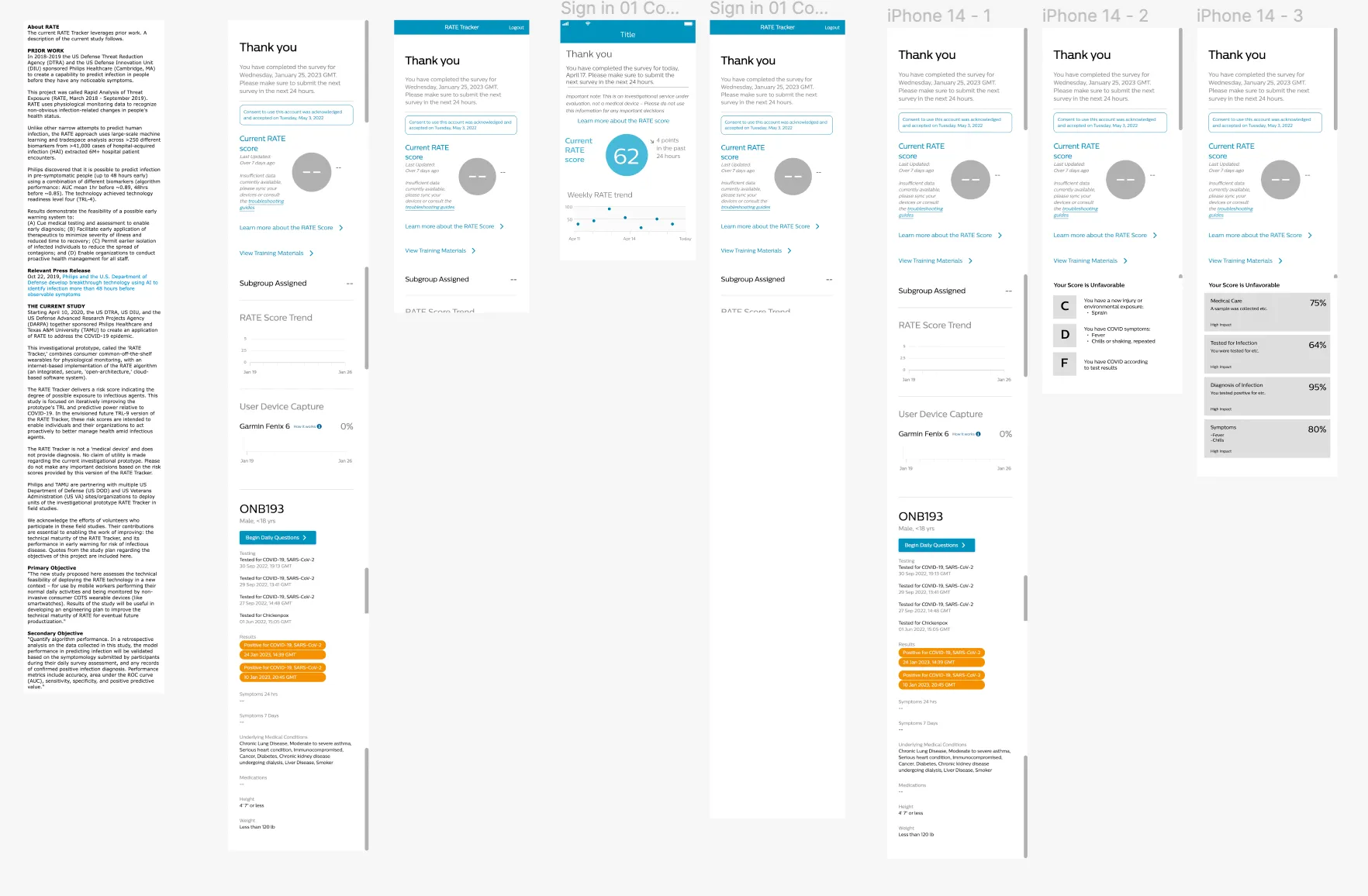
Resolved wireframes
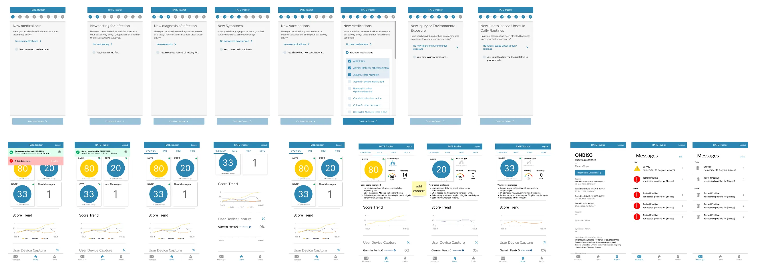
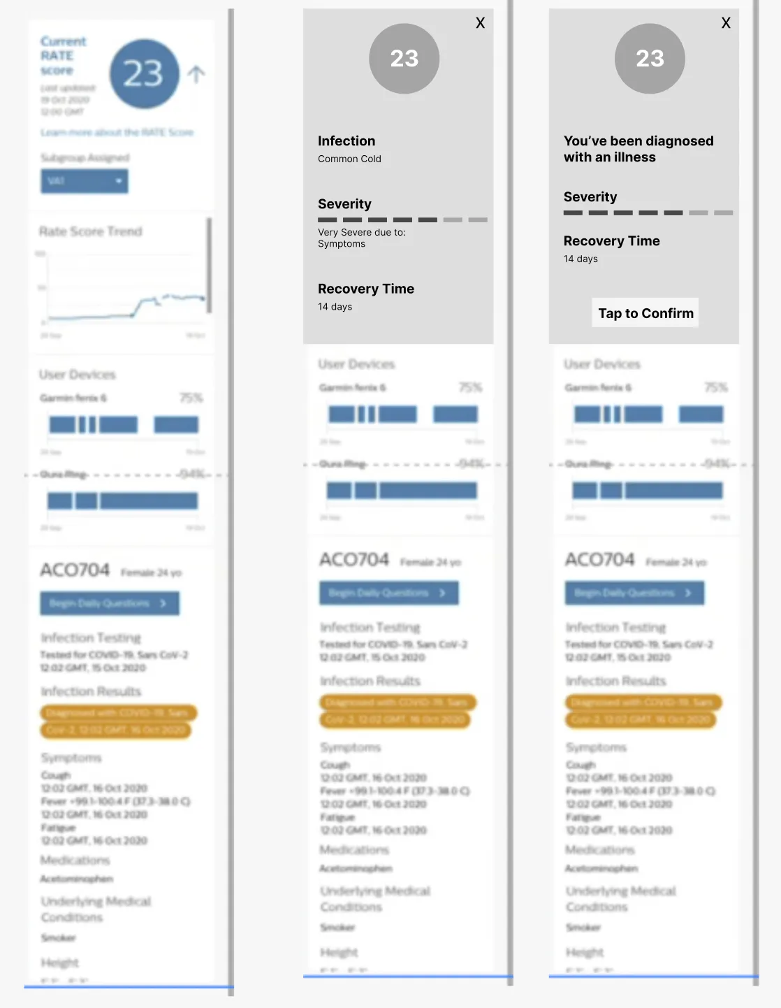
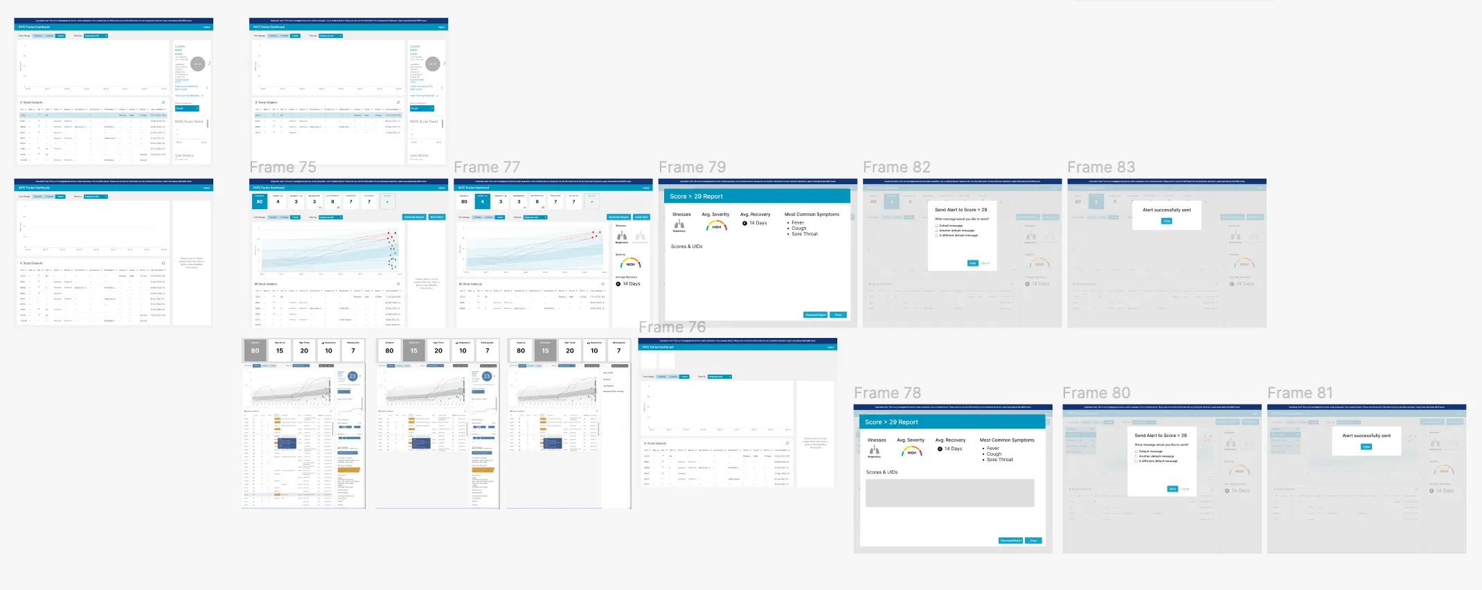
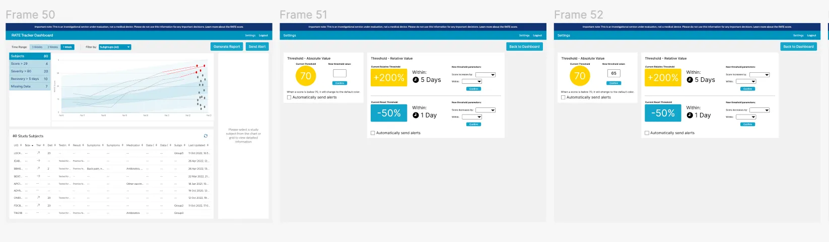
Wireframes exploring: a clearer description of scores, infection type, severity, and recovery time; support for additional algorithms; filters for viewing aggregated data; and setting score thresholds.
Wireframes
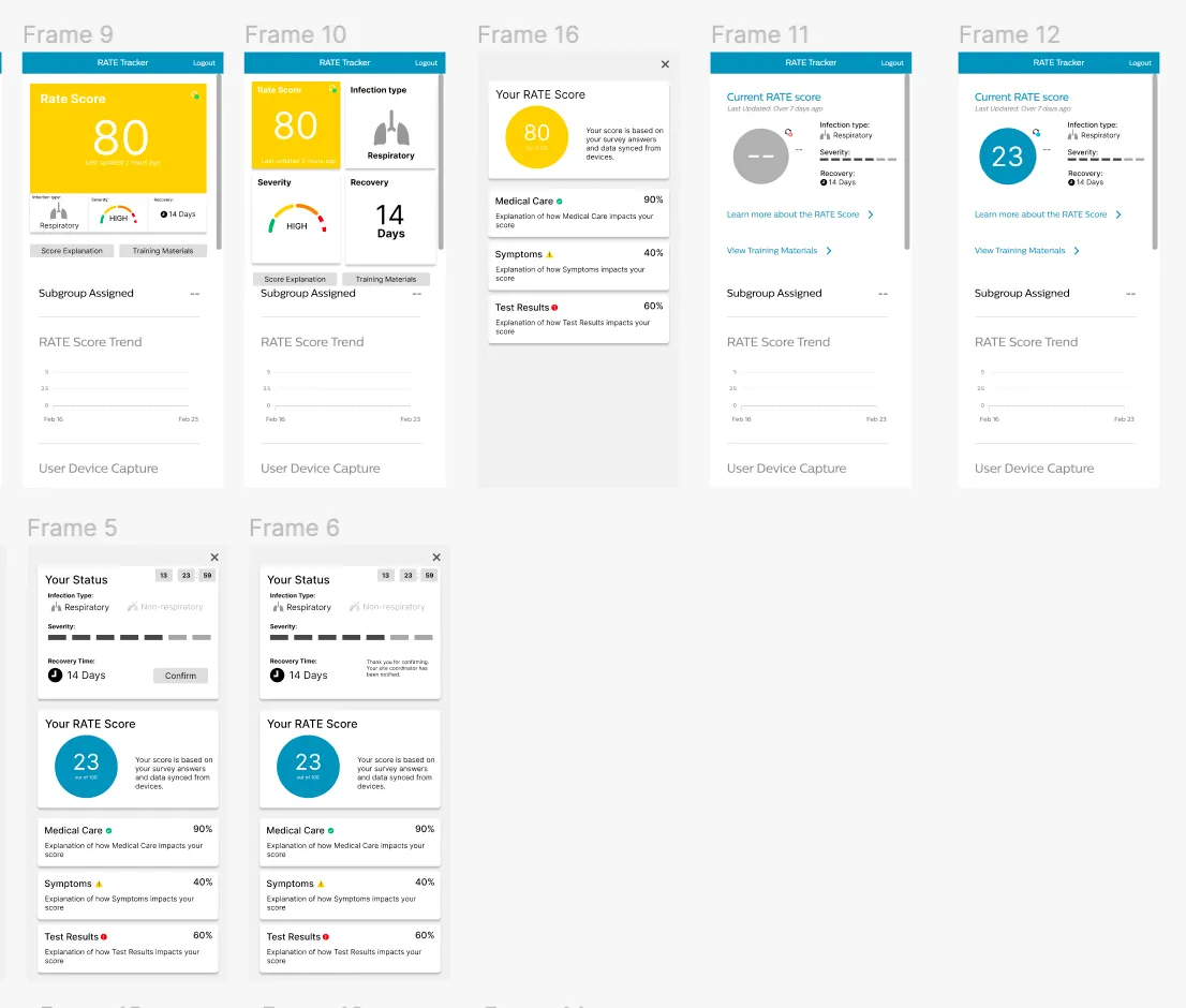
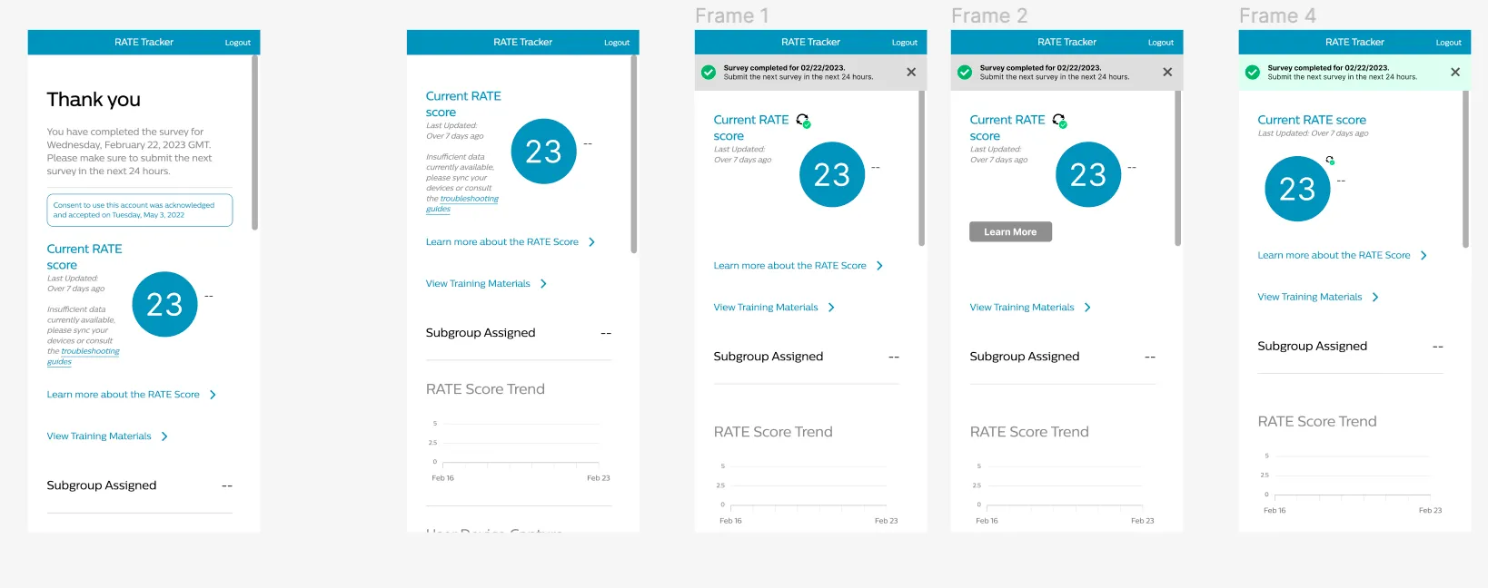
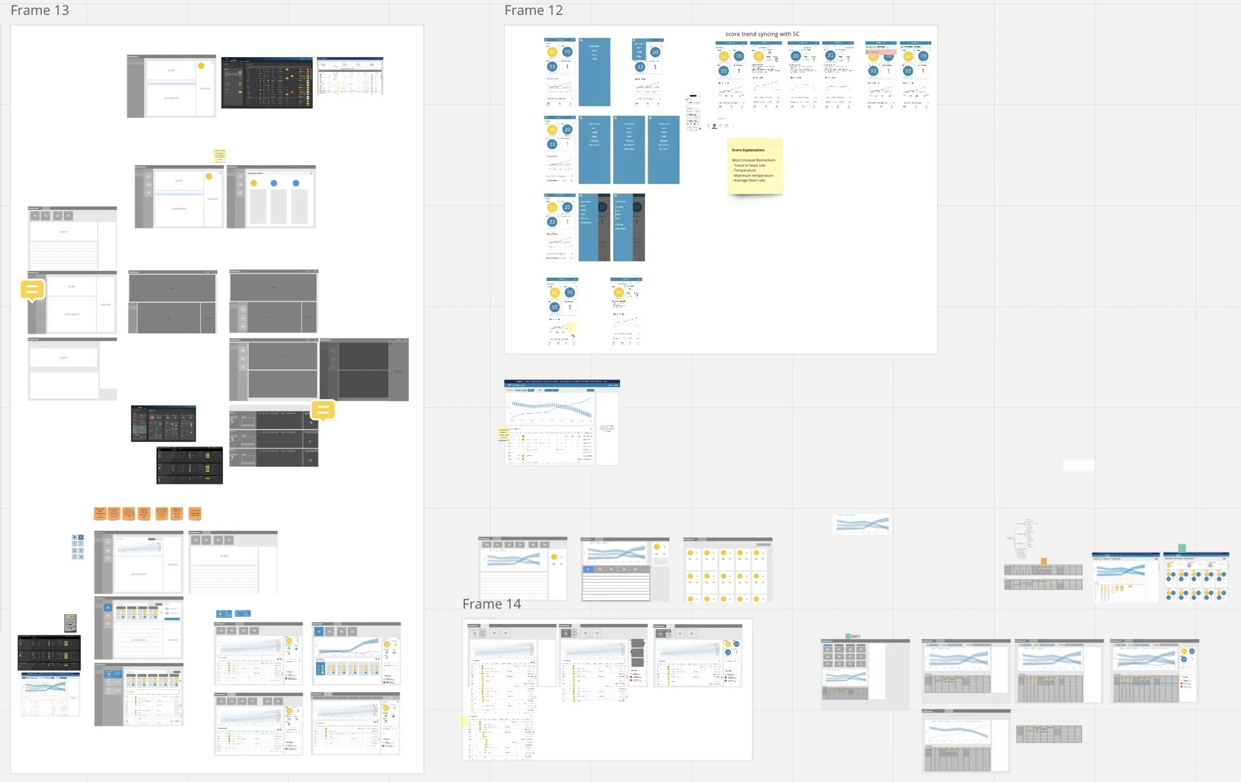
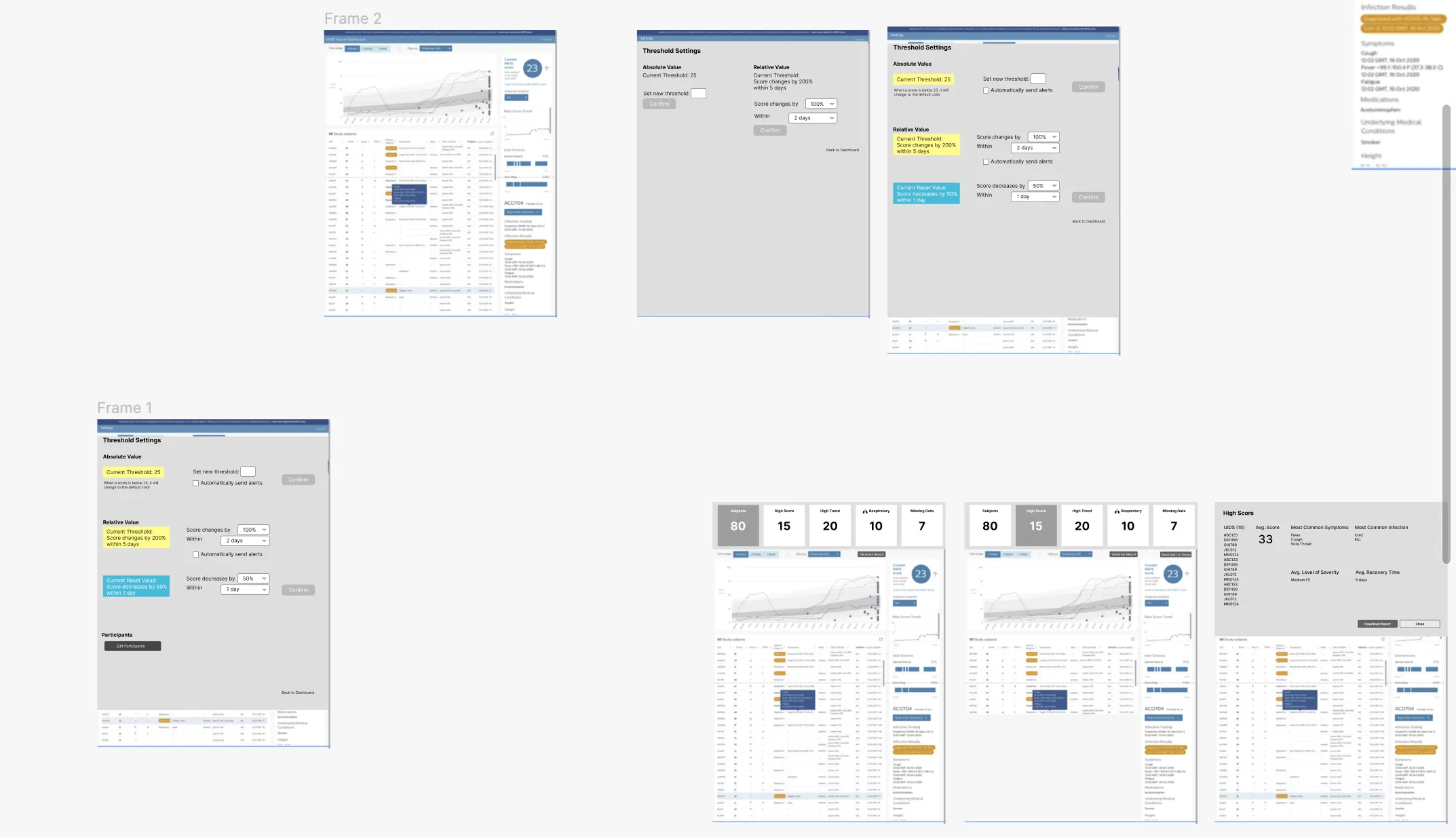
Possible flows
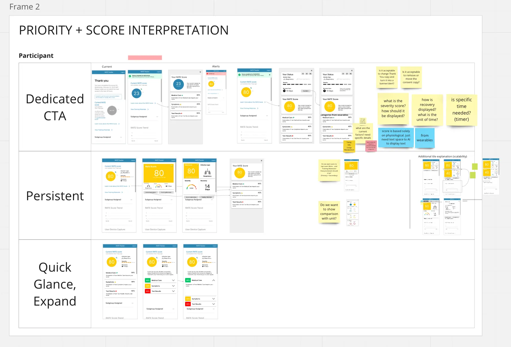
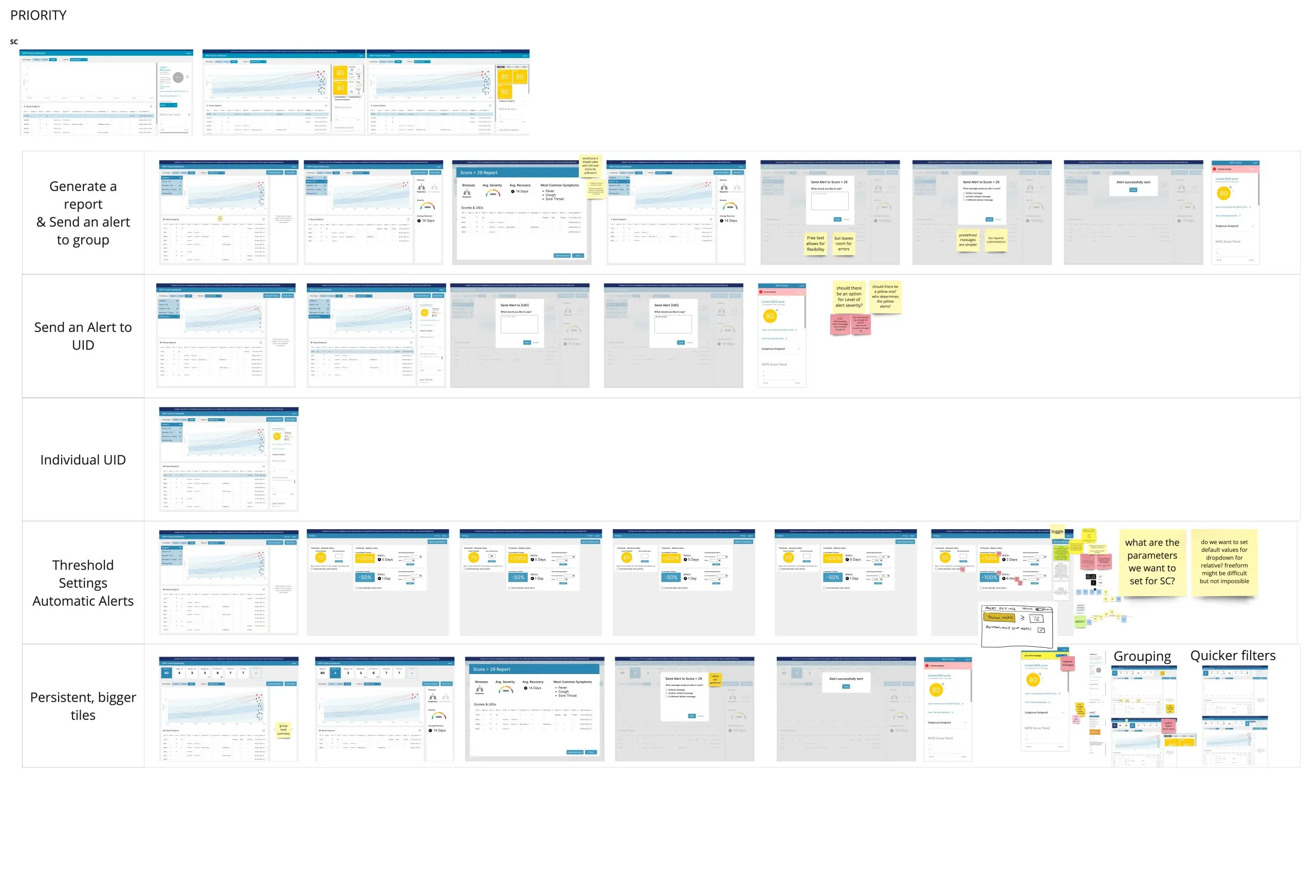
Exploring flows across various designs: participants mainly complete a survey and check their score, while site coordinators look at data trends and seek out participants with high scores in order to request medical resources.
Flow Exploration
Further iterations
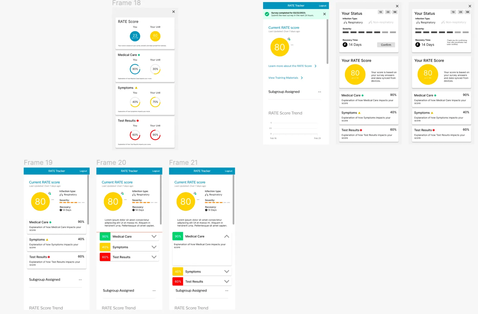
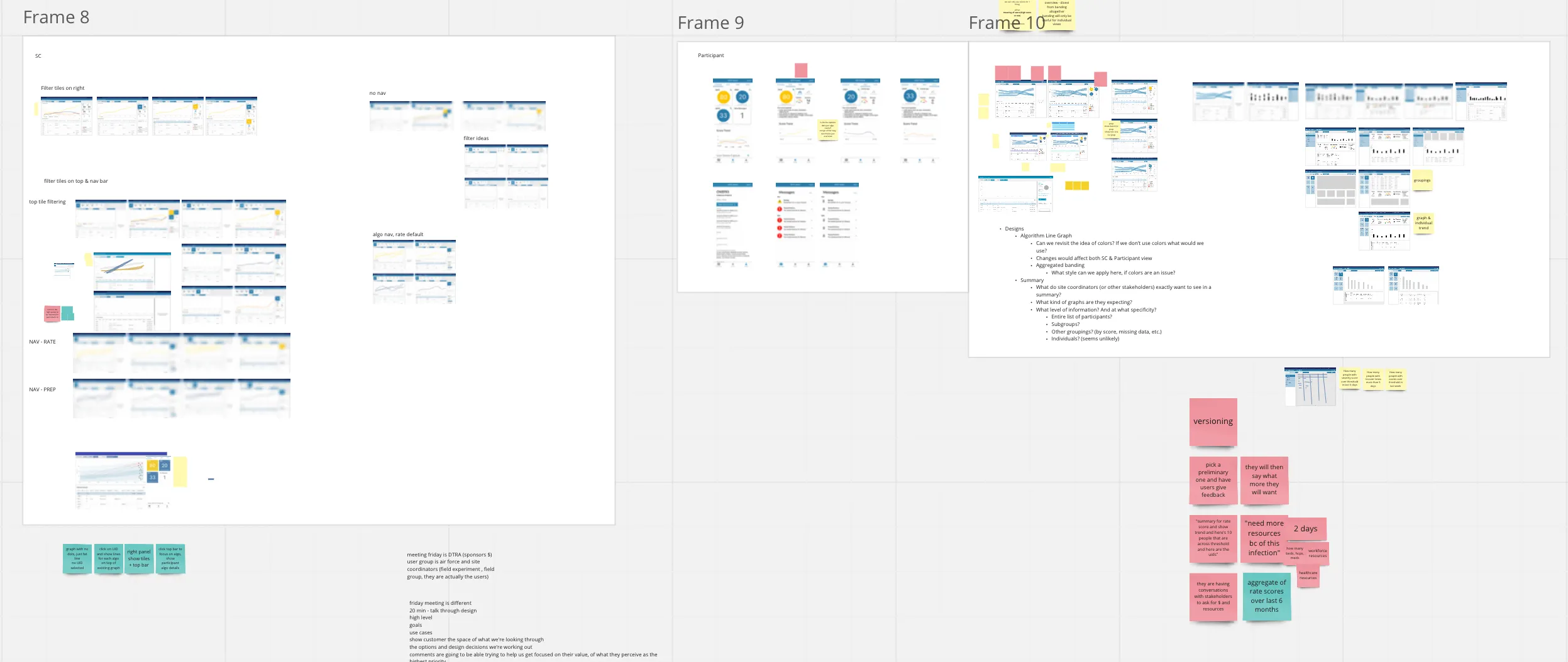
Further explorations focused on tiled designs for scalability. Testing was done mainly with site coordinators and stakeholders, to identify the areas of importance and functionality that would be used regularly.
Iterations
Design
Prototype
Early prototype walkthroughs of the redesigned participant and site coordinator experiences.
Prototype Walkthrough 1
Prototype Walkthrough 2
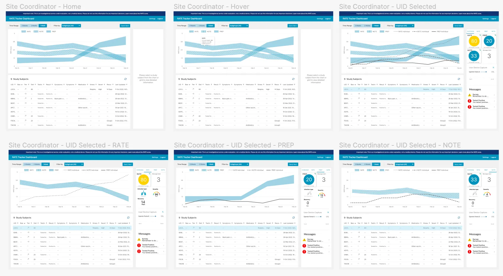
Semi-final designs
The tiled design is finalized, though messages and alerts will still change. Data aggregation is finalized, but more filters will be added, along with customizable data summaries.
Semi-Final Designs
Future plans and next steps
The team wasn’t able to fully implement tiles as filters immediately, because more information was needed on what site coordinators frequently filter by. An exportable view of the filtered data is also the aim, so the information is easily shared — along with additional filters, a graph reflecting those filters, and customizable data summaries that meet different groups’ needs.
Future Plans
Before & After
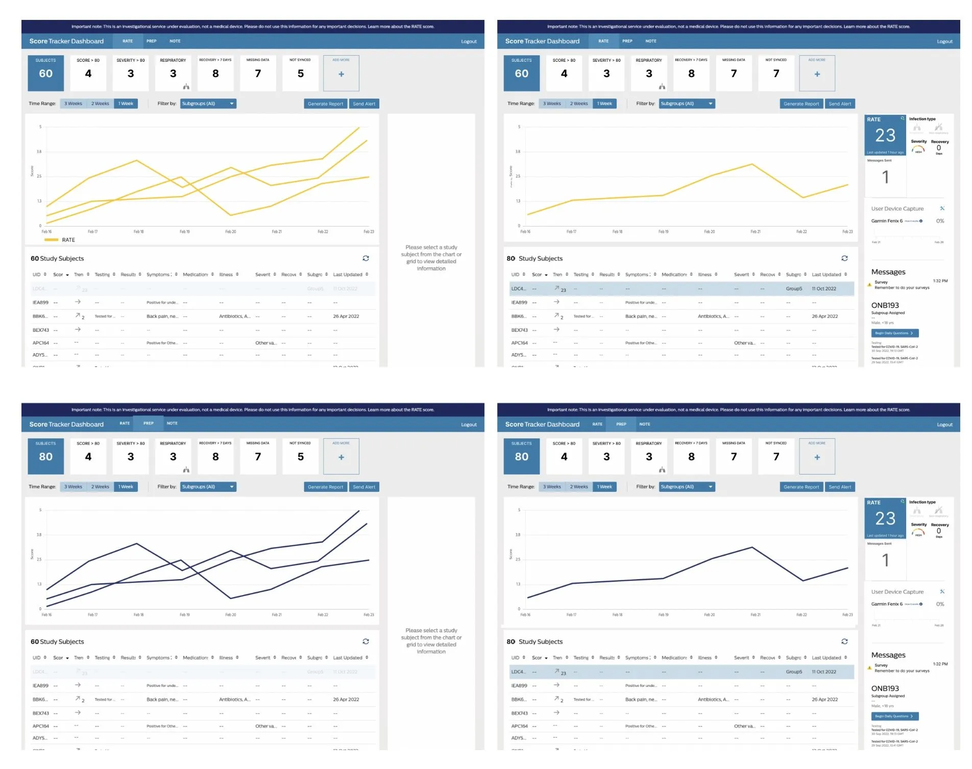
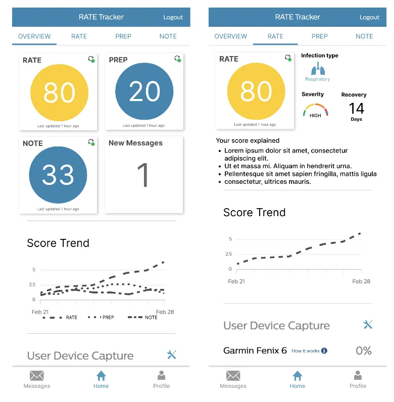
Redesigning the participant score view made the shift from an ambiguous number to a clear, explained score concrete.
Before
After
Before
After
Outcome
- Reduced clutter and provided clearer scores along with their meaning, while enabling additional algorithm support for participants (soldiers).
- Clustered data grouped by algorithm without relying on varying colors, additional filters beyond Units (groups of participants), and an easy way to export data for summarized resource requests by site coordinators (managers).
- Data aggregation and individual comparison.
- Various filtering options.
- Data view export for easy summaries.
- Scalable design to accommodate additional algorithms.
- Clear score meanings and insights.
Final Outcome
Lessons Learned
- Through the use of wearable data, algorithms can predict the likelihood of the wearer being ill within 24 hours. The government can use this information to allocate resources ahead of time.
- Resource management can be done with algorithms — the DoD now has actionable data to shift resources where needed, because they know who will get sick and for how long.
- A lot goes into relative thresholds. Many questions can’t quite be answered: if someone has a high score, what determines a “low” score? How fast did it drop? The low score itself, or the percentage change?
- Implementing additional algorithms could put our defenses in the most optimal position.