Case StudySalesforce
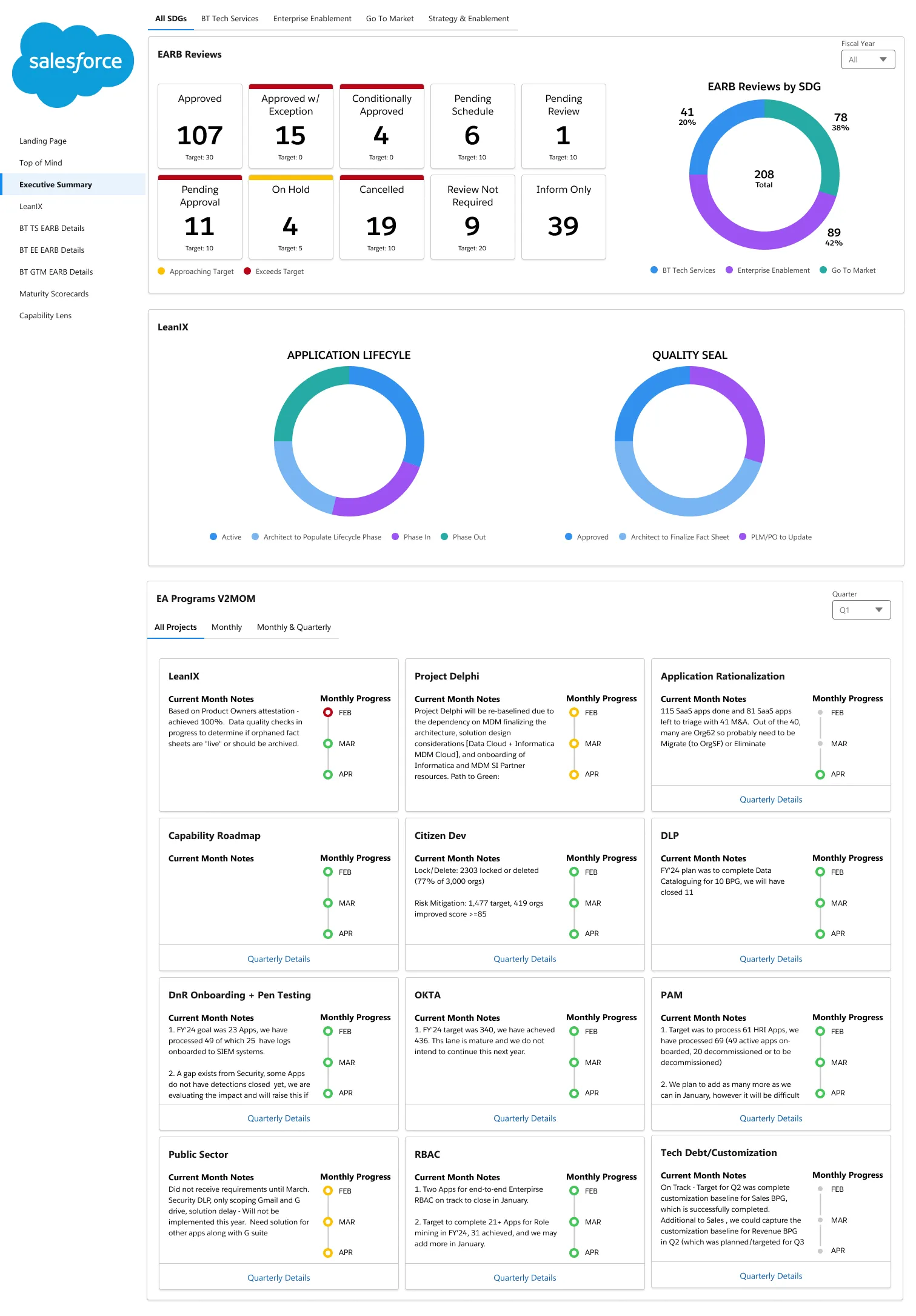
A redesigned Tableau dashboard giving Enterprise Architecture leadership an uncluttered, actionable view of the entire organization.
The Enterprise Architecture team at Salesforce manages onboarding for new applications and vendors, and the end-of-life cycles that follow. Leadership had a dashboard meant to give an overview of the whole organization, but it wasn't part of anyone's day-to-day — the data was there, but it wasn't readable, filterable, or actionable.


Overview
A dashboard leadership actually opens.
The Enterprise Architecture team at Salesforce manages the operations behind onboarding new applications and vendors, and the end-of-life cycles that eventually retire them. Leadership had a dashboard meant to give a top-level view of the entire organization, gathering data from EARB reviews, LeanIX, and V2MOM. It technically existed, but it wasn’t part of anyone’s day-to-day.
My role was to lead design workshops with directors, stakeholders, and developers to understand the problem, the underlying data and processes, and the business goals, then redesign the dashboard in Tableau: conducting user research, gathering feedback and requirements, building user flows and wireframes, and finalizing a mockup with a working prototype.
Focus: Data legibility, filtering, and actionable insight for EA leadership
Scope: User research, UX exploration, Tableau dashboard redesign
The Problem
Why the current dashboard wasn't being used
- Aggregated data couldn’t be easily read.
- Default filtering was a hassle.
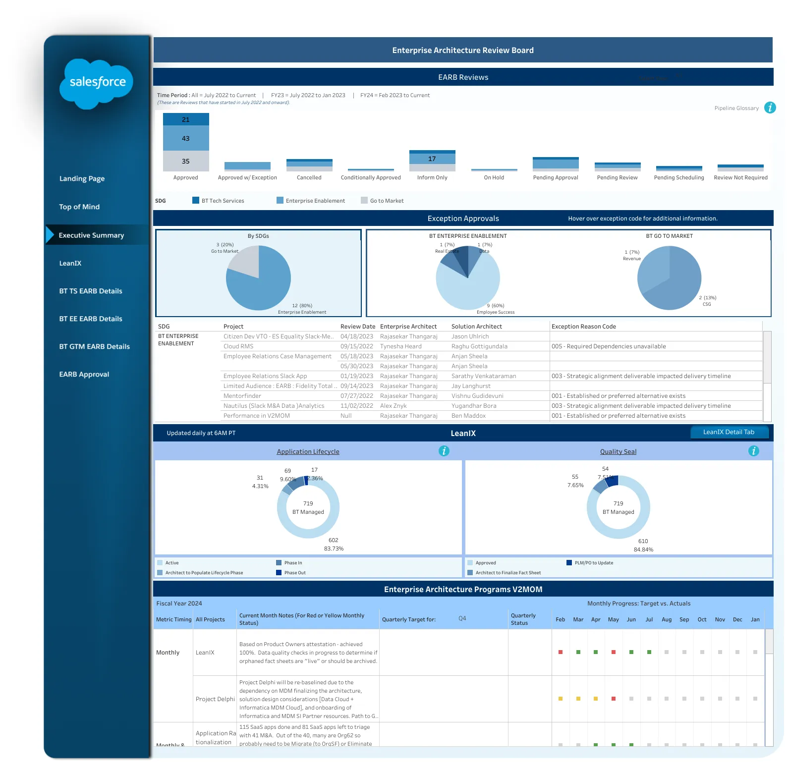
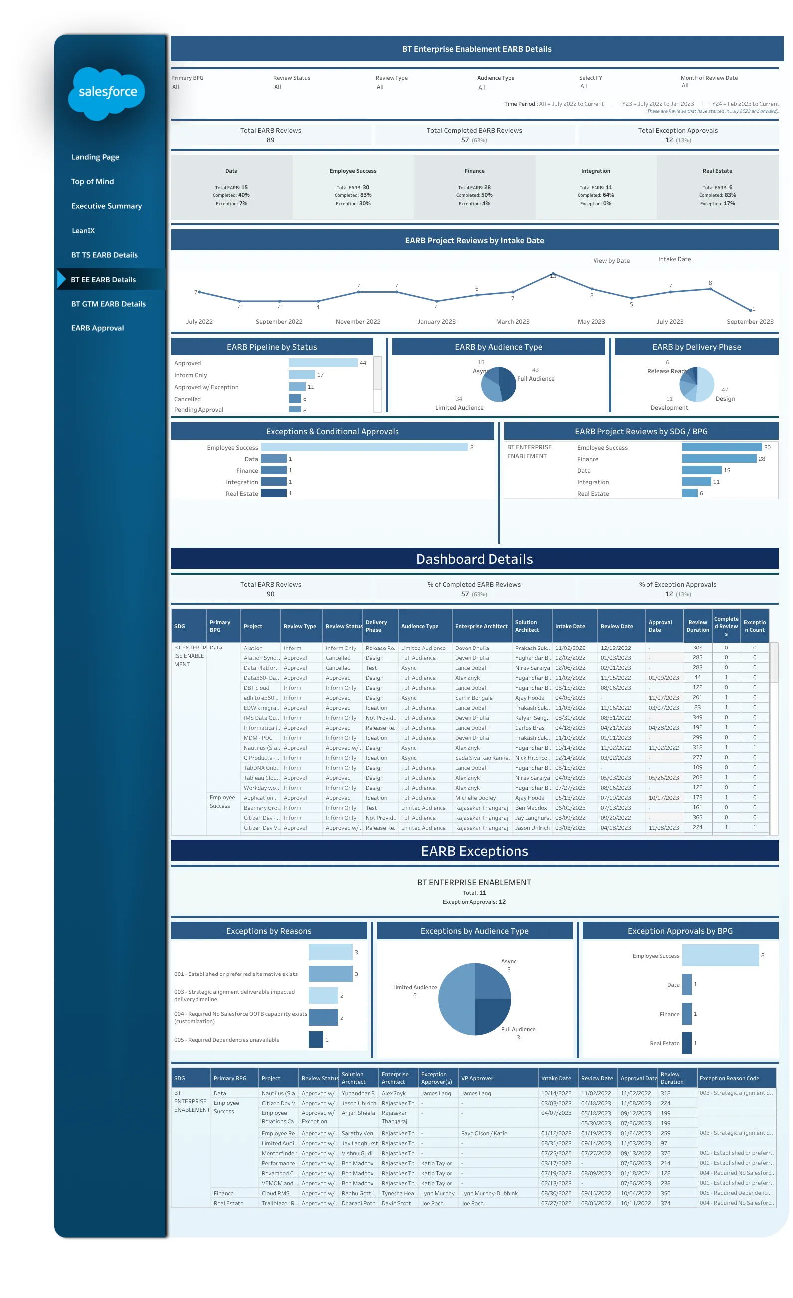
- Raw data was directly imported and visualized as plain tables.
- There were no clear actionable items.
The task was to redesign the Tableau dashboard for the EA leadership team so it actually reflected the state of the organization’s reviews, quality seals, and goals — and so leadership would use it.
Discovery
Key findings
- The data points for the review process of requesting new programs and vendors weren’t all being tracked.
- Exceptions are allowed during reviews but require remediation plans — yet fields like last action taken, approver, and remediation plan due date weren’t tracked, even though they needed to be accounted for.
- Some goals, like Application Quality Seals via LeanIX, can never technically be “reached,” but the underlying data was still relevant to different action items.
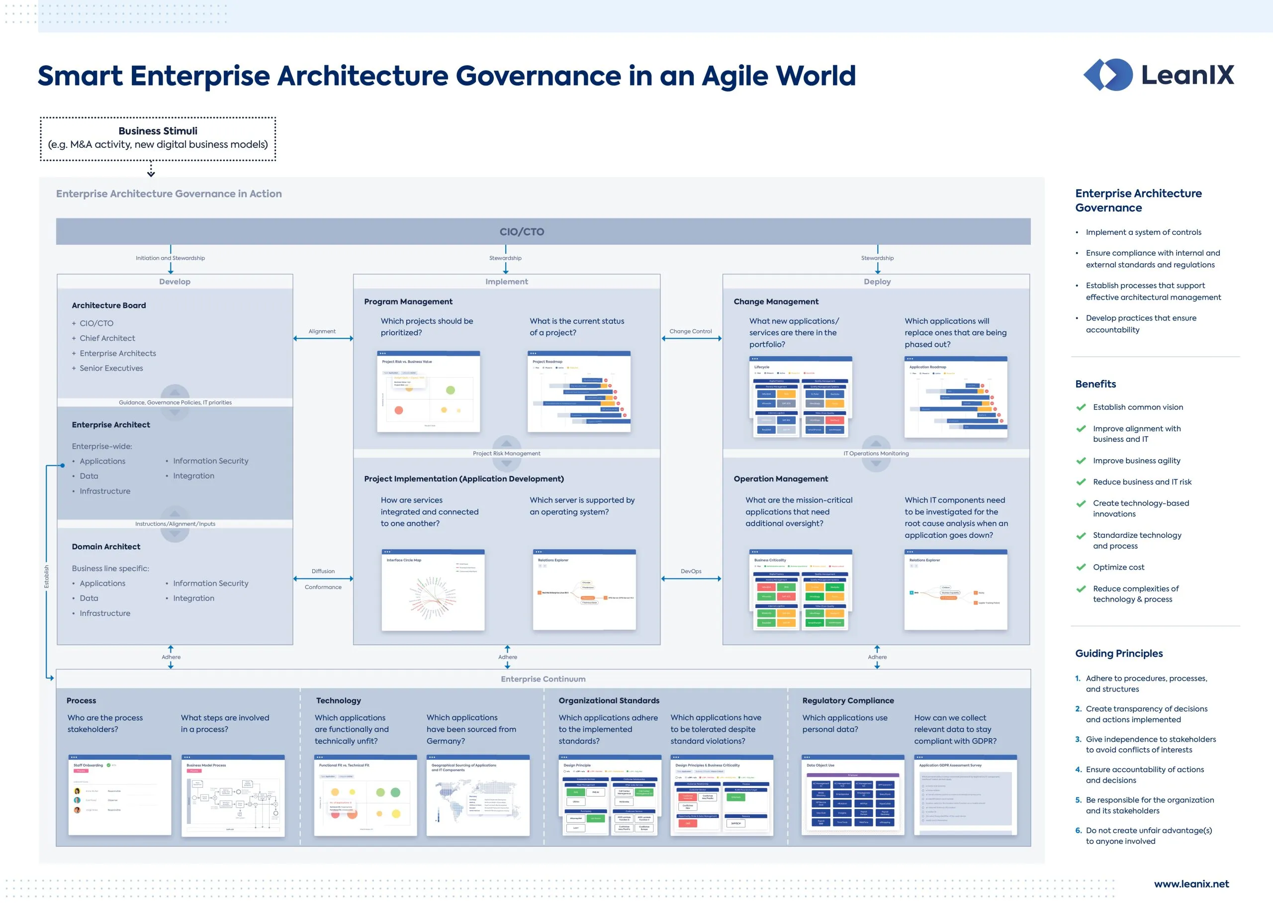
Cross-department collaboration: I met with architects to understand the Enterprise Architecture Review Board (EARB) process — parts of the organization request software or new vendor partnerships by presenting a business case, and the review board evaluates the request and makes a decision.
LeanIX Governance Poster
Existing UI
Where the dashboard started
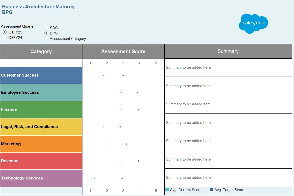
The existing dashboard imported raw data directly into Tableau’s default table views, with no hierarchy, filtering logic, or way to tell what needed action versus what was just informational.
Existing Dashboard
Explore
Sketches and requirements gathering
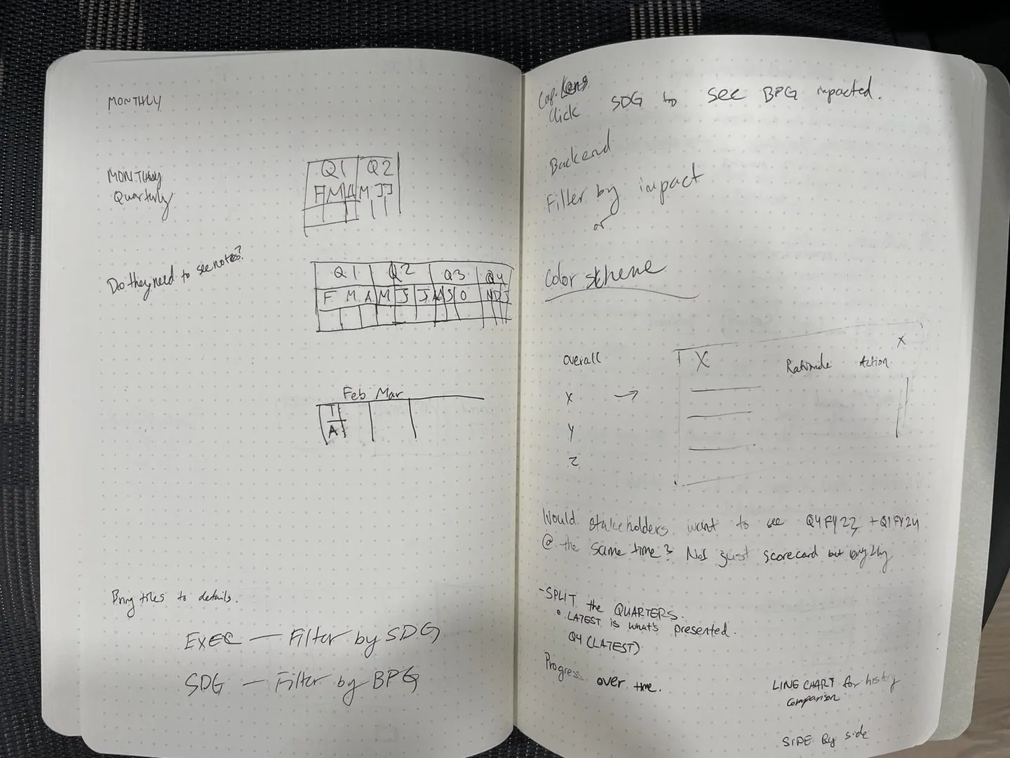
Early sketching focused on getting the review, exception, and remediation data into a hierarchy leadership could actually scan — before touching Tableau’s component library.
Early Sketches
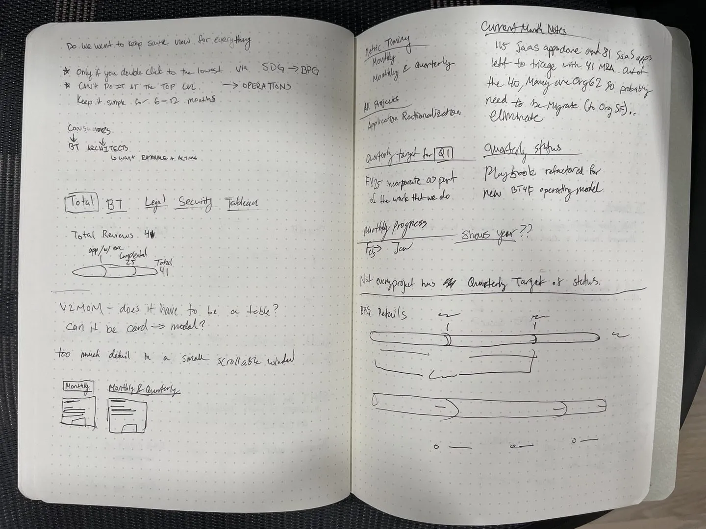
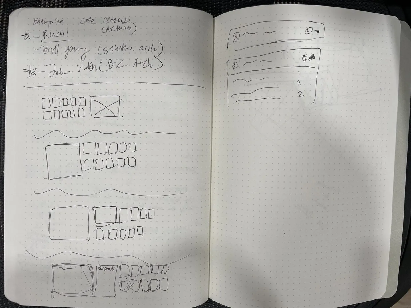
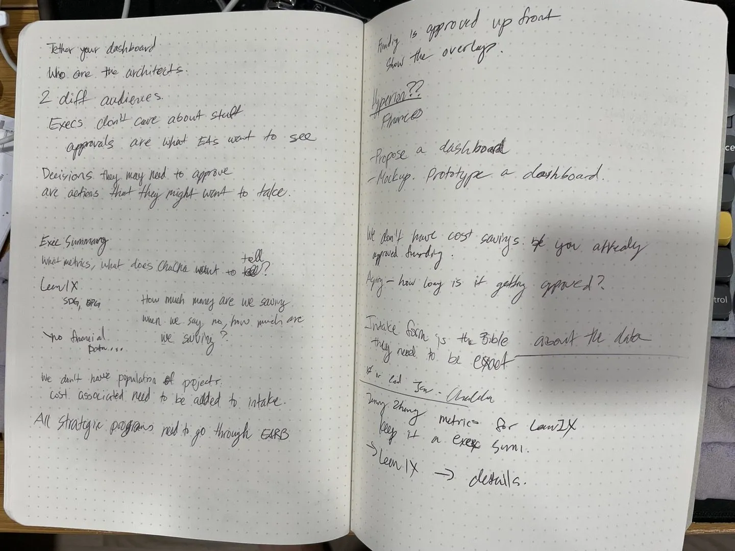
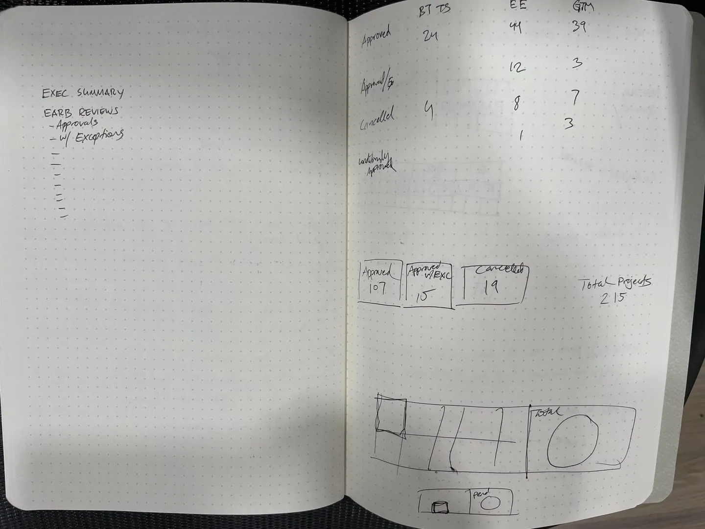
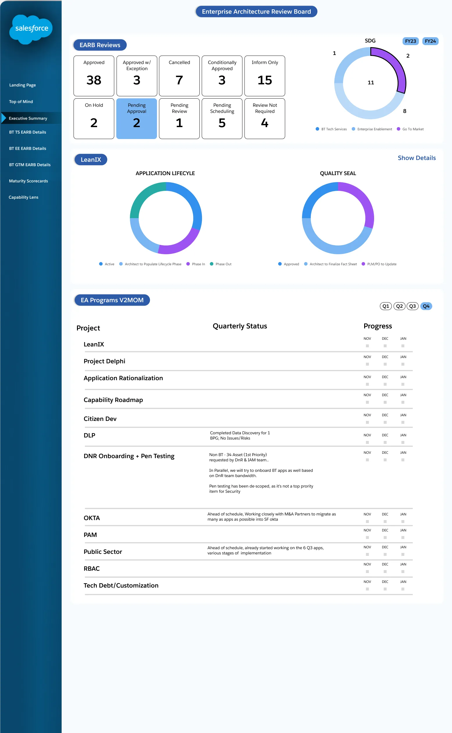
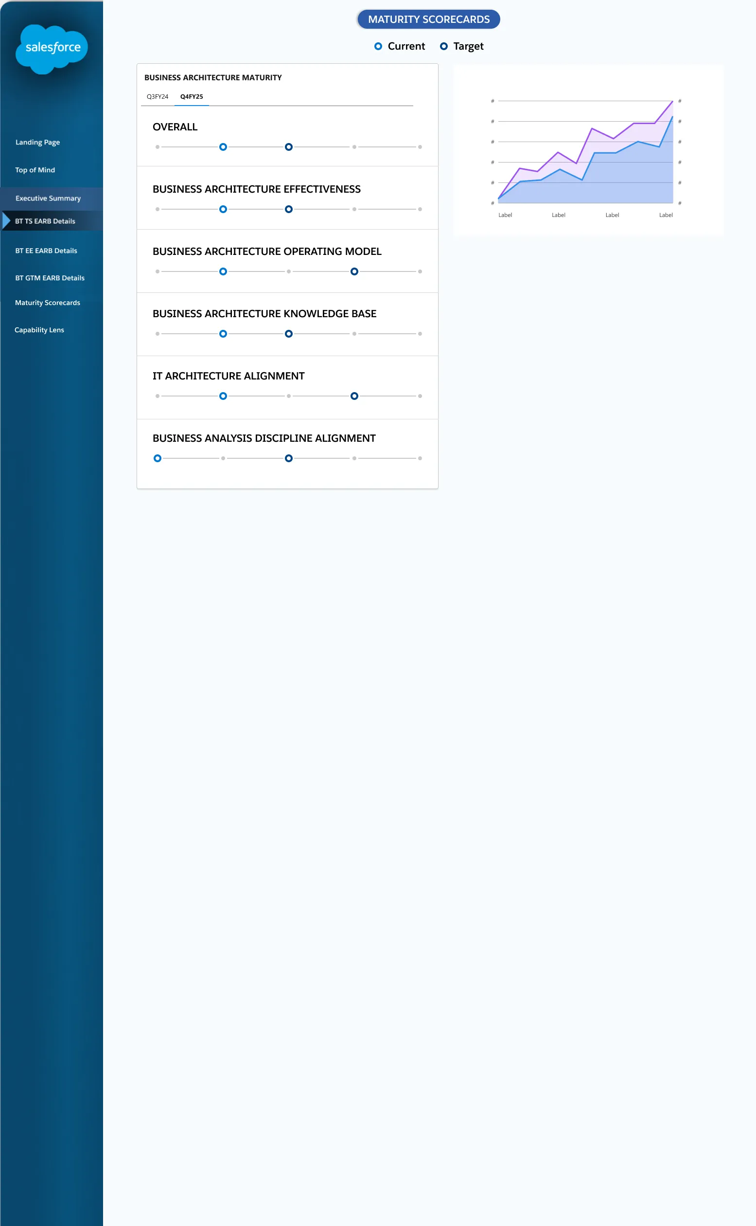
Resolved wireframes
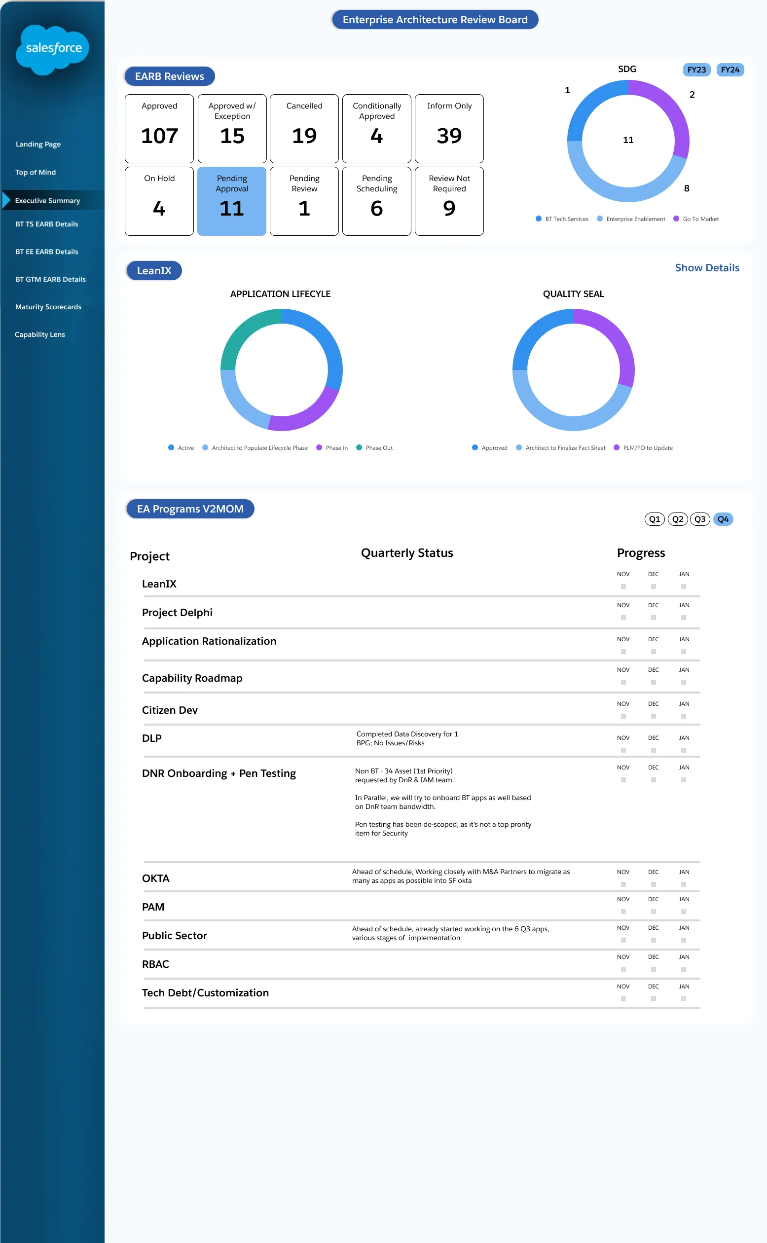
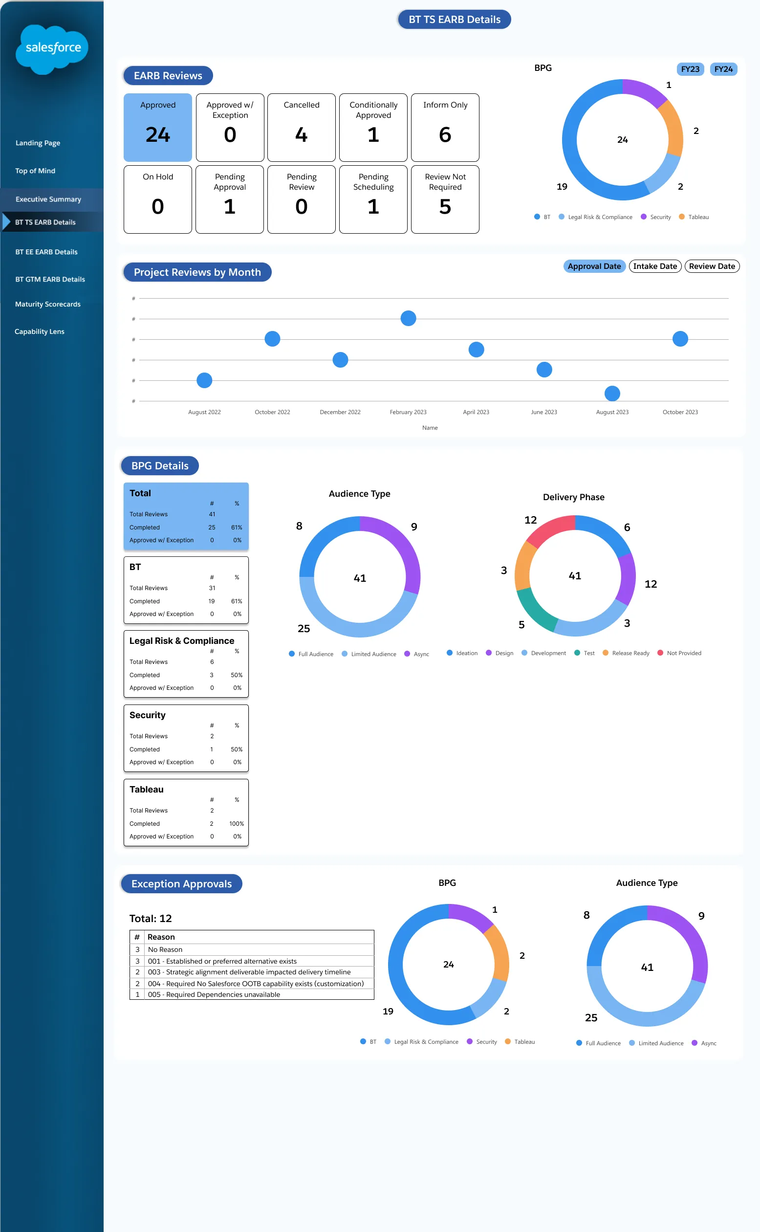
After conducting user research and gathering feedback, we learned that stakeholders weren’t familiar with Tableau’s default navigation patterns. I sought out Salesforce’s existing design system and proposed implementing its graph and chart components directly into Tableau, so stakeholders would recognize the components they already used elsewhere.
Wireframes
Further iterations
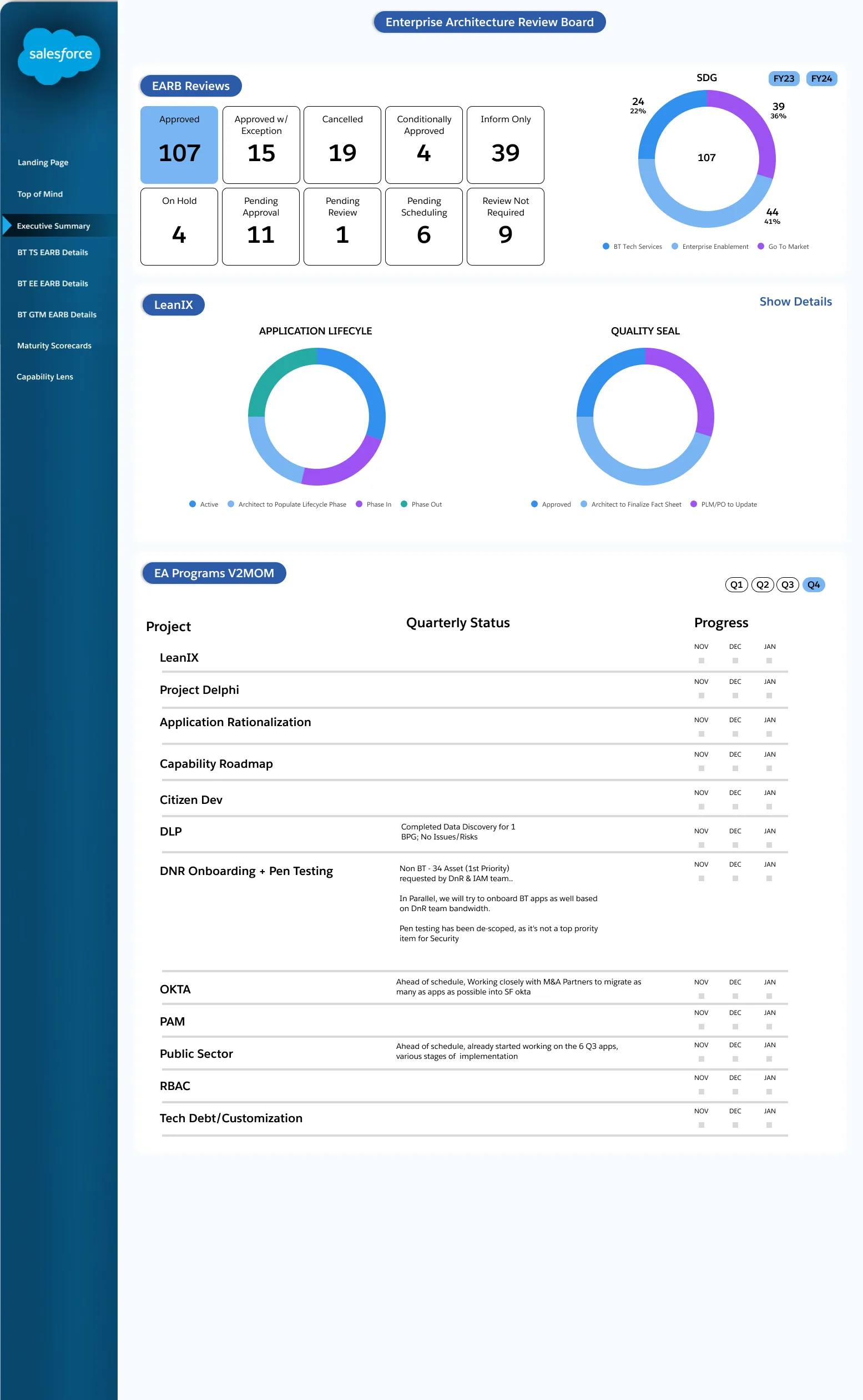
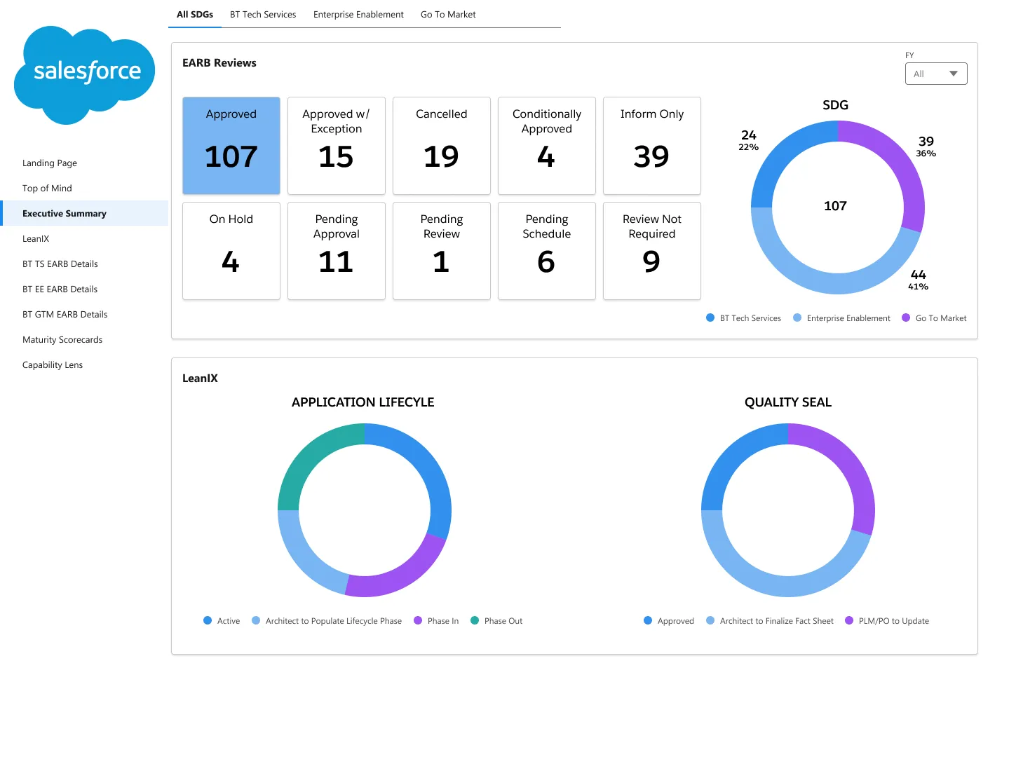
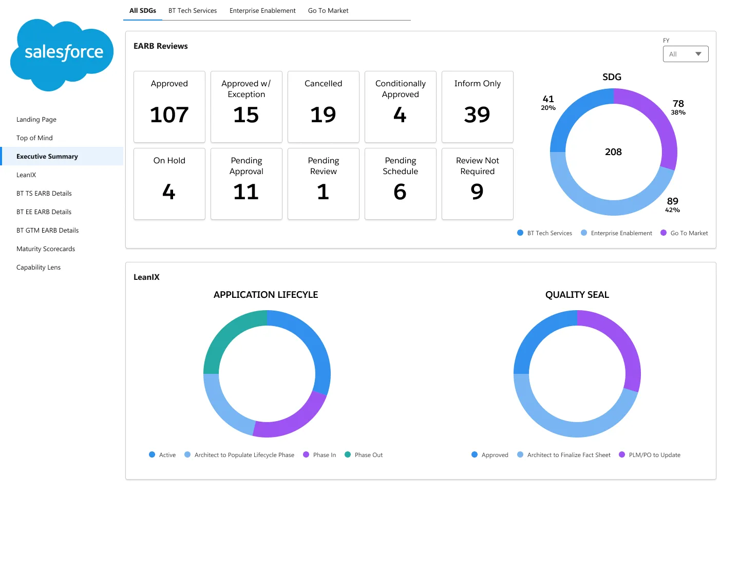
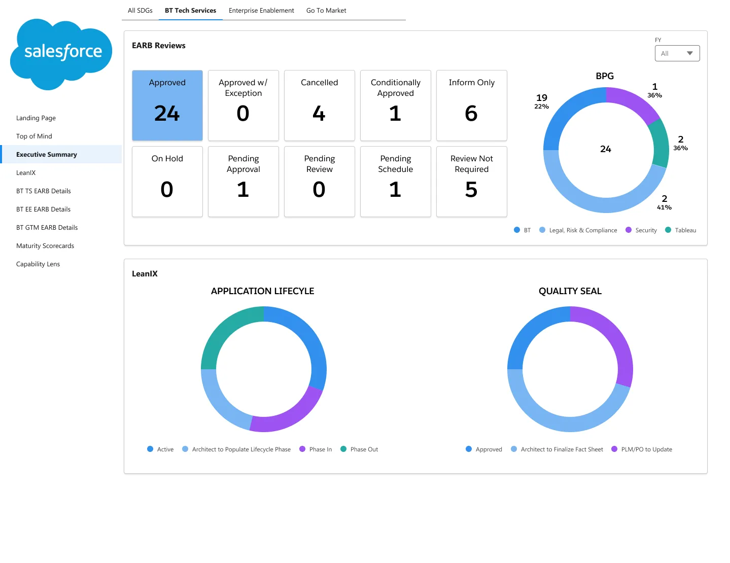
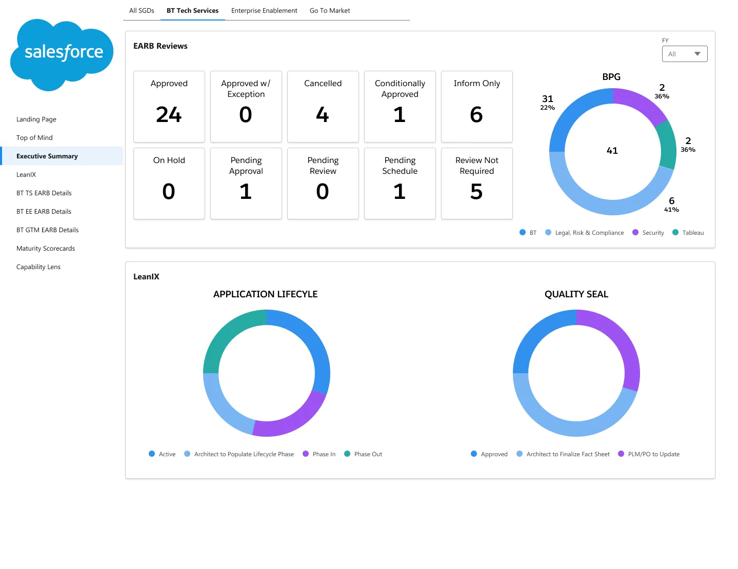
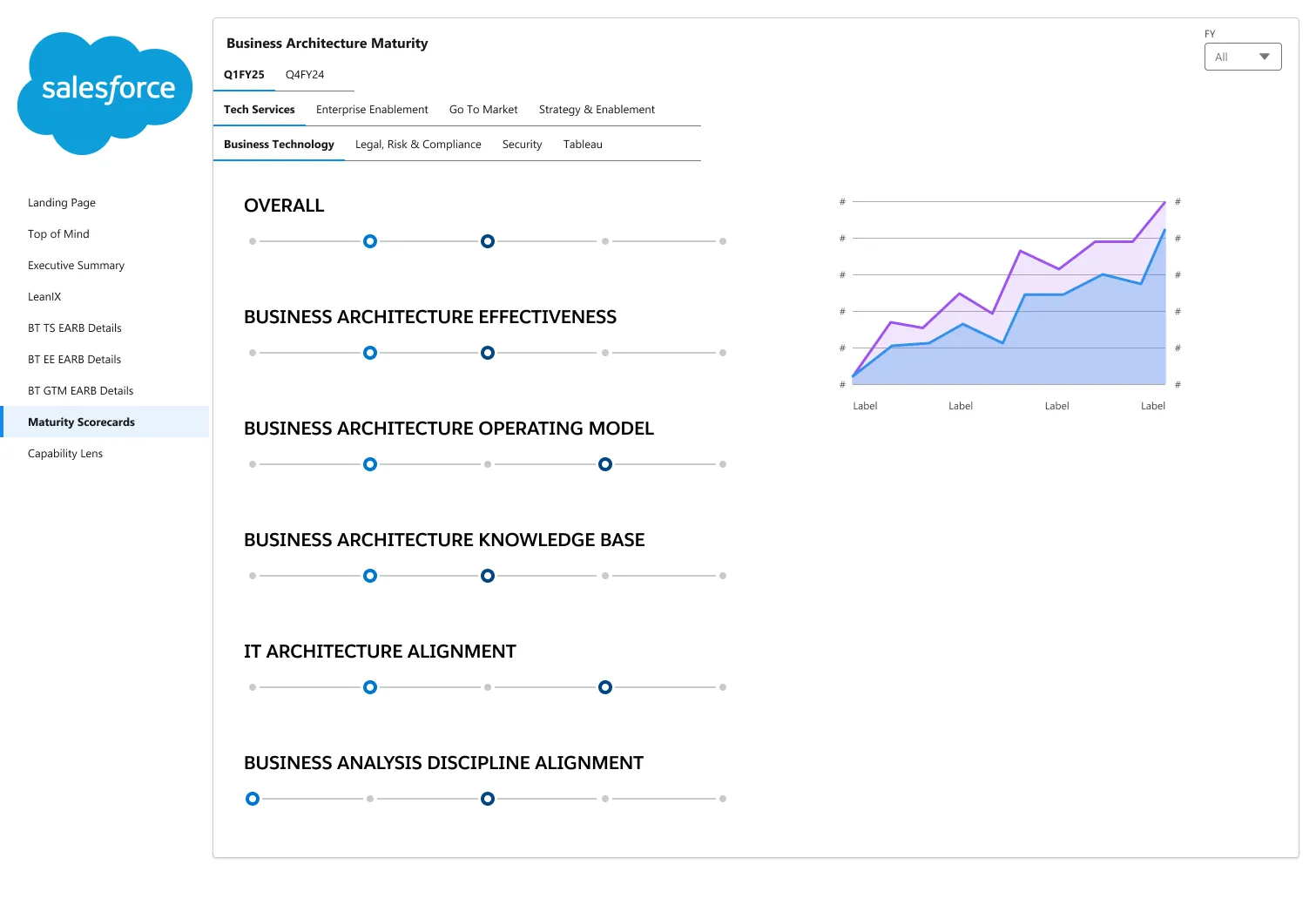
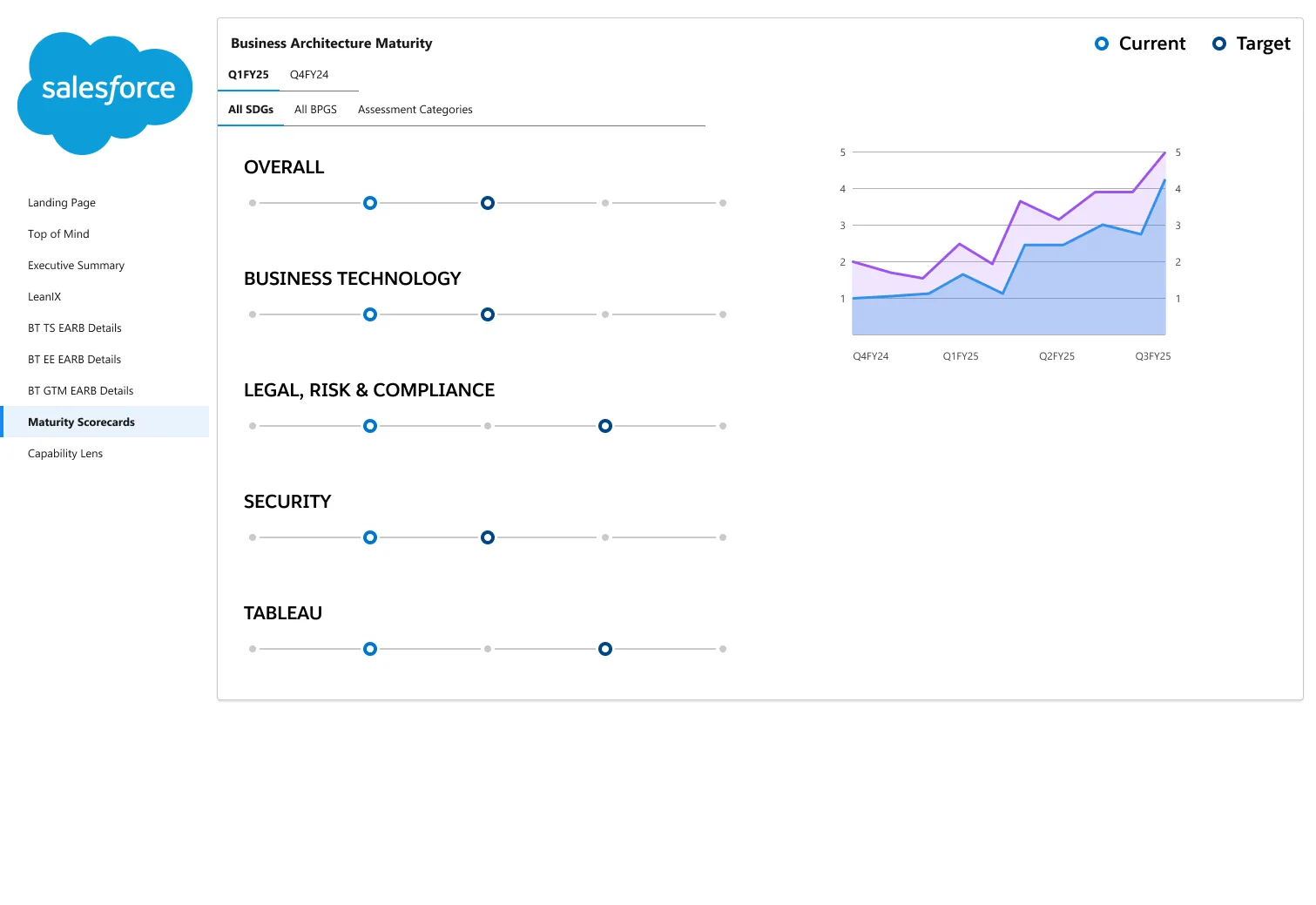
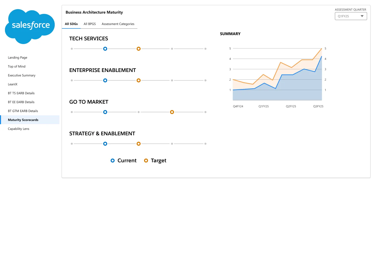
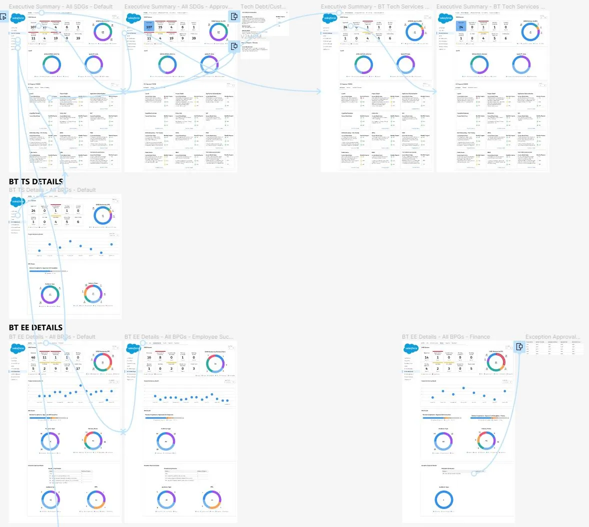
Iteration focused on two things at once: designing default vs. approved states for the Executive Summary views, and building out the Maturity Scorecard as its own dedicated view rather than another tab buried in the same dashboard.
Iterations
User Flow
Design
Prototype
Final design
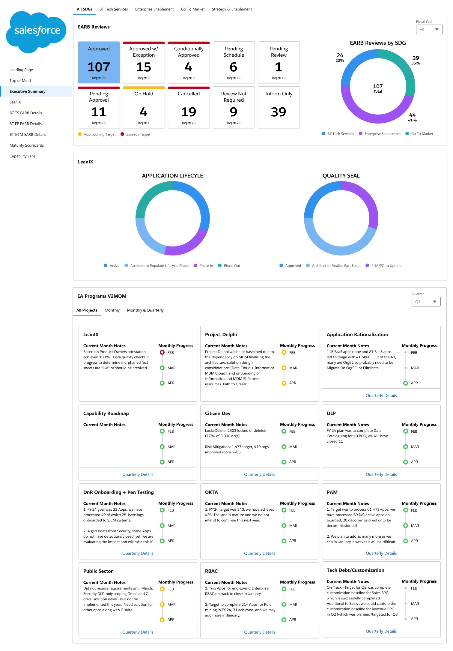
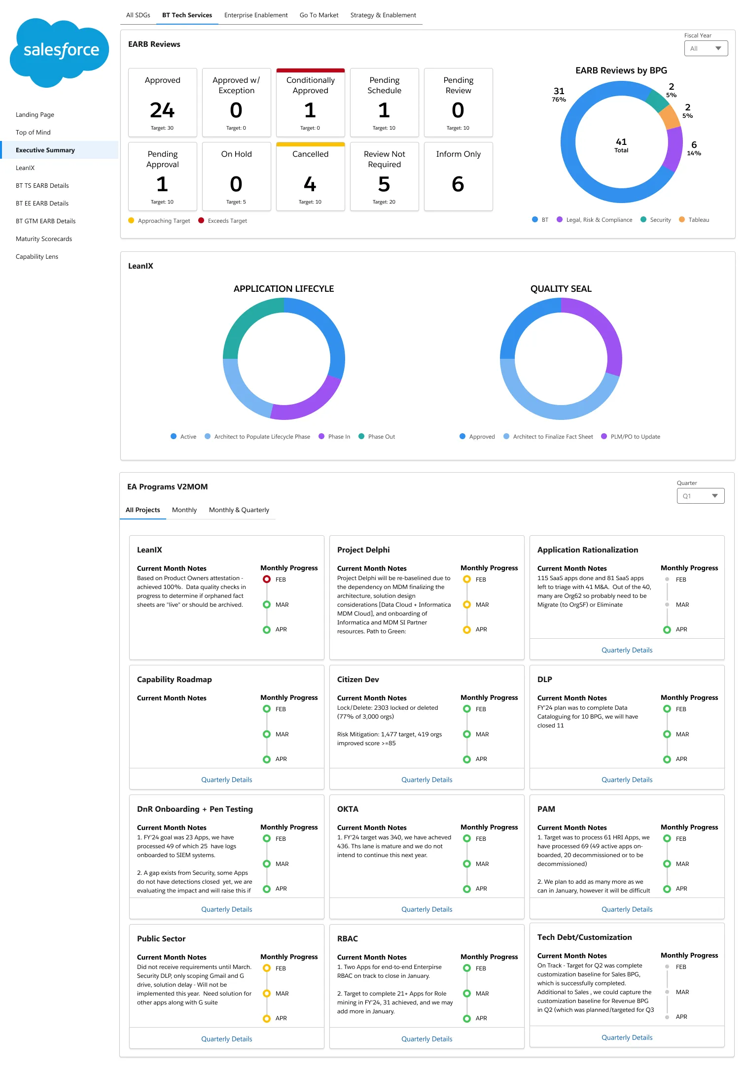
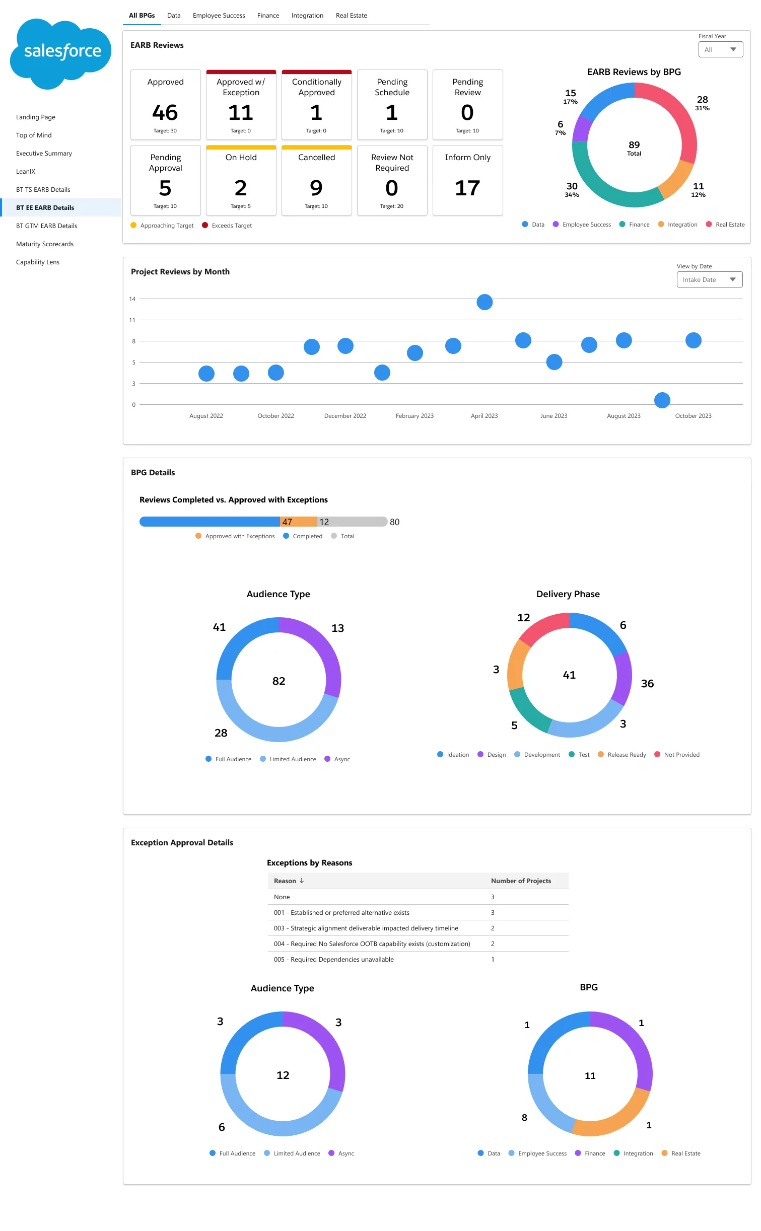
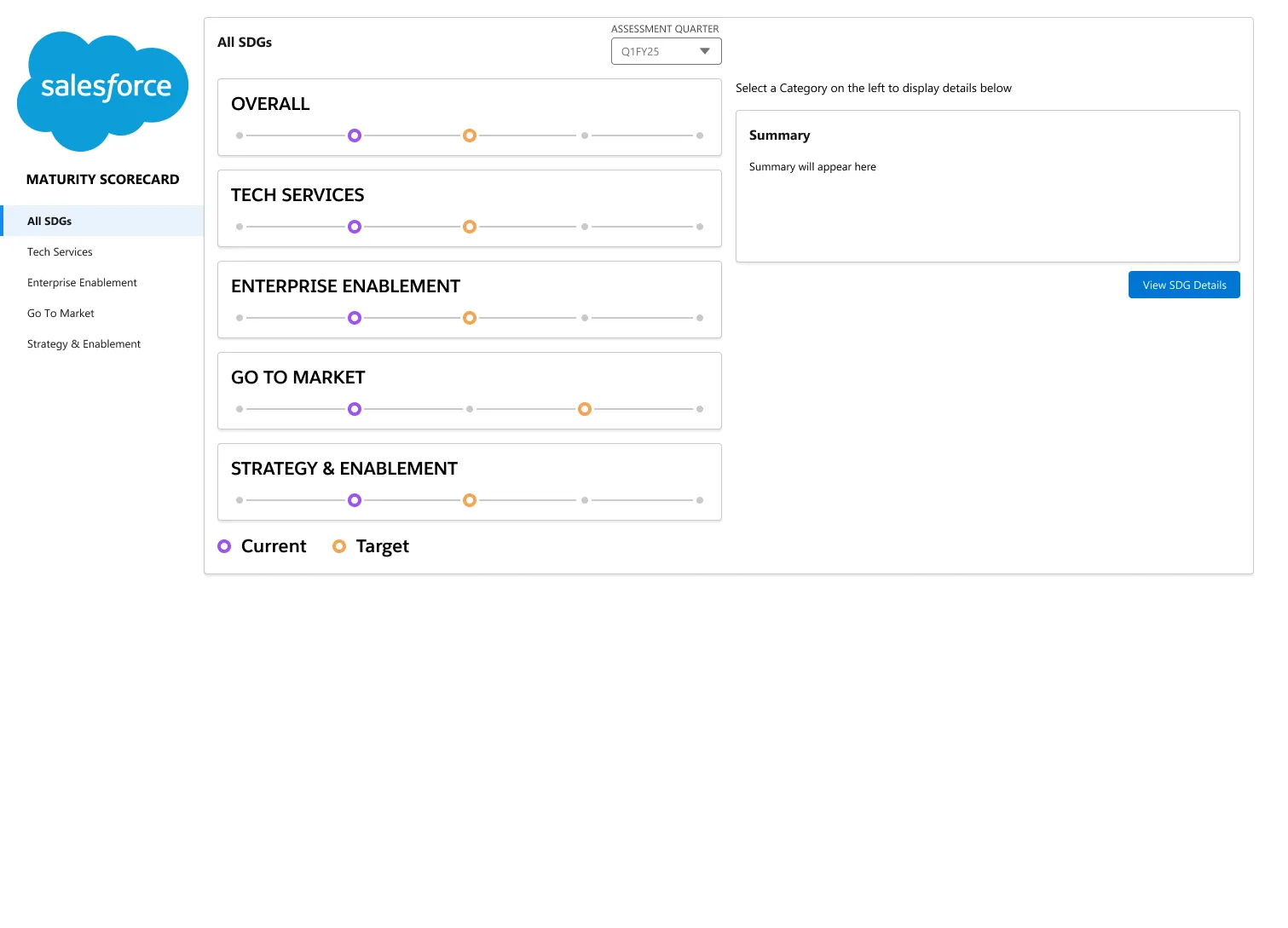
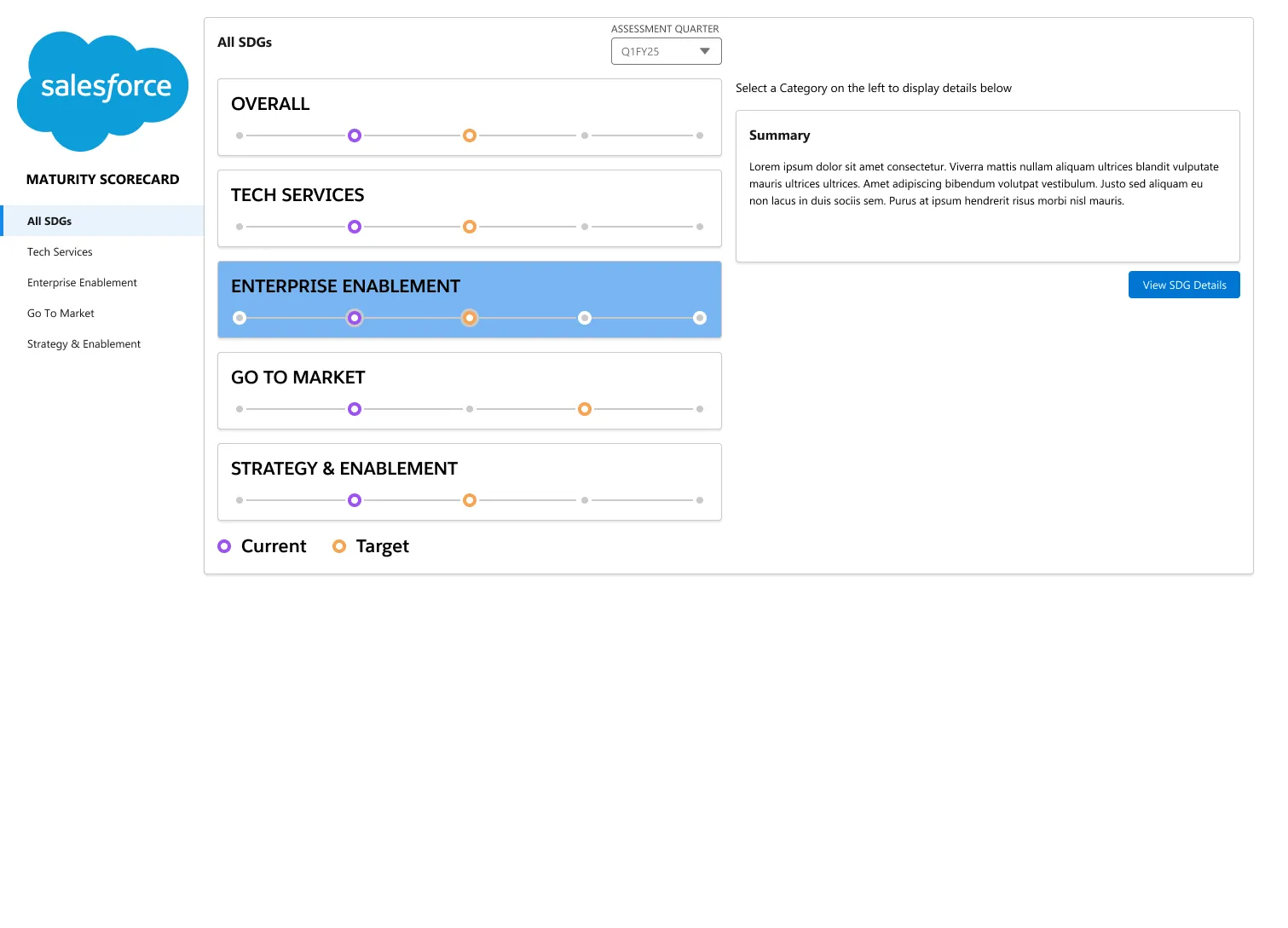
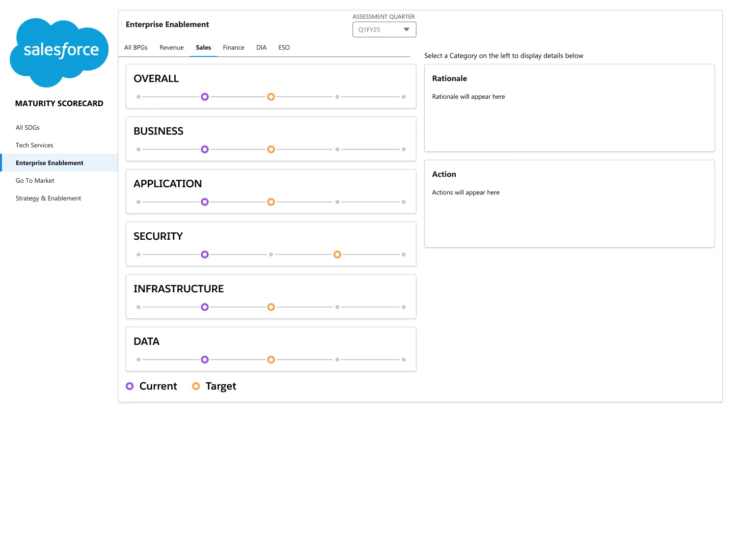
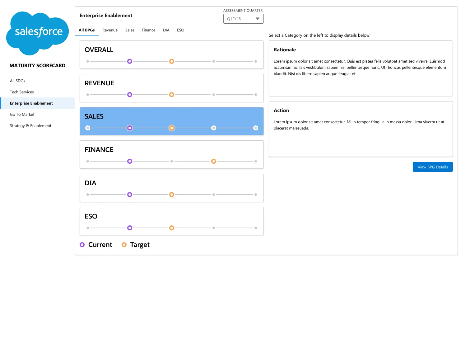
The final design separated the dashboard into dedicated views rather than one overloaded screen: an Executive Summary with default and approved states, BT and BT Tech Services detail views, and a standalone Maturity Scorecard broken out by team.
Final Dashboard Views
Before & After
Redesigning the two most-used views made the shift from raw tables to actionable dashboards concrete.
Before
After
Before
After
Outcome
- Reduced clutter and provided actionable insights through clearer data.
- Separate dashboards so users aren’t overloaded with excessive data and information.
- Data aggregation and thresholds that surface what needs action.
- Various filtering options in place of Tableau’s default filtering.
- Dynamic data views instead of static raw tables.
- Introduction of Salesforce’s existing design system into Tableau for scalability.
- An uncluttered view of raw data leadership can actually use day-to-day.