Endless Aisle
Outcome
85% Increase in Revenue.
Designed an experience where users are able to make clearer, distinct choices while shopping, which resulted in zero abandoned shopping carts.
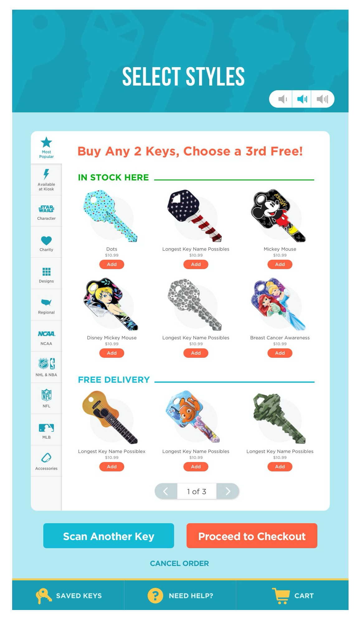
- Unobstructed view of keys to show inventory which led to decreased basket size
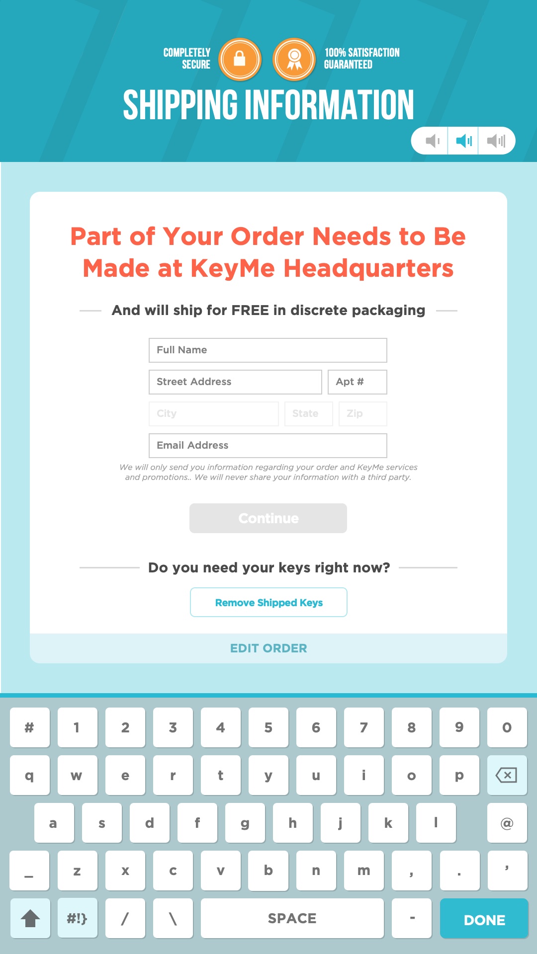
- Altered delivery experience to remove keys that needs to be shipped which led to increased checkouts and a revenue increase of 85%
Problem
Redesign main shopping experience to differentiate dispensable keys vs. delivery keys and explore drastically different layouts in order to increase revenue.
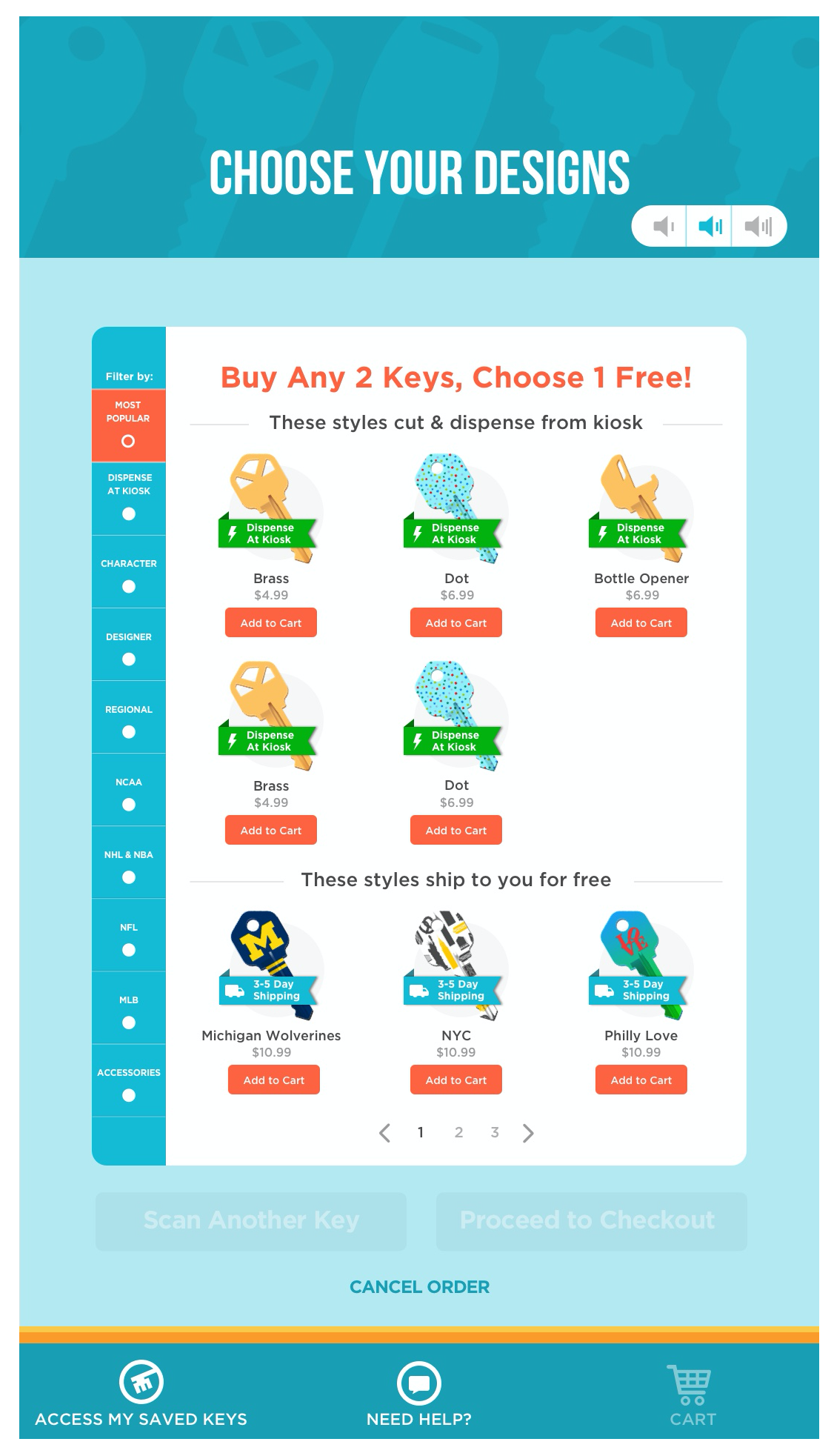
- Unclear as to what keys are in stock vs. delivered
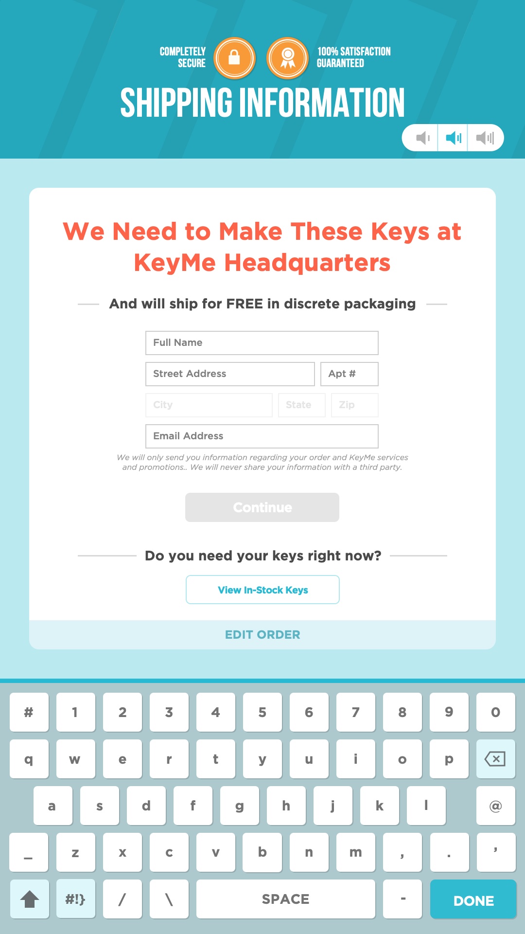
- When users select keys that require delivery, which requires an address, they cancel the order, which leads to high drop off rates
Discovery: Understanding the customers and the product, Cross Department Collaboration, Competitive Analysis
Main Findings
- Customers browse through designs first and assume it will come out of the machine.
- They get frustrated when they proceed and need to enter their address.
Understanding the customers and the product
I wrote a script and utilized TaskRabbit to send people out to various kiosks to go through the flow for copying a house key.
KeyMe valued capturing the experience in real scenarios. Yes, you can bring them into the office in a closed environment but you don’t get the Slurpee machine from 7-11 or the registers from the cashiers.
Cross Department Collaboration
I’ve met and discussed with employees in Operations to become knowledgeable about where we get our keys and how to further organize the assets and categorization of keys.
I’ve also worked closely with developers to learn about the codebase and how it would require completely being refactored to implement the ideas that I had.
Standard blank keys are loaded into magazines and are loaded into the machines. The reason for many key designs requiring delivery is because there are no magazines that support the varying key shapes with intricate designs.
Competitive Analysis
I looked at the flow for our main competitor as well as other companies that had kiosks which provided products in a short amount of time.

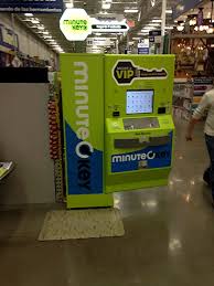

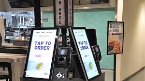

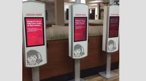
I also looked at other ecommerce sites that showcased products through traditional means in order to see if they could be carried over and applied to KeyMe’s products.
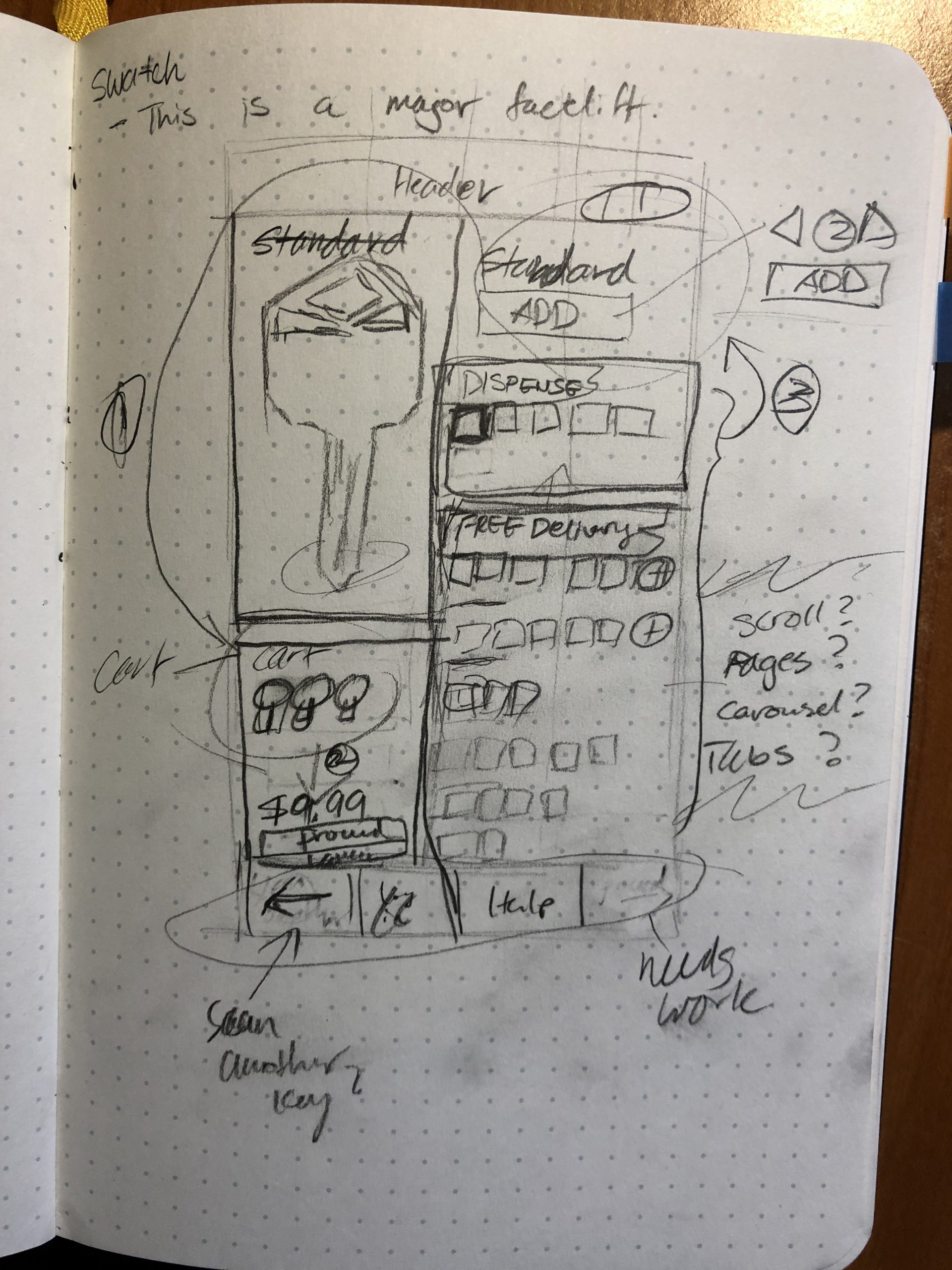
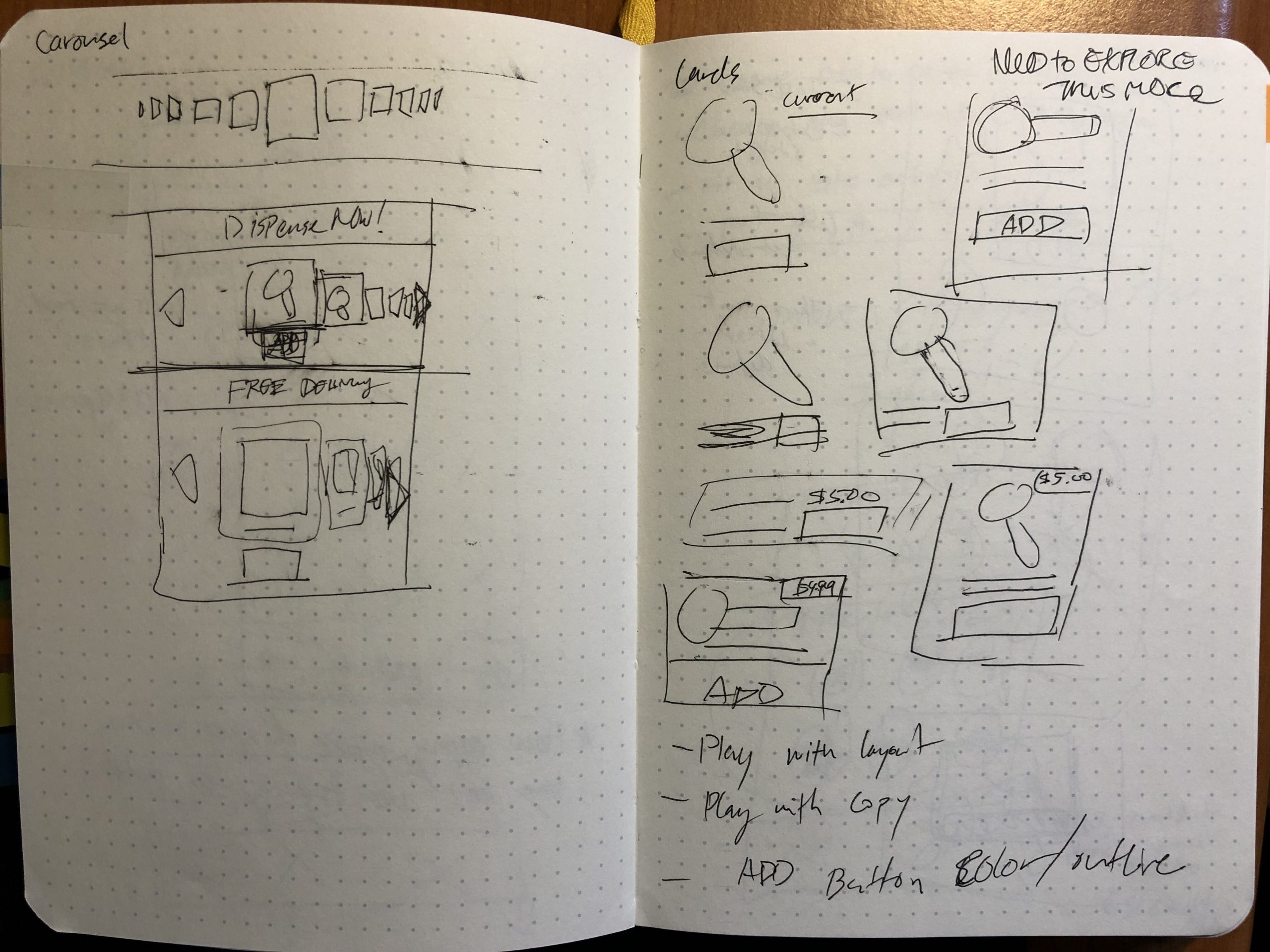
- Swatches
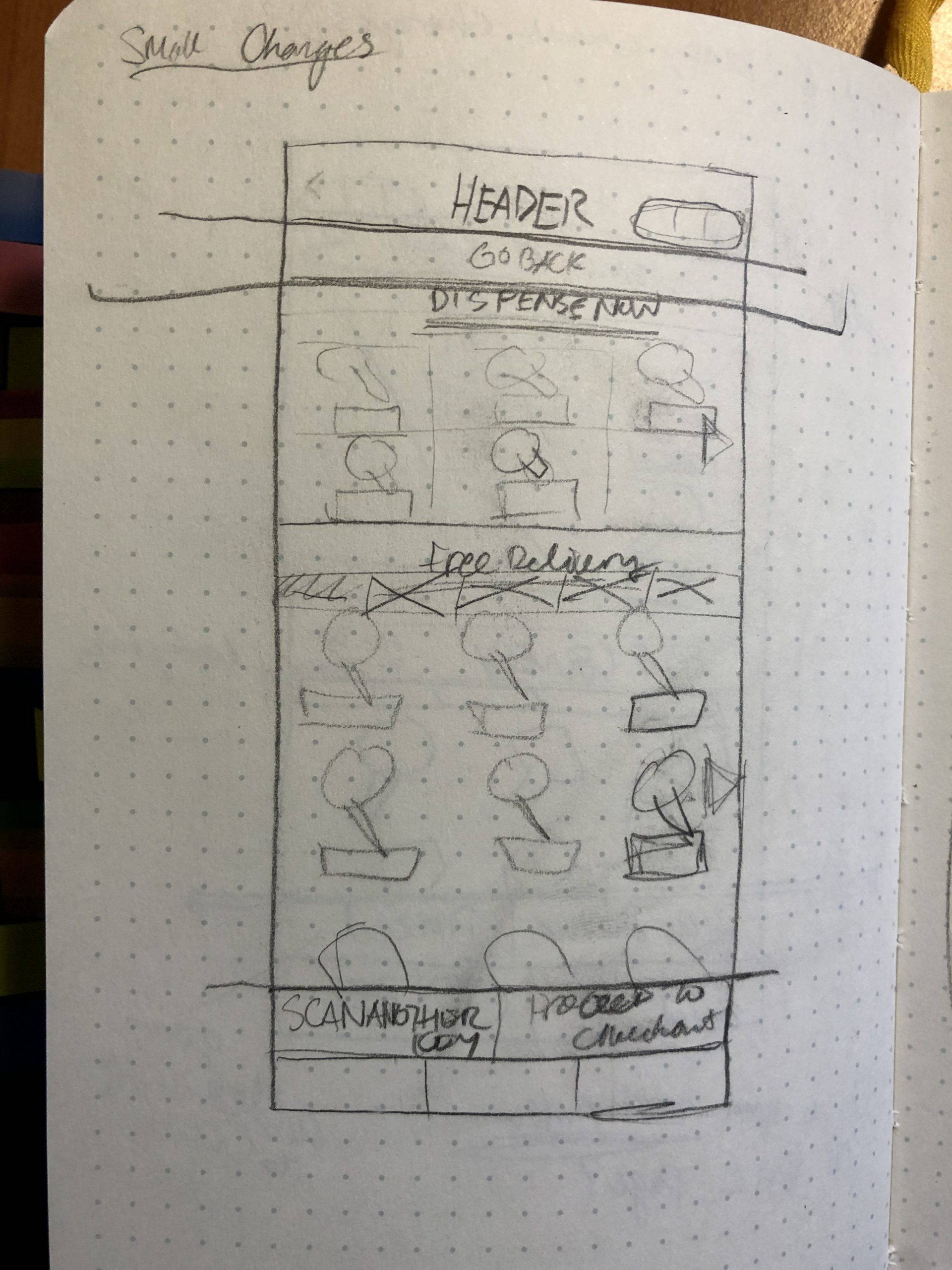
- Carousel
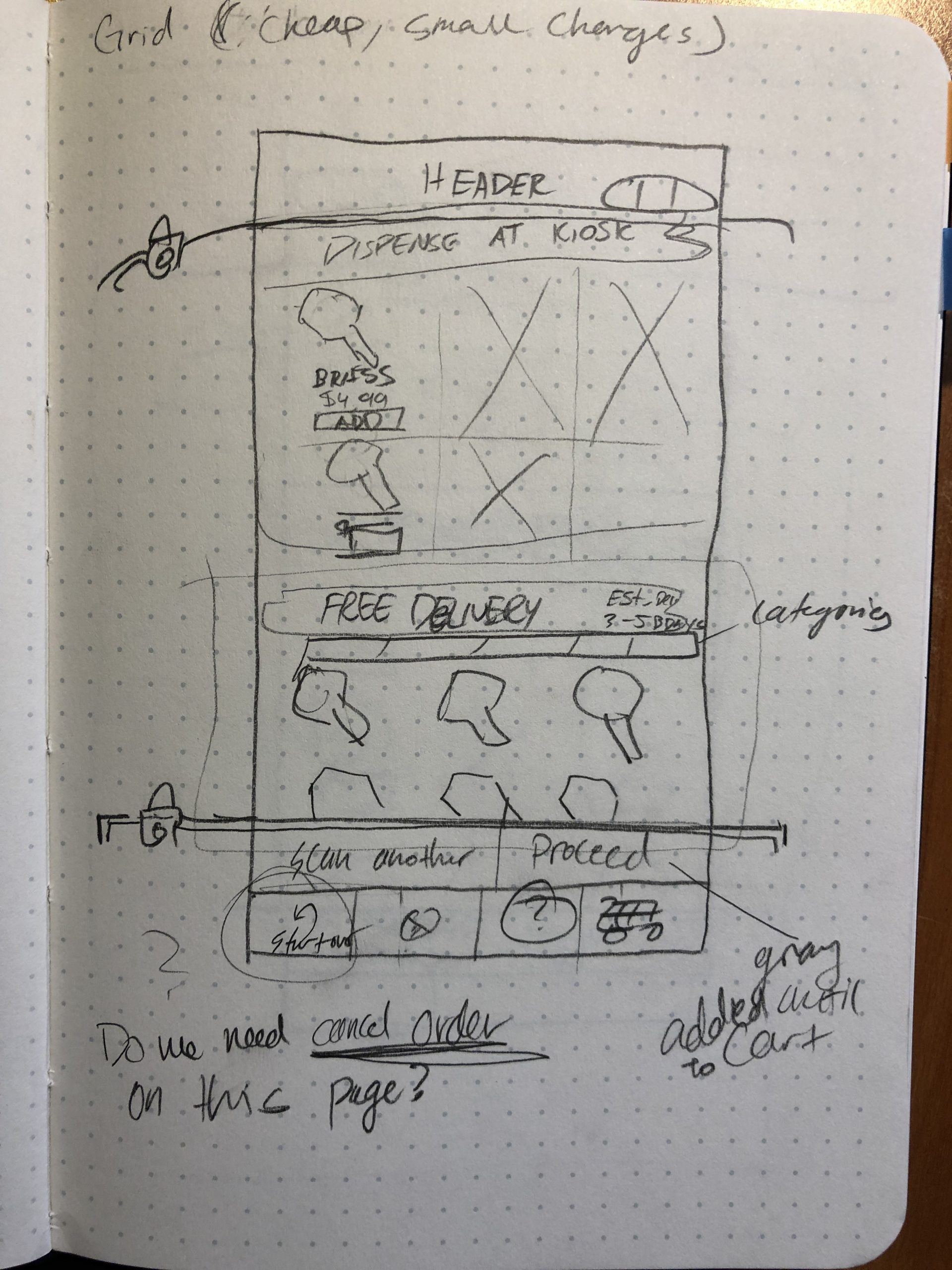
- Fluid Grid
Explore: Sketches, Resolved Wireframes
Sketches
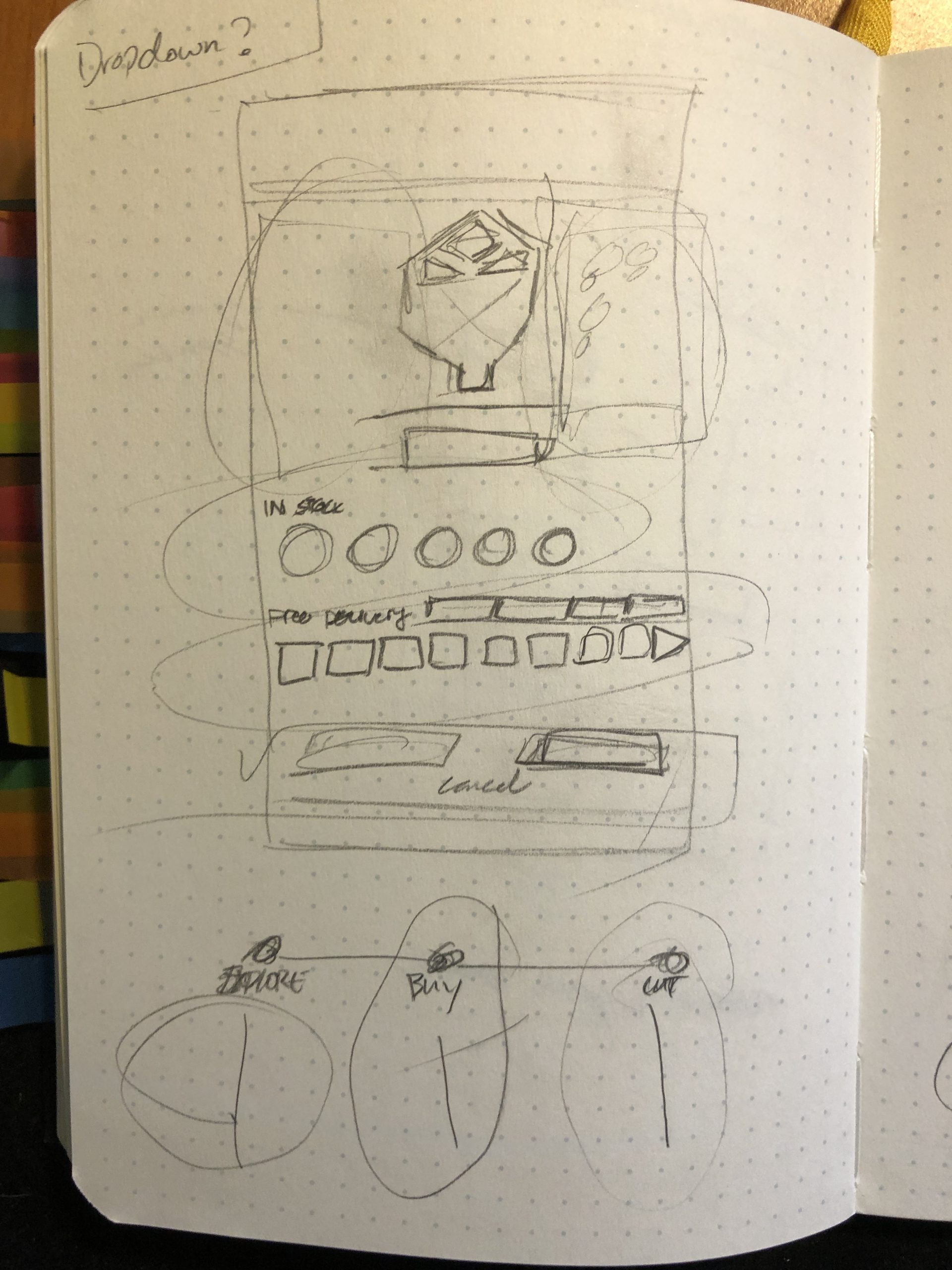
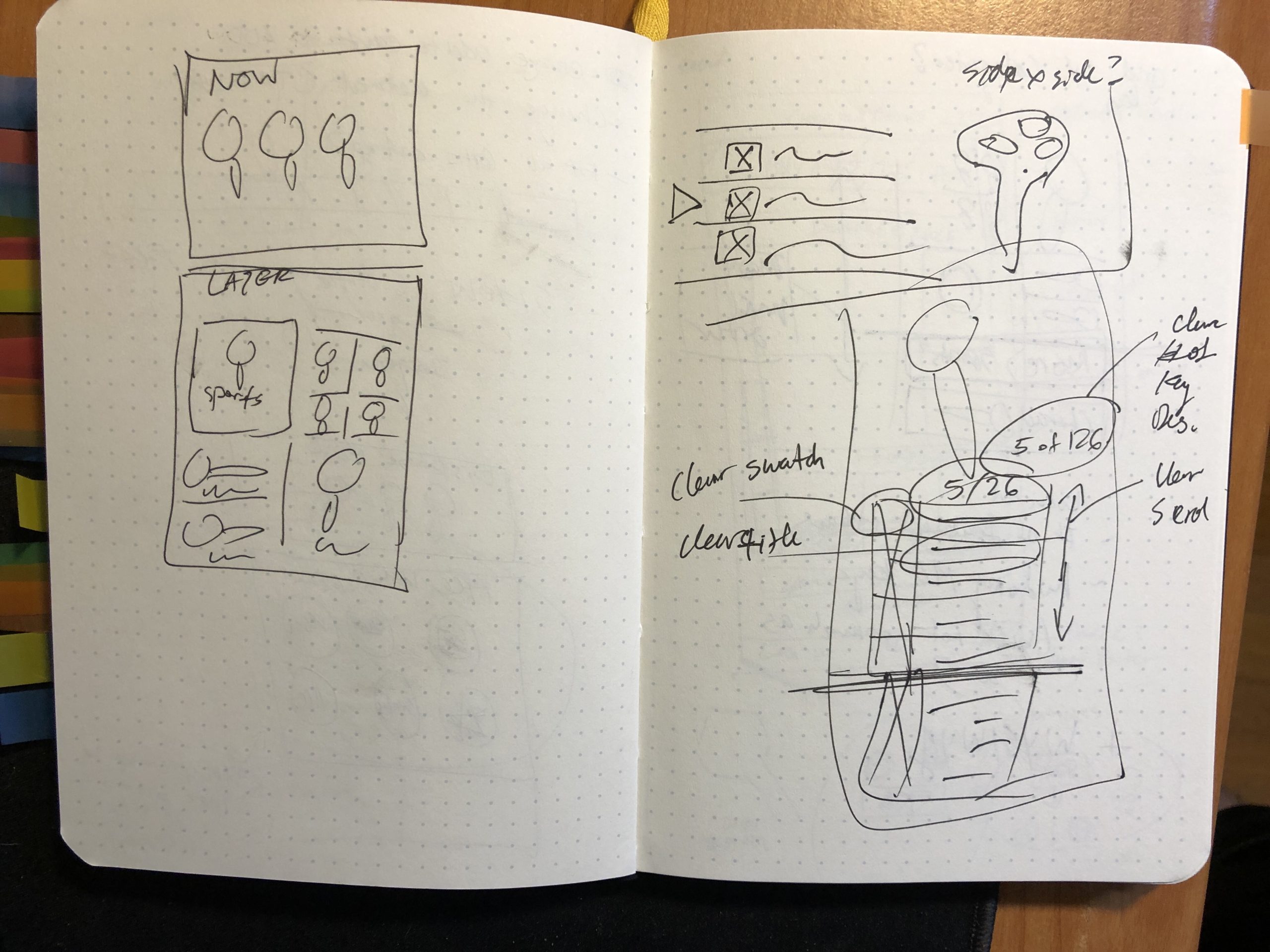
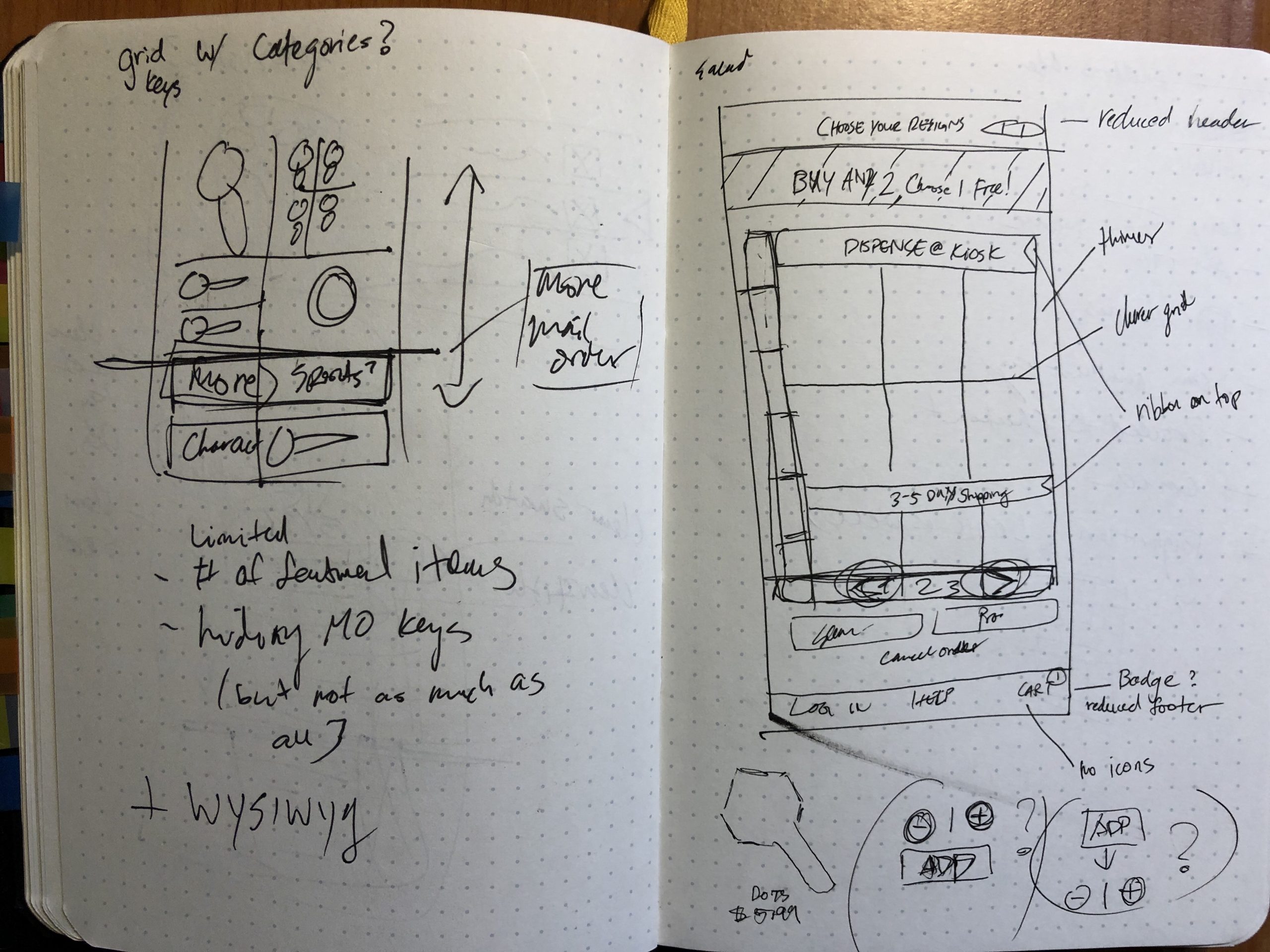
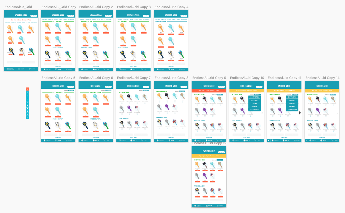
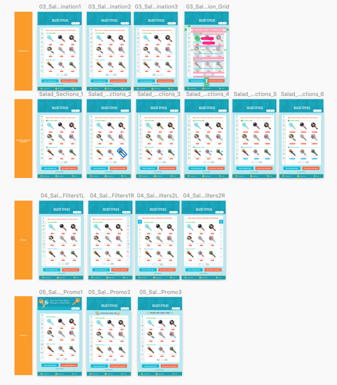
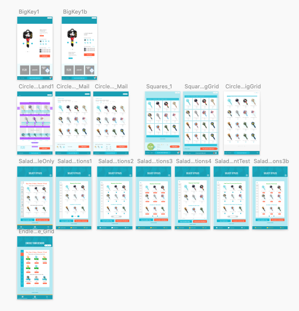
Based off of competitive research, I explored ideas of how to present the various key designs. Most notable is the idea to shift key design into a site similar to apparel customization.
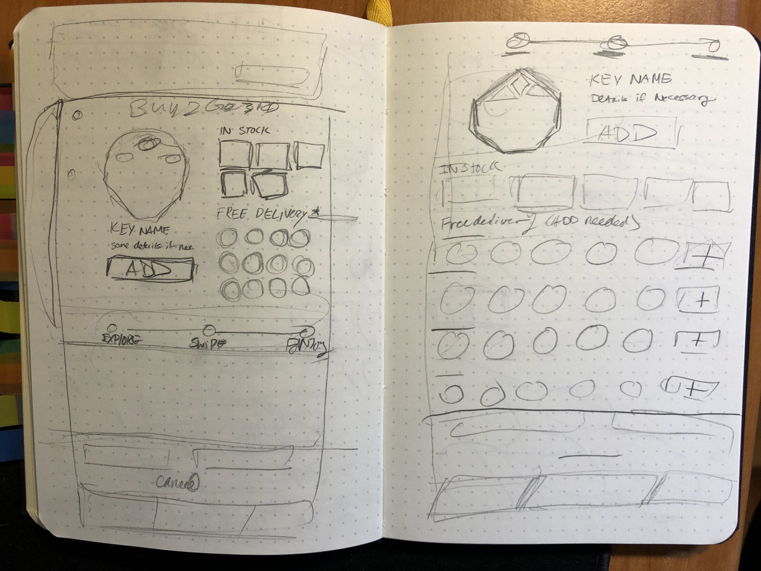
Resolves Wireframes
Design: Before and After, A/B Testing, Changing Functionality
Before and After
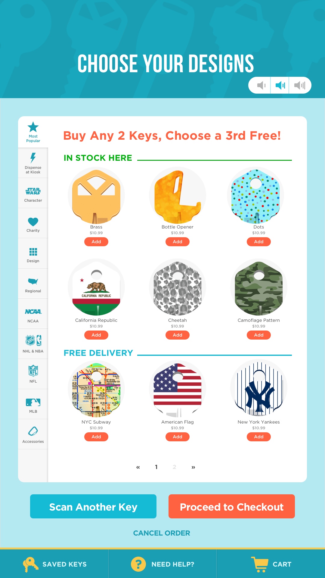
Increased size of keys
Removed ribbons to provide clearer view of keys
Differentiated headers for In Stock vs. Delivery
Made pagination more apparent
A/B Testing
I also had the opportunity to A/B test a different design. Users seemed to like that they could see the key more. We hypothesized that users were interested in the key head as opposed to the entire key. This proved to be false.
Changing Functionality
I changed the Secondary button "View In-Stock Keys" to "Remove Shipped Keys." This ultimately led to decreased basket sizes, but increased checkouts. With smaller basket sizes, we realized that users were able to be more intentional with their purchases after seeing clearly what was available from the machine. Revenue increased by 85%.
Lessons Learned
Customers are enamored by the different designs of keys and start browsing and adding to their cart. Only until they realize it will be delivered do they hesitate and adjust their orders.
Customers are more focused on exploring the product options and assume it will come out of the kiosk regardless.
They really wanted it at the moment and would rather not share their address and, instead, buy a key that was in the machine.
Looking at the products and details are important to the customers.
Decrease in basket size resulted from making clearer distinctions and options to remove delivery keys.
Project Overview
Users who wished to copy their keys were enamored by the various designs the kiosk offered. However, it was unclear that there were only a select few that were in stock in the machine and that the rest of the designs needed to be delivered. KeyMe saw high drop off rates because no one wants to enter their home address on a big screen in a public area.
Role
Lead UX Designer
Team
Aly Valli – Chief Product Officer
Mary Doyle – Freelance Designer
Shirley Wang – Front End Developer
James Krayer – Sr. Front End Developer
